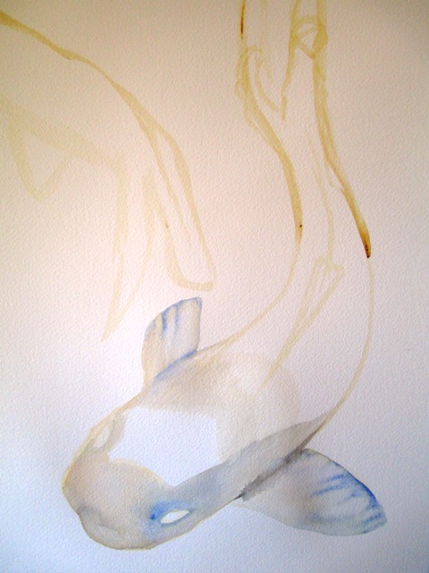
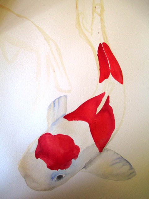
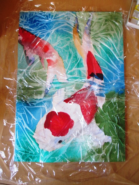
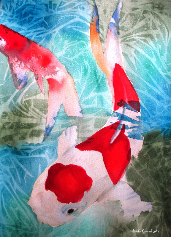
For some reason, I'm still in the mood to paint fish... and I wanted to refine some things I wasn't entirely happy with in the first Kohaku Koi painting a few weeks ago. The source was from a photo of Koi. These Koi were the very traditional red and white Kohaku Koi, which apparently actually means "red and white". The first step was to just lightly outline the shapes of the fish and do a very pale wash with a very watered down Australian Red Gold (Artists Spectrum watercolours) with touches of Ultramarine blue along the fins. I then thought out where the white parts of the fish were going to be and left them blank and filled in the red splotch parts on the body with Permanent Crimson on the outer edges and spectrum red towards the middle of the red parts.
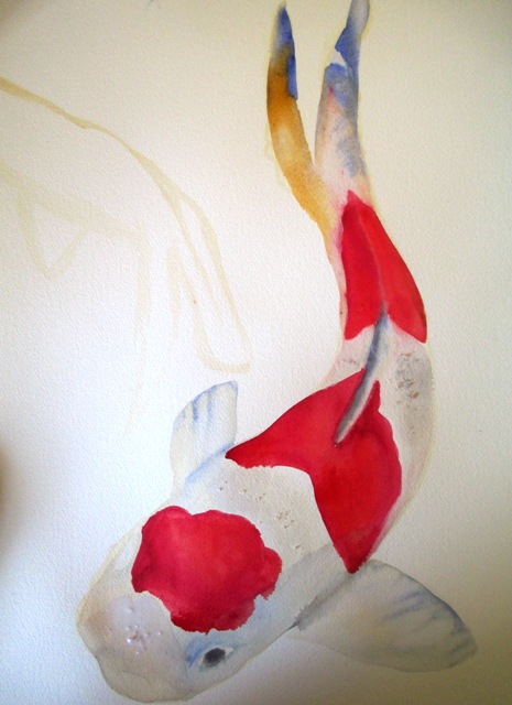
I then painted the tail a little multi-coloured, with Yellow Ochre and Ultramarine Blue, with Chinese white for the highlights. I did a wash with Chinese White over the "white areas" and some of the surrounding colours seeped through that in places which was what I wanted to create a bit of tone and interest along the body. I did the salt thing again, this time sprinkling it on the white part of the body to try to create some splotch effects, however the effect was not very noticeable in the end - it works better on bright colours.
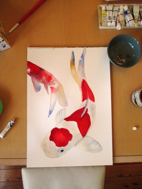
Now for the water special fx, I did a wash of clear water over the background, then went over while still wet with a turquoise (Winsor & Newton), Pthalo Green (Artists Spectrum) and Oxide of Chromium (Artist Spectrum). The painting was left to dry for a couple of hours and ...voila !
0 Comments
Leave a Reply. |
AuthorSacha Grossel is a practising Visual Artist from Australia. Archive
February 2019
Categories
All
|
 RSS Feed
