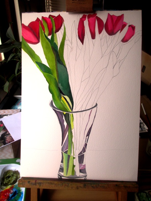
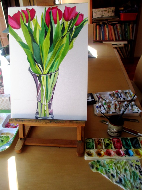
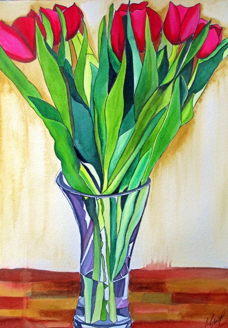
This new painting finished last week was painted from a bunch of reddish pink tulips that I'd bought, as Winter is here in Sydney, it seemed the perfect time to paint some more tulips. The main aim in this painting was to practice painting the glass vase, using the reflection of light and to give a sense of transparency. I think water and glass are two very difficult things to paint well.
I referred to my book "Painting Vibrant Watercolors" by Soon Y. Warren. Her paintings are magnificent and I find her technique very inspiring. She is a watercolour artist, but her paintings are almost photorealism. The detail and technique is amazing. There is a whole chapter in her book on how to paint crystal vases. So I read it carefully and tried to apply some of the techniques such as leaving areas of reflection white, painting in the shapes that the light refractions make. My vase is much simpler in shape than a cut crystal vase, so it was not as time consuming or as difficult as I originally thought it would be. I'd like to try to paint a cut crystal vase one day. That would certainly be a challenge !!
0 Comments
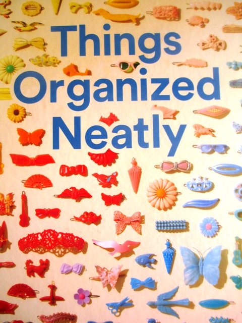
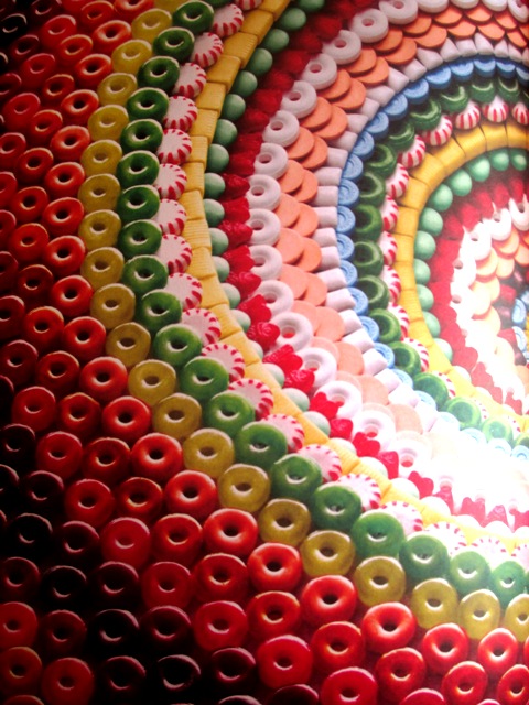
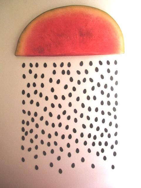
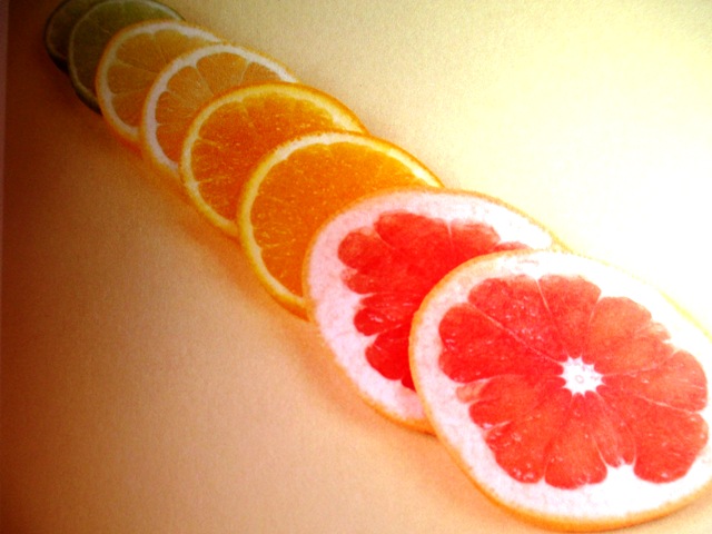
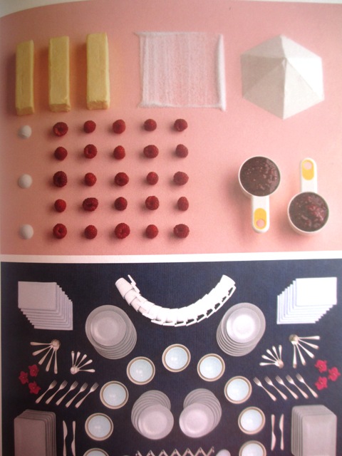
So apparently there is a verb for this and it's called "knolling". It's the method of organising things neatly. This book based on a website is curated by Austin Radcliffe, who describes the aesthetic of precision as injecting meaning into random objects as we infer relationships and stories between the objects. For me, in this chaotic world, these pictures inspire a sense of calm and relaxation. In general it seems that people are drawn to the order of the grid, to parallel lines and right angles. It's the penchant for precision that makes these images so satisfying. I like that artist Tom Sachs makes a point that knolling is not related to obsessive- compulsive disorder as this is a rational construct which is not based on fear or ritual. There is often a practical purpose for knolling, as scientists will use this method for classification or collectors may do this to show reverence to their collection. Some of my favourite images from the book are seen above. The middle image is of lollies arranged by artist Sam Kaplan. He is famous for food arrangements. The watermelon cloud raining seeds artwork is by Berlin based artist Sarah Illenberger. Below left is a food arrangement by Florent Tanet, a French photographer. Bottom right is kitchen food and implements by Carl Kleiner. He has very interesting arrangements of raw ingredients and he photographs catalogues for IKEA. Here is a link for the Things Organised Neatly website and facebook page. I'm a big fan ! https://www.facebook.com/thingsorganizedneatly/?fref=ts
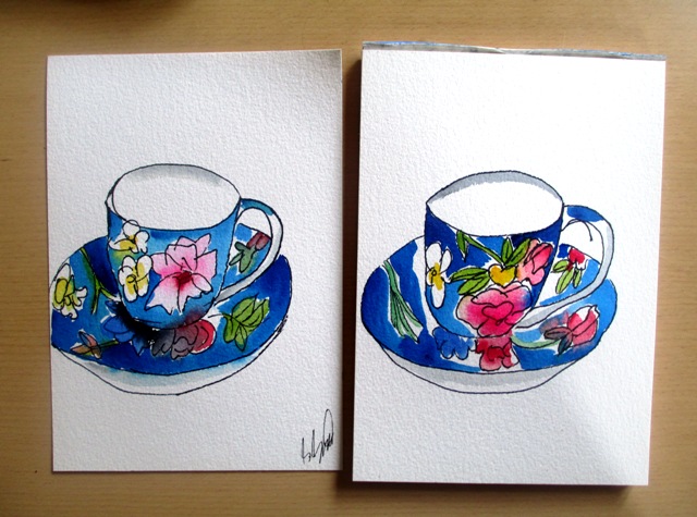
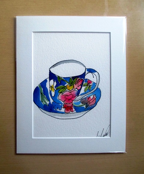
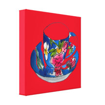
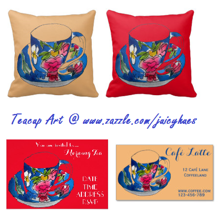
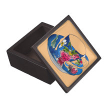
Last week I had some time to once more delve into my "Urban Watercolours Sketching" book by Felix Scheinberger 2011 (above left). I really like his freehand illustration style and the book is so cute and easy to read... So I thought I'd focus on the chapters "What is beauty anyway" and "Less in more". He encourages you to paint what is around you and look for your own subjects for inspiration. Artists ought to be authentic and tell something about their world. So anyway, I thought my teacup and saucer would make a cute illustration. This was a lovely designer teacup given to me for Christmas last year from one of my students that I teach - hence I've called it "Becky's teacup" I did two similar versions, but thought the second one turned out slightly better. In the Less is More chapter, Felix encourages us to be economical with colours when illustrating. Hence, I tried to deliberately not paint every space in the picture, but left some parts completely untouched. I tried to make use of the white paper as an element. I do like the effect of this technique for these urban illustration styles. It is my aim to do more of these illustrations over the coming months...I think they look great on the products in my design shop www.zazzle.com/juicyhues
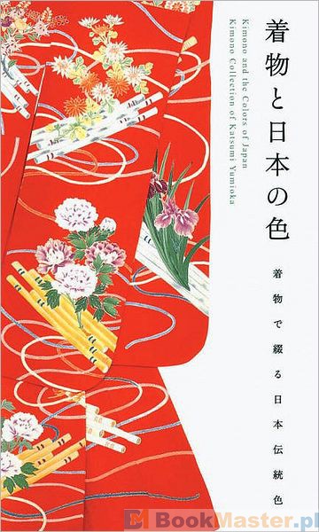
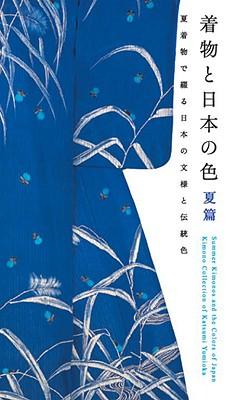
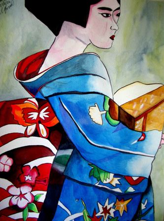
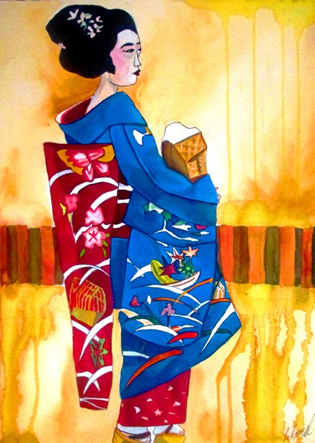
There is a great book (featured above) called "Kimono and the colours of Japan" by a kimono collector called Katsumi Yumioka. (Also "Summer kimono and the art of Japan) These books are fabulous references for colour theory about Japanese colour schemes and their use in kimono. Each page shows a single colour in a photo of a kimono with a description of the colour and its meaning in a Japanese context. For example, white, black and gold is an expression of cheer. Red represents the sun, blood and fire. Various botanical motifs are also explained in context of the traditional kimonos. So, with being inspired by colour theory and Japanese style, I completed a new painting featuring a Geisha in a blue kimono (below right). This was actually a re-creation of an earlier painting (below left) taken from the same source photo. I wanted to show the kimono in full length this time and experiment with more unstructured background styles... The paintings are about ten years apart, so as you can see, my style has really not changed at all...
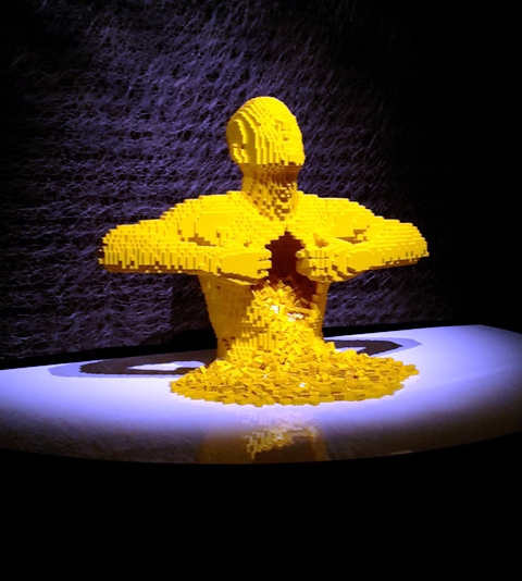
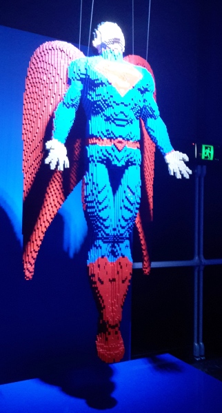
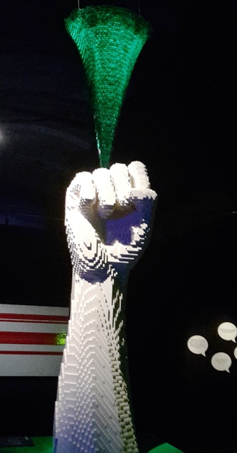
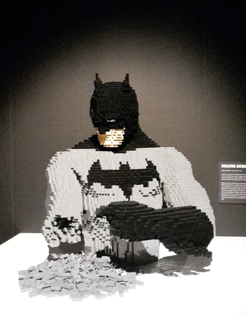
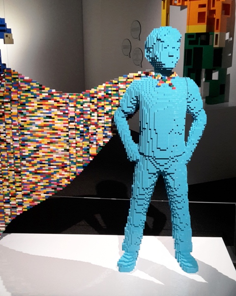
I haven't really been to any recent art exhibitions, but I did take the time to bring my kids along to visit the recent "Art of Brick" exhibition at the Powerhouse Museum in Sydney. This recent exhibition by New York official LEGO artist Nathan Sawaya features large scale sculptures on the theme of heroes and villains and is inspired by DC comics. Various superheroes on display include Superman, Batman, Green Lantern, Cyborg, Aquaman, The Flash and many more that I hadn't heard of, though luckily my son was able to give me a running commentary on all the more obscure heroes ! Villains included The Joker, Harley Quinn, The Riddler and many more. My kids both liked the life sized Batmobile the best, made from 500,000 bricks ! My son also liked the larger than life dark knight batman. My favourite one was called "Angel" (above middle) of Superman with wings flying up towards the sky. I love these art of brick exhibitions, as they do have some thought behind them and are very accessible for all ages. Sawaya is quoted as wanting to create a democratisation of art that is accessible for families and children. My other favourite piece is the famous "Yellow" (above left) which was on display, about baring his (the artist's) soul and letting everything out... with LEGO guts spilling out. So brilliant! The other brilliant one is Batman (below middle) trying to repair himself one brick at a time... More information on Nathan Sawaya and the art of brick here: www.brickartist.com Art of Brick - DC Superheroes is on now at the Powerhouse Museum until the end of April 2016.
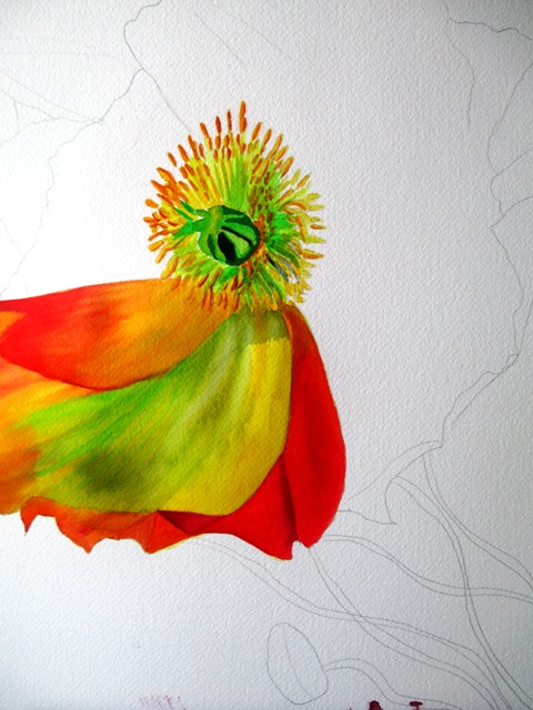
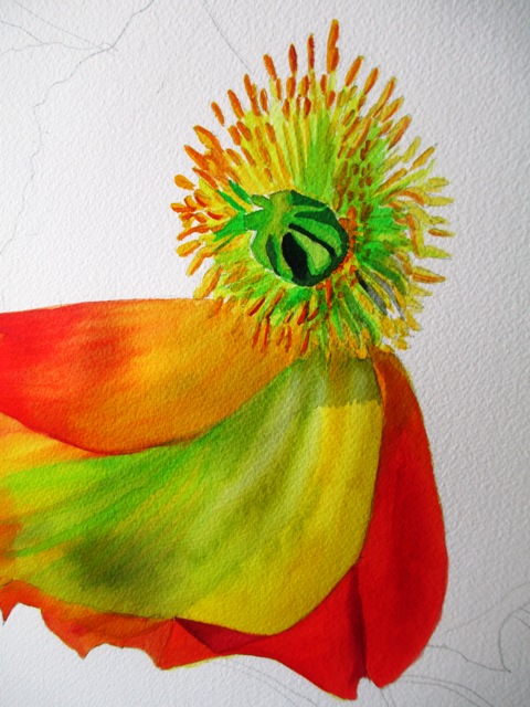
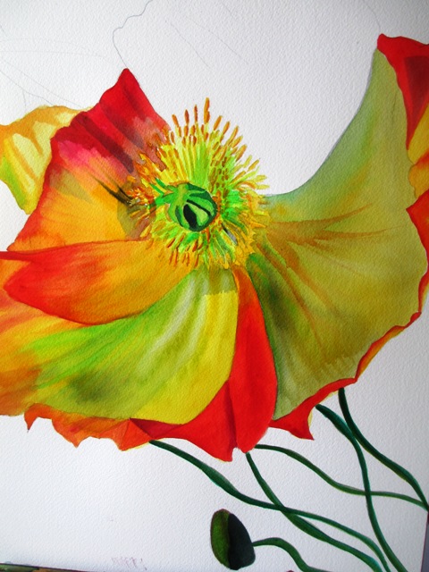
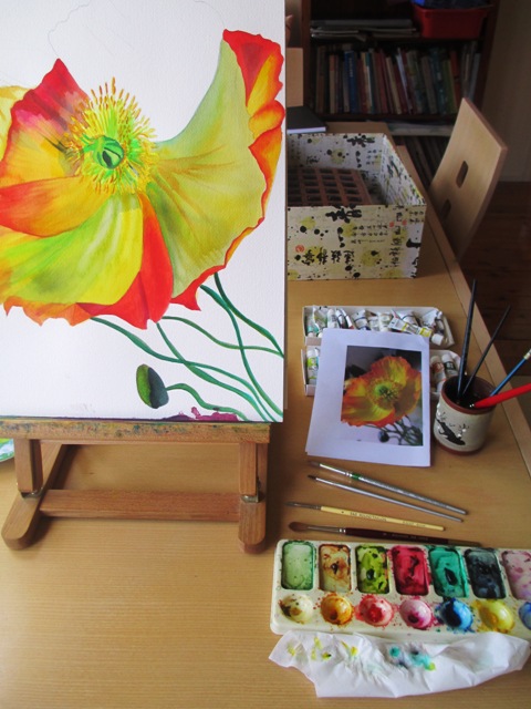
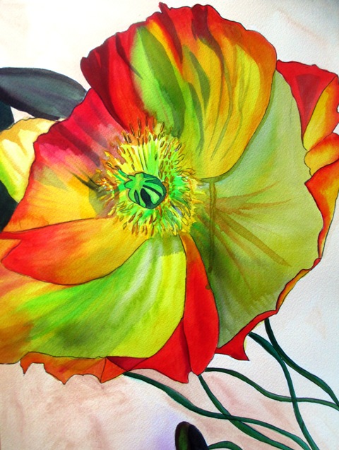
Poppies are one of my favourite flowers - I really love the texture of their petals - the papery quality and the bright colours of the petals. I also love how that is contrasted with the spindly stalks in dull green.. As I really liked how my previous poppy painting turned out, I decided to paint a close up version, focusing more on the petal texture. I used a reference photo that I had taken a few months ago of a bunch of poppies that I'd bought from the florist. The first step was to decide on the composition and roughly draw a pencil sketch of the outline of the flower. I usually like to start with the middle, more detailed section of a flower, using a small brush for the detail work. I then turned my attention to the beautiful papery petals. As I needed a translucent quality with various colours showing through, the colours needed to be layered carefully. Lemon yellow and spectrum yellow (Art spectrum brand paints) were the base colours, with overlays of Australian leaf green, Australian red gold and Spectrum red. The base colours needed to be almost fully dry before the outer colours were applied on top. It was important that certain sections dried fully before the next petal could be painted so as to avoid the colours blending into each other. Textural effects were created by using a small brush to lift paint in some areas (using water) and to create the veins or lines in other areas of the petals. The spindly green stalks were painted in layers of Australian dark leaf green and Pthalo green with Flinders red violet highlights. The background has been kept as a light beige / neutral colour so as to not draw attention from the feature attraction. I'm happy with how it has turned out - I really like the colours !
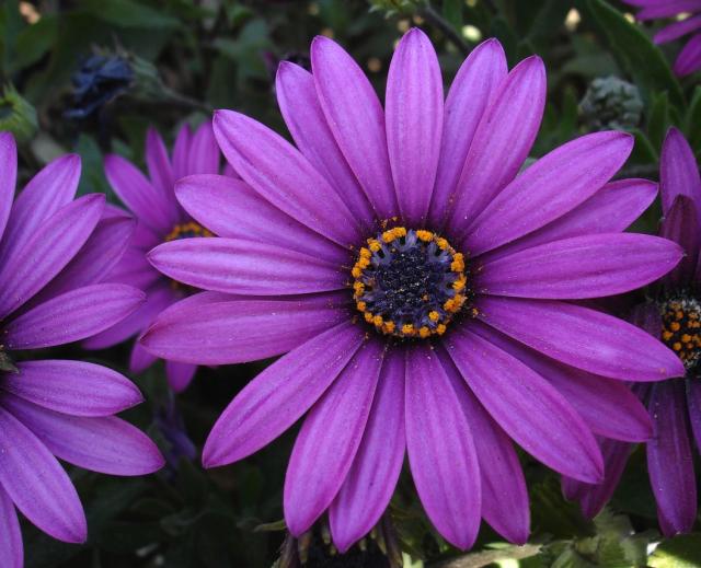
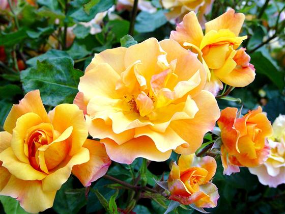
Here is a real Summer flower, as the weather warms up in the Southern Hemisphere heading towards the hottest months of the year. African Daisies are also commonly known as Cape Daisies or Blue eyed Daisies, though their scientific name is Osteospermum. As their name suggests, they are commonly found in parts of Africa. These flowers are quite hardy and are also commonly found in flower beds in local parks and gardens in the Summer months. The petals are smooth and flat like a daisy and radiate out in a spoon shape. Colours can include lavender, pink, white and yellow.
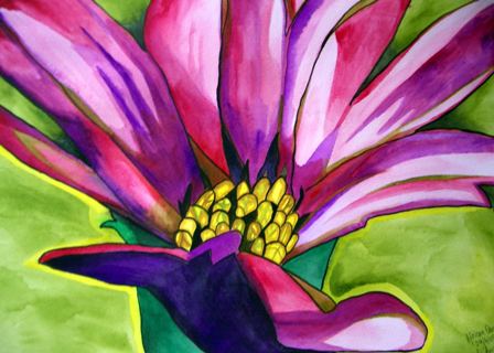
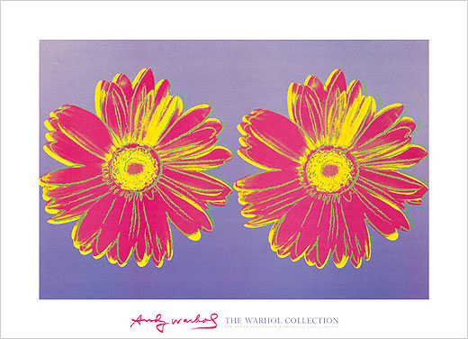
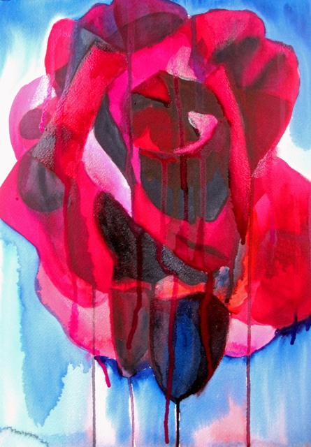
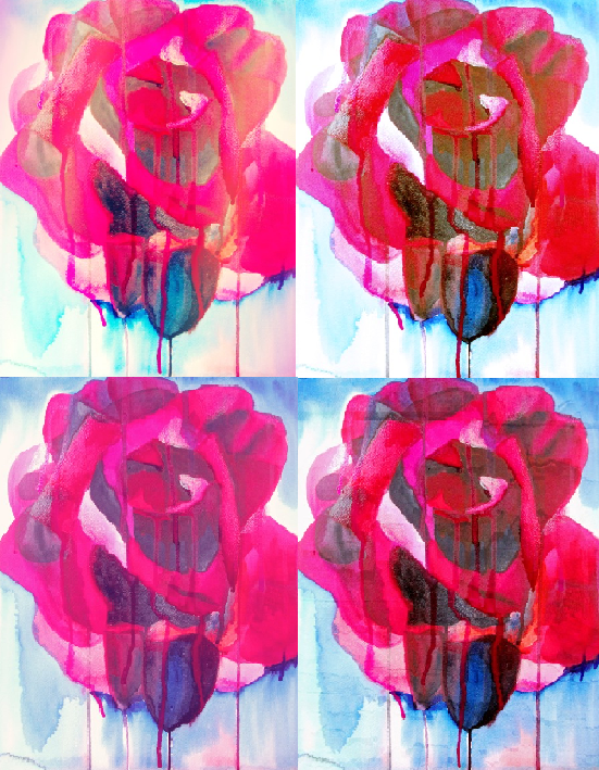
My painting of the lavender coloured African Daisy (above left) is one of my earlier paintings. I was interested in the unusual perspective angle of looking across the flower from slightly below rather than painting it as a flat daisy. Daisies are such popular iconic flowers of Springtime / Summertime innocence. Above right is Andy Warhol's screen printed take on this popular, rather common motif. 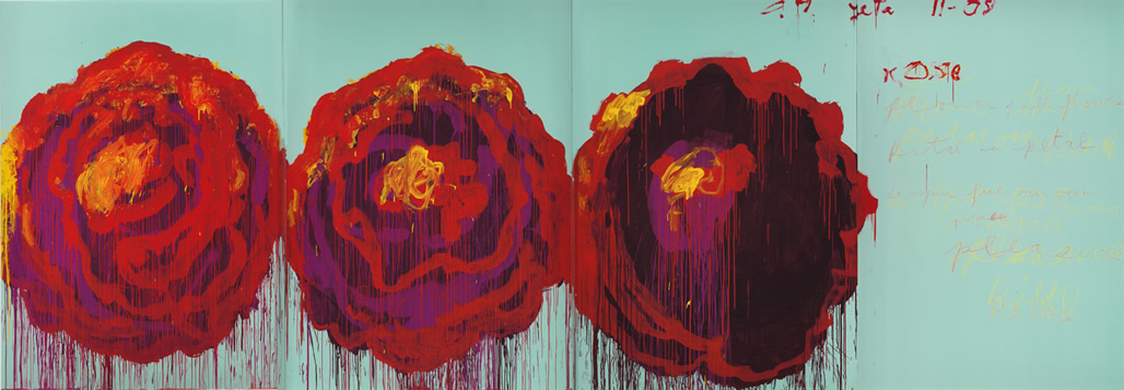 I had in my mind that I wanted to try to create something a bit more expressive with more freedom in my brushstrokes for my next painting. As I was looking online to see a more urban or expressive approach to painting flowers, I came across a wonderful artist called Cy Twombly. Twombly was an American painter, born during the 20th Century and recently passed away in 2011. He spent most of his working life living in Italy and was interested mostly in abstract expressionism. His large scale works included freely hand scribbled text and were graffiti - like and urban in construction. I really liked the above work "The Rose" (2008) - a series of four large scale paintings - above is no. IV. I can really feel some emotion from the brushstrokes and dripping paint, like bleeding roses - very free and expressive. I tried to channel this freedom of brushstroke and emotion in my watercolour painting Etoile de Holland - below left- which is the name of the rose I have painted. I also wanted a "bleeding" type quality to come through with the watercolours and I wanted a dark, kind of heartbreaking gothic style of emotion with the black and red colours used. I also used the opportunity to experiment with gum Arabic in parts - just to see what it would do. I'm not sure of the final outcome - but it was fun to be a lot looser in my style and to try to paint my emotions on paper. I used photoshop to apply some effects for future prints - below right... I thought they turned out pretty well and I'll definitely use some in my print shop.
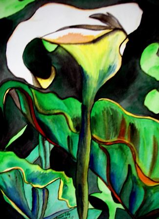
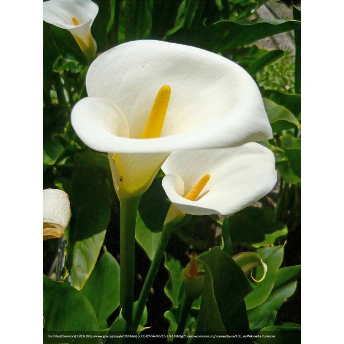
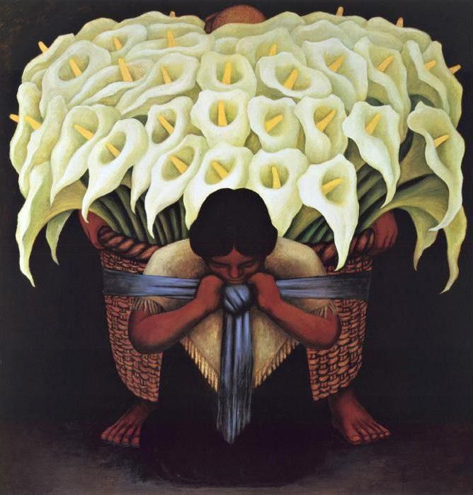
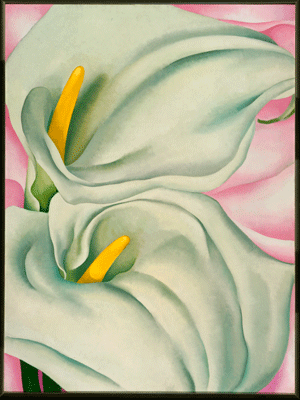
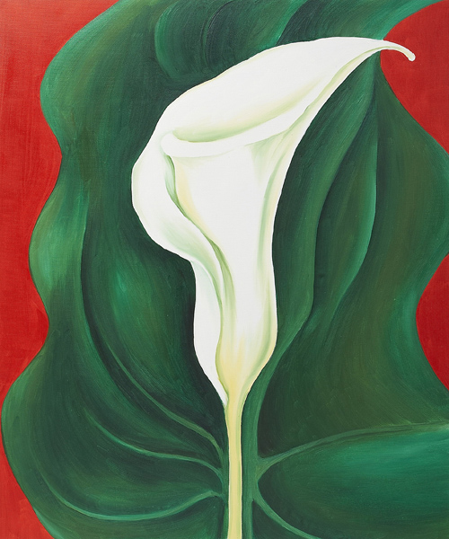
The scientific name for the Arum lily is Zantedeschia !! What a mouthful ! Native to South Africa, these lilies are actually not technically types of lilies, but are commonly known as Arum Lilies or Calla Lilies. These waxy flowers grow mostly in marshy areas and are very sturdy, hardy plants, able to survive in a variety of soils and habitats. The Arums come in shades of white / cream and light pink whereas the Callas are mostly orange shades. These plants are actually regarded as weeds through much of the world. Georgia O'Keeffe was most famous for using the Arum lily as a subject matter for many of her most famous paintings (see below). As the Arum lily is said to resemble the female genitalia, many artists have used this theme to represent female sexuality. Another famous series of paintings using the Arum lily as the main motif is Diego Rivera's Flower vendor series painted in 1935 (above right). My painting of the Arum Lily (above left, 2004) was heavily influenced by Georgia O'Keeffe's style. It is one of my earliest paintings and sold a few years ago. I was drawn to the vibrant colour of the foliage more than anything else.
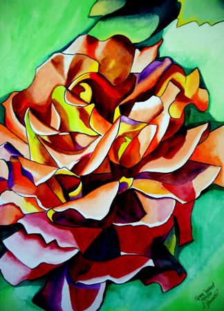
The Alpine Sunset is a type of hybrid tea rose with rounded, double petals and light peach / yellow or apricot colour flowers. It is also known to be a very fragrant rose. It generally blooms in Spring time, though I could not find a reference as to why it is named Alpine, as it does not really grow in Alpine areas. The colours of the petals I suppose resemble a sunset.
My painting of the Alpine Sunset is one of my earlier paintings. It sold a long time ago but is available as a print by clicking on the above image. I think with this one I was trying to experiment with using many colours to try to depict the shade and tone of the petals. Though the overall flower is supposed to have an apricot or peach tone, I've actually used a limited amount of orange and yellow as base colours. I wasn't all that happy with this one when I first painted it, but looking back, I can appreciate the process and what I was trying to achieve. |
AuthorSacha Grossel is a practising Visual Artist from Australia. Archive
February 2019
Categories
All
|
 RSS Feed
