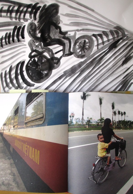
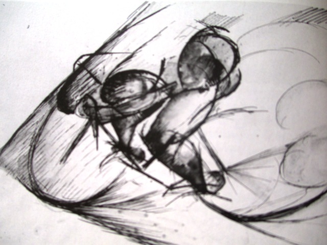
The drawing on the right is by Umberto Boccioni "Study for the dynamic force of the cyclist" (1913) and conveys the ideas of motion, power, energy and speed by the use of energetically drawn sweeping lines. It was part of the futurist movement which emphasised concepts of motion by their use of expressive line.
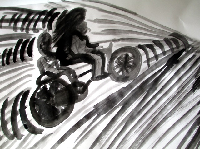
The drawings on the left are with black watercolour and brush on paper (supposed to use India Ink, but I didn't have any). I was supposed to draw a bicycle still - life, but to be honest, couldn't be bothered to drag out the kids' bikes from the garage, so just found a photo from a book to copy (promise I'll make more of an effort next time?..) Anyway.. the point was to convey the kinetic (movement) potential of the still - life non moving object by creating visual activity and movement. The goal was to explore dynamic , expressive possibilities of line and space. I tried to imagine the bike zooming by quite fast and tried to draw speed and motion - the actual riders are in shadow and not really emphasised as being important to the drawing. I think the use of line is quite dynamic and I think it conveys some sense of motion, so the goal was achieved.
0 Comments
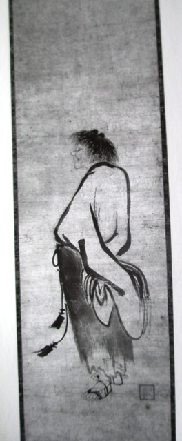
Chinese and Japanese art traditionally uses a very strong link between calligraphy (beautiful writing) and drawing. The picture on the left is by a Chinese artist Kao in the 14th Century and clearly shows the bold, expressive line used on his torso where he would have used his whole arm and wrist in a calligraphic motion. This style is all about the interactions of the drawing tool with the physical movements our hand and body makes.
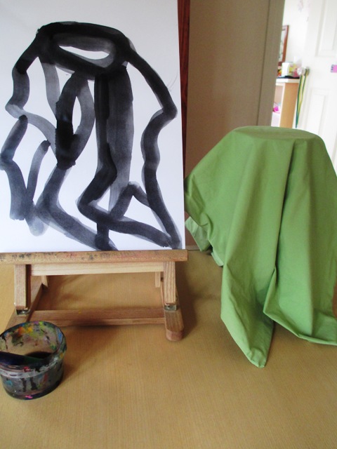
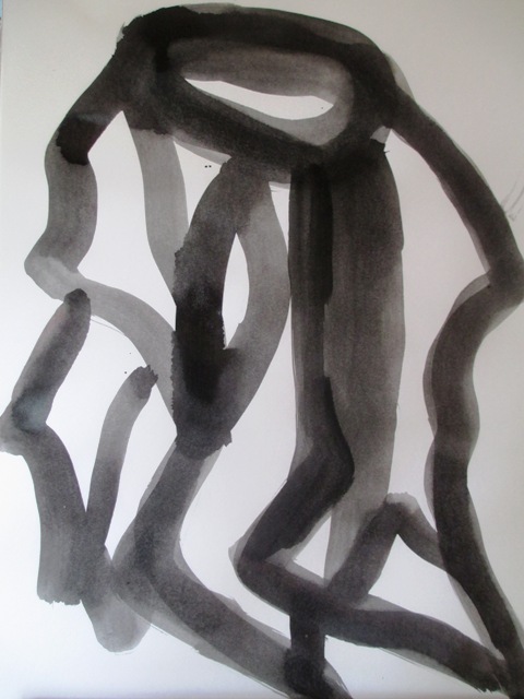
The drawings on the right are done in black watercolour with a very thick brush on heavy weight paper (was supposed to use India Ink, but didn't have any...) The painting was not to take more than about 5 minutes. I was supposed to respond with body movements to the visual movement of the drapes of the folds of the sheet. I tried to be very flowing and use my wrist and whole arm to capture the style. It would have been better to think about varying the thickness of the lines as my wrist curved. It was an interesting exercise using a style and technique I hadn't tried before... This style can be further studied and refined if you're interested in doing Ink Wash Painting.. http://en.wikipedia.org/wiki/Ink_and_wash_painting 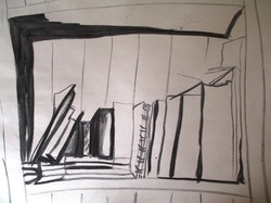 Now we're looking at how line makes visual statements that are personally expressive. The next few exercises are to practise some different line qualities in different styles. The drawing on the left of a shelf of my bookcase is a practice of tonal variations using charcoal on paper. The aim was to analyse and exaggerate the difference between the light and dark areas to heighten the visual effect and to create a mood.
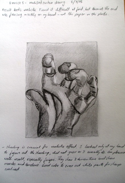
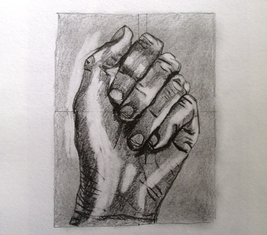
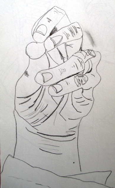
The two drawing on the left are exercises I did a few years ago using a picture plane from Betty Edwards' Drawings on the Right Side of the Brain. They are also good examples of tonal use of line to convey three dimensionality and realism. The drawing on the right is an exercise from Keys to Drawing by Bert Dodson and was drawn without use of a picture plane. The point was to choose an unusual end view of the fingertips and stress accurate detail using line only. It was to practise drawing what you see and observe rather than what you know and trying to ignore the logical part of the brain which keeps trying to tell you what a hand should look like. Drawing a range of everyday object from unconventional or unusual points of view is good practice to improve your artist eye...
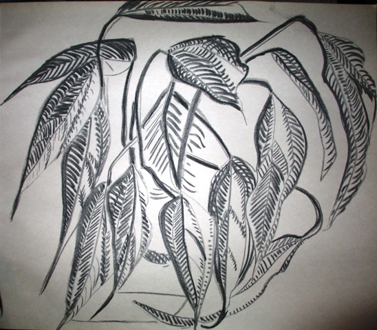
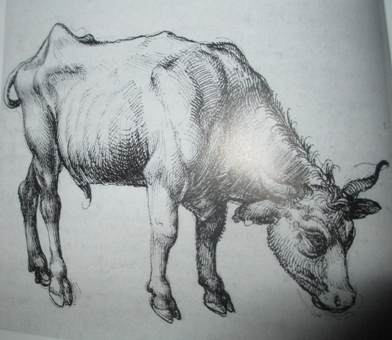
So, now we're up to cross contour line techniques where we are recording information not just of the outer dimensions of subjects, but of the inner dimensions of the three dimensional form. The point is to follow the contours of the form from the edge inwards by drawing lines through and across the form. A good example of this technique is found in the right hand picture of Albrecht Durer's "Young Steer" (1495) drawing where you can clearly see the brilliance of his line work as he follows the muscles and skeleton of the animal with very detailed cross contour lines to describe the 3D form. It really is meticulous and brilliant. I have a lot of time for good old Albrecht ! 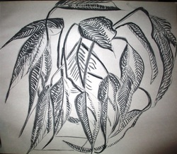 This is my attempt at a cross contour line drawing of my peace lily plant in charcoal. The aim was to use parallel line to follow the vertical and horizontal contours of the plant, indicating shadow by drawing the lines close together and leaving areas blank to indicate highlights. I think it would have been better if I'd used a bit more variety in the line to indicate the tonal aspect more definitely and clearly... but it was late...and I was tired.... To do a good job with this topic, I think it's best to be able to take your time and not be rushed or tired.
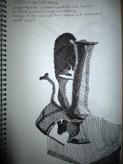
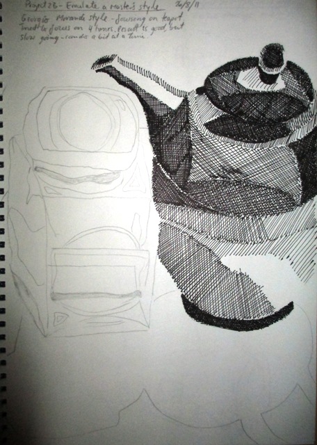
These exercises were from a few years ago from Bert Dodson's Keys to drawing book. They explore a technique called hatching where tone is produced by a series of short parallel strokes and crosshatching where lines are drawn over top at right angles. It's a very methodical method of drawing and is very controlled and takes hours to complete small sections. These were done with a fine tipped felt pen. The one on the left is a copy of a small section of Georgio Morandi's Still life (1933). On the right is my teapot. Only four tones are used - light, middle light, middle dark and dark. I enjoyed doing this exercise and didn't mind the tedious aspect too much. My natural style and inclination is probably more controlled than spontaneous..
|
AuthorSacha Grossel is a practising Visual Artist from Australia. Archive
February 2019
Categories
All
|
 RSS Feed
