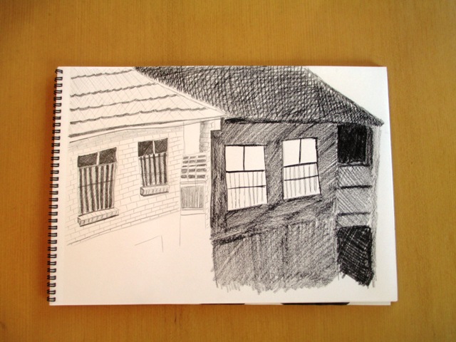
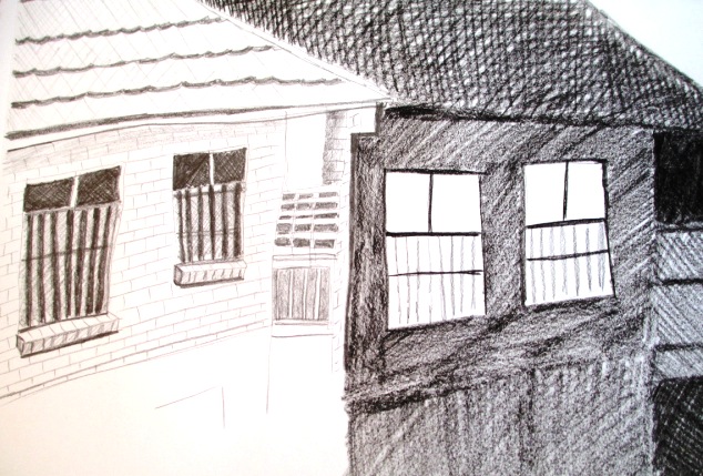
This is the last section dealing with value or tone, and it ends with a study of Rene Magritte's drawing "The Thought Which Sees" (1965) - you can view this drawing on the right. Magritte creates this drawing to confound normal perceptions of day and night / light and dark. It's quite a symbolic use of value and creates a dreamlike impression of day and night. So the project this week was to create a drawing which uses value to create mood and expressiveness created by juxtaposing light and dark. An example of this was suggested to draw a cityscape or landscape by day and the same scene by night. I've chosen to draw my neighbour's house in the daytime and draw the same house as it appears at night time. You can see the value reversals clearly in the way value is used for the window lighting in both scenes. Another option would have been to draw the same house, half in daytime lighting and half as a night scene. Almost half way through the Creative Drawing course (Howard J. Smagula) now ! Not sure if it's actually improving my technical ability much, but the projects are mostly interesting and do encourage me to reflect more deeply on different drawing concepts...
0 Comments
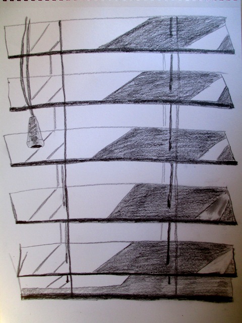
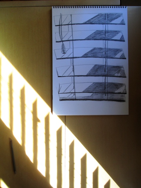
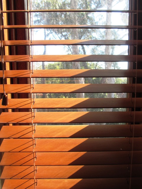
This week we're looking at repetitive shapes that range in tone from white to black - or pattern. The project this week was pretty simple and straightforward. I was supposed to look for patterns created by the interaction of light on three dimensional surfaces.. Examples of this would be light filtering through the blinds (above) or even a macro view of the texture of a wall with the play of light and dark. That also sounded interesting to me, but I found a good example of the light pattern on the blinds, so I thought I would draw that and find the pattern that the light was creating.
An interesting exercise to consider the everyday surfaces around your house and examine them closely to find interesting patterns. There are many interesting inspirations for future drawings when you view your immediate environment in this way. I enjoyed this weeks task !
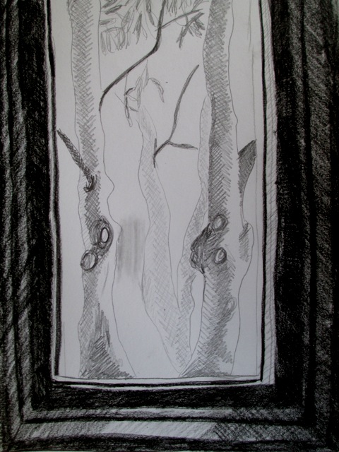
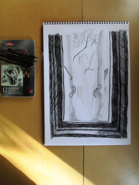
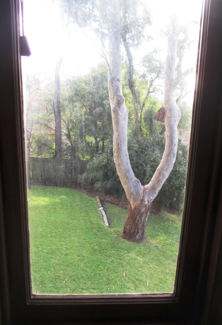
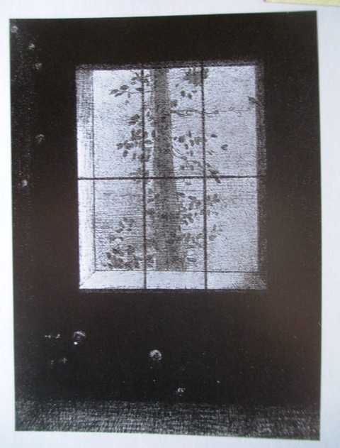
This week, the brief was to observe the difference between outdoor lighting, which is strong and direct and creates strong contrasts between highlights and shadows on sunny days, and indoor lighting which is softer and more diffused. Because of the difference in light between these two spaces, value contrasts are emphasised to create the desired effect. The project then, was to explore these value contrasts of interior and exterior light. I needed to find an area in my house where light from a window creates an interesting visual effect. I took inspiration from Odilon Redon's "The Day" lithograph (1891), as seen below right, where he leads the viewer out the window to focus on the outdoor scene. The light of the interior window pane is dark and diffused, whereas outdoor, it is bright with shadows on the trees. I've drawn the large gum tree outside my sunroom window. I used graphic pencils on paper. I'm quite happy with the drawing. I wanted to keep the background shrubbery out of the drawing to give it a more sparse feel similar to Redon's picture to emphasise the contrast very clearly.
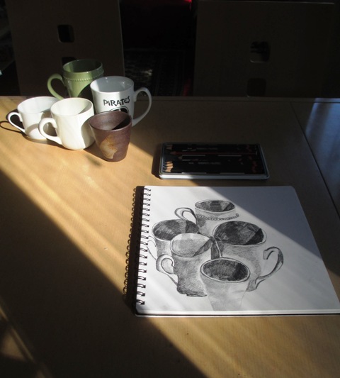
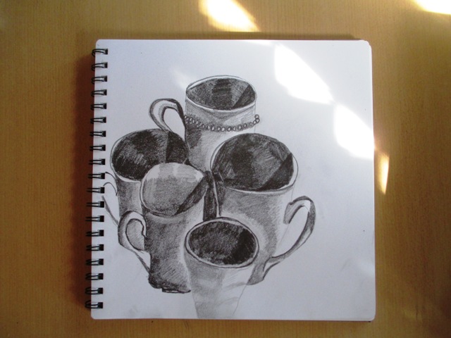
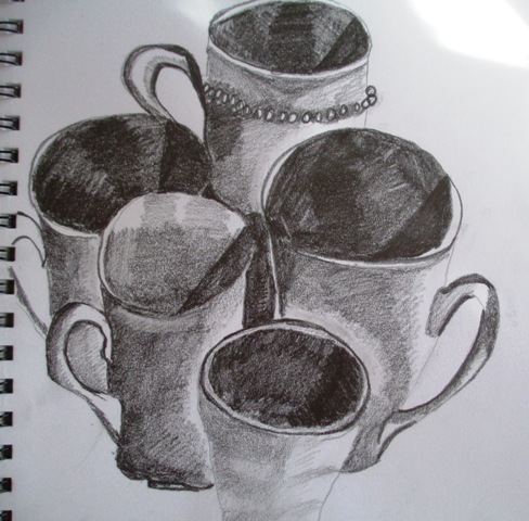
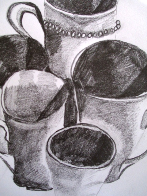
Last week I explored how value or tone can create mood, this week, the next part of the chapter is how value defines the form or space by juxtaposing the light and dark tones to establish the position of the forms. In this activity, care needed to be taken about the placement of the dark and light tones to indicate the position of the form, In this case the cups. The first step was to note how the light and dark areas created by the lighting allow us to see the cups as three dimensional forms. Then care had to be taken about placing light tones next to dark tones to create the position of the cups in front of one another., thus showing the spatial relationships between the five cups. It was actually quite an analytical exercise which I enjoyed...
This week, the concept is that since light plays such an important role in governing our moods and perceptions, so value or tone is the primary means by which artists create moods and evoke feelings.
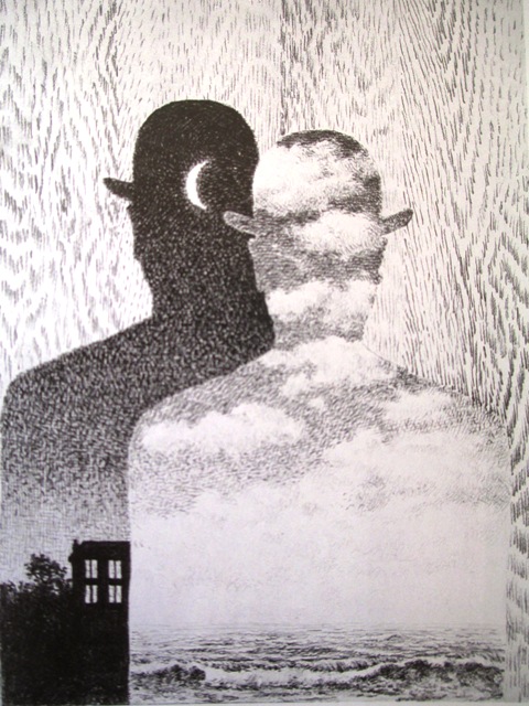
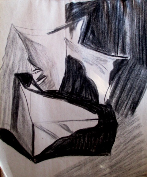
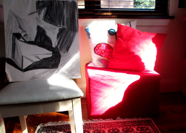
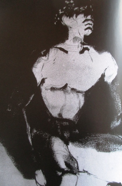
The task this week was to explore the way light affects our psychological perceptions. A good example of this is given on the right of a drawing by T.C Stevenson who created some special lighting conditions to manipulate the visual effects of value to create this particular moody, atmospheric portrait The idea this week was to observe the way light falls in your home and if you come across a particular effect that interests you, try to explore the possibilities of mood creation through emphasising the tonal relationships. A typically vague assignment from Smagula with no clear instructions. This was, I suppose an opportunity to set up some staged lighting effects with lamps in dark rooms etc... but instead I found some interesting shadow patterns that I tried to draw to create a moody, mysterious room atmosphere. The results are somewhat successful in parts, though I feel I could have taken it further with more thought... |
AuthorSacha Grossel is a practising Visual Artist from Australia. Archive
February 2019
Categories
All
|
 RSS Feed
