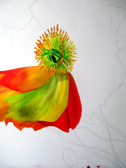
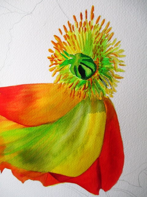
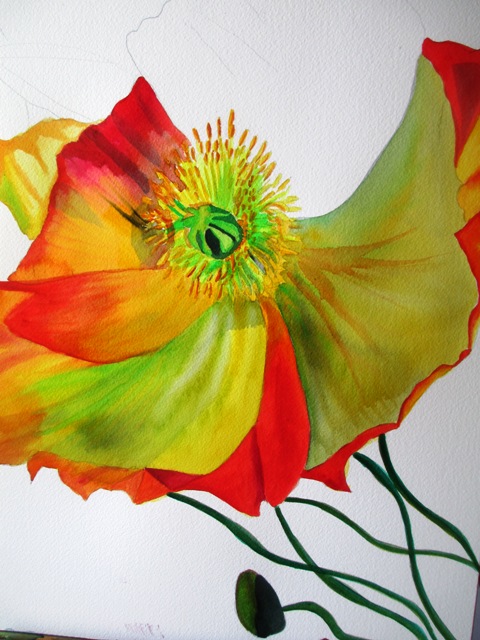
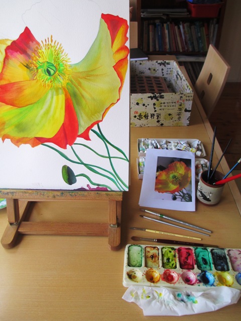
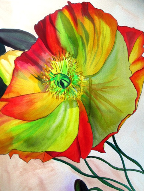
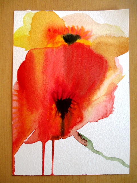
Poppies are one of my favourite flowers - I really love the texture of their petals - the papery quality and the bright colours of the petals. I also love how that is contrasted with the spindly stalks in dull green.. As I really liked how my previous poppy painting turned out, I decided to paint a close up version, focusing more on the petal texture. I used a reference photo that I had taken a few months ago of a bunch of poppies that I'd bought from the florist. The first step was to decide on the composition and roughly draw a pencil sketch of the outline of the flower. I usually like to start with the middle, more detailed section of a flower, using a small brush for the detail work. I then turned my attention to the beautiful papery petals. As I needed a translucent quality with various colours showing through, the colours needed to be layered carefully. Lemon yellow and spectrum yellow (Art spectrum brand paints) were the base colours, with overlays of Australian leaf green, Australian red gold and Spectrum red. The base colours needed to be almost fully dry before the outer colours were applied on top. It was important that certain sections dried fully before the next petal could be painted so as to avoid the colours blending into each other. Textural effects were created by using a small brush to lift paint in some areas (using water) and to create the veins or lines in other areas of the petals. The spindly green stalks were painted in layers of Australian dark leaf green and Pthalo green with Flinders red violet highlights. The background has been kept as a light beige / neutral colour so as to not draw attention from the feature attraction. I'm happy with how it has turned out - I really like the colours !
0 Comments
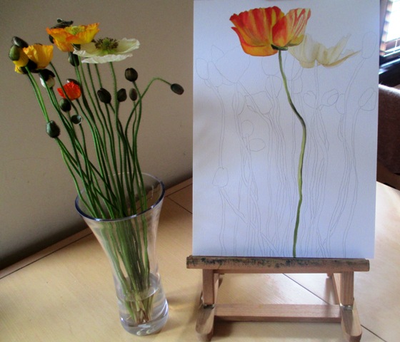
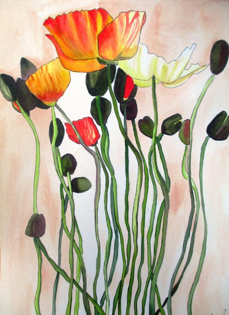
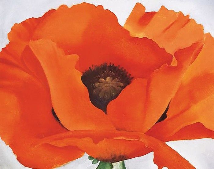
Poppies are short lived perennial plants. The petals are crumpled in the bud and as blooming finishes, they lie flat before falling away. The petals are showy and may be of any colour. They are generally in bloom in late Spring or early Summer. The symbolism of the poppy has long been used as that of sleep, peace and death. Sleep because the opium extracted from some varieties is a sedative and death because of the blood red colour of the red poppy. This sleep / death symbolism is evoked in the famous novel "The Wizard of Oz." The symbol of the poppy is also used for wartime remembrance. In many countries around the world, artificial poppies are worn to commemorate those who died in war. Poppies are actually one of my all time favourite flowers. I really love the delicate papery, crumpled translucent quality of the petals. I'm really interested in trying to evoke this translucence with watercolours. I also love the long spindly stems and how they explode in a pop of colour at the top of these long spindly stems when they bloom. I could gaze at these flowers for hours and find every detail about them fascinating. Above left is a recent painting I have completed of a bunch of colourful poppies I bought from the shop. Above right is a old painting I completed quite a few years ago of a Himalayan poppy. The original sold a long time ago, but unfortunately I didn't take a high resolution photo of it, so it will never be available in print form. Below left is a red poppy that I painted in a more freer, spontaneous style, trying to capture the essence of the flower. This one is available as a print by clicking on the photo. Below right is one of Georgia O'Keefe's most famous paintings of a Red Poppy (1927). It is a perfect example of the macro modernist style for which she became most famous.
|
AuthorSacha Grossel is a practising Visual Artist from Australia. Archive
February 2019
Categories
All
|
 RSS Feed
