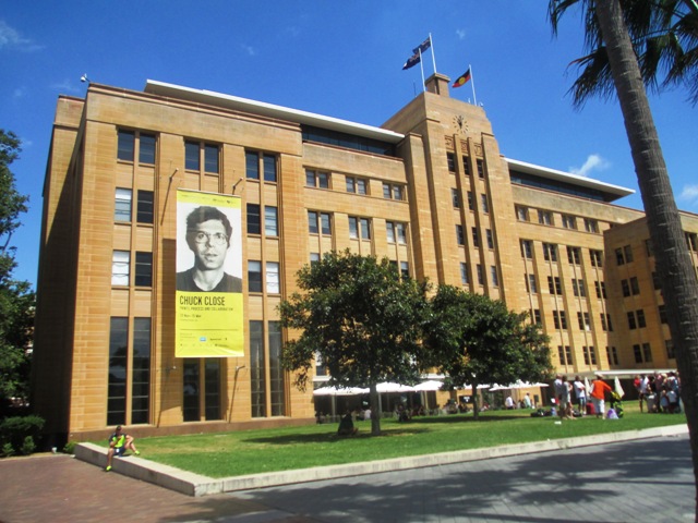
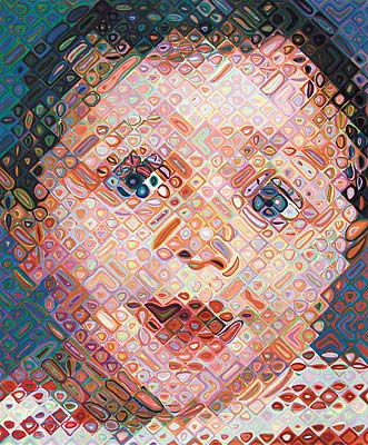
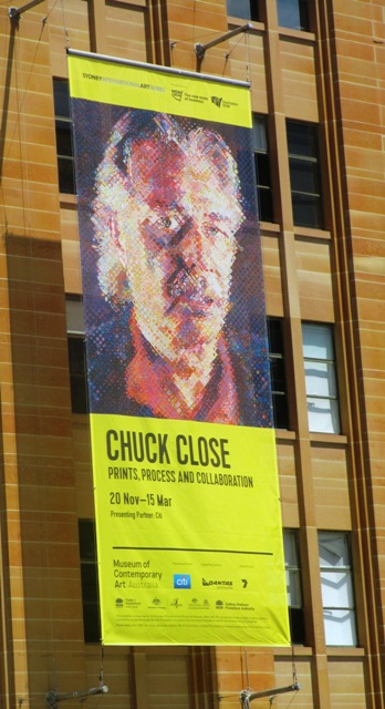
I was really only familiar with American Chuck Close's large photorealism airbrushed portraits, such as the famous one titled "Bob" which has been used on the banner to advertise this exhibition (above left). I wasn't expecting to be quite so enthralled and blown away by the genius of this artist's explorations of portraiture. The exhibition of his large scale photo based portrait paintings is currently being held at the Museum of Contemporary Art in Sydney. It's a great venue for modern art - large rooms, high ceilings - perfect for large paintings and installations. I took my kids along, as I thought that the theme of portraits might be fairly accessible for them, and they actually got a lot out of the exhibition and really enjoyed the "kids corner" activities related to Chuck Close's work. They spent ages in there drawing their own grid style self portraits and adding them to the kid's gallery. What I learnt was that although the theme of photo based portraits has not changed, Close's exploration of various techniques to produce these portraits has been very innovative and experimental over the years.
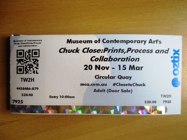
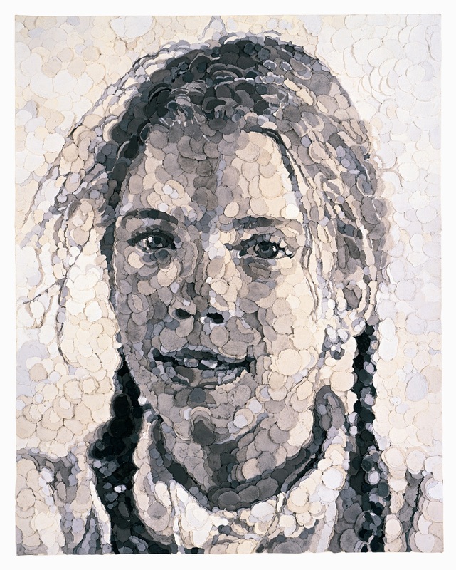
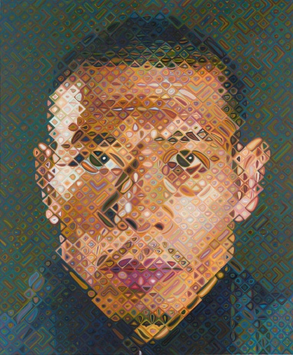
Various drawing and painting techniques that he has used over the years to create these portraits have included: ink, graphite, pastel, airbrush, watercolour, conte, finger painting, stamp pad ink, printmaking, etching, lino and woodcuts, silk screen, hand made paper collage, rags, tapestries.. Above left is an example of collage work made from left over rag pulp squeezed into round discs in various shades of grey. The best part of the exhibition was detailed descriptions and examples of his technique of using gridded photographs and applying shades of colour or greyscale one stroke after another methodically in the grid cell by cell. There was also a lot of technical descriptions and examples of his printmaking process and examples of his portraits in various stages of completion. I found it really fascinating ! Below you can see a close up of each cell of the portrait - just abstract shapes, but from a distance, the whole portrait is recognisable - really genius and amazing ! I thoroughly recommend this exhibition of Chuck Close for people of all ages including kids. I found it fascinating ! 5 stars ! On at the MCA Sydney until March 2015 http://www.mca.com.au/exhibition/chuck-close-prints-process-and-collaboration/ 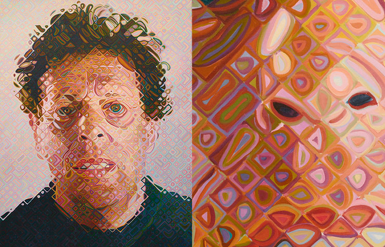
0 Comments
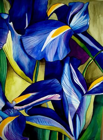
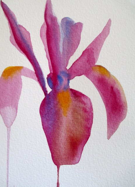
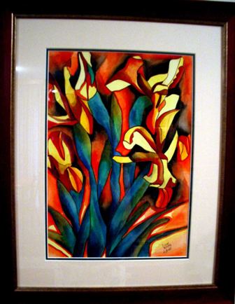
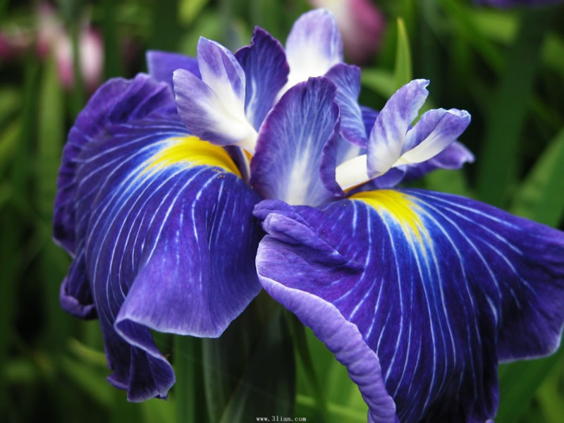
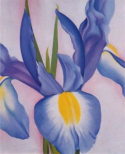
As we've approached Summertime in Australia, it's time to focus on those flowers that bloom during this warm to hot season. The Iris is a species of flowering plant with showy flowers in a variety of colours. It's named after the Greek word for rainbow. These are popular garden flowers, the most popular being the bearded Iris, which blooms primarily in the Summer months. The Iris is found natively in the Northern hemisphere zones, mostly in Eurasia and Asian countries. They are predominantly found in dry areas. I've painted a few artworks of this beautiful and popular flower. The two on the left were painted from photos and the originals have sold. The Blue Iris on the left is actually one of my favourite paintings that I've done. The framed one on the right currently hangs in my dining room - is not for sale at the present time - and was painted from a bunch of Irises in a vase. Prints of these artworks are available here and here.
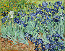
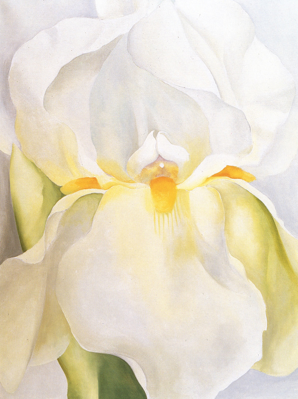
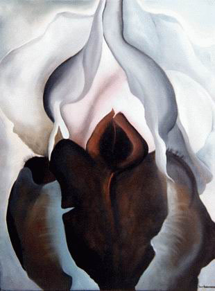
The Iris has been a popular subject for famous painters and artists over the years. Vincent Van Gough painted this artwork of a field of "Irises" in 1889 above on the right. Georgia O'Keeffe also painted a number of Irises, mostly in the 1950s. Below are three of her Iris paintings - "White Iris no.7", "Black Iris" and "Lavender Iris"
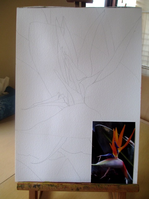
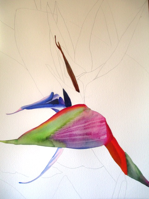
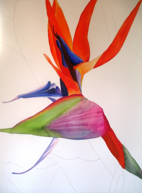
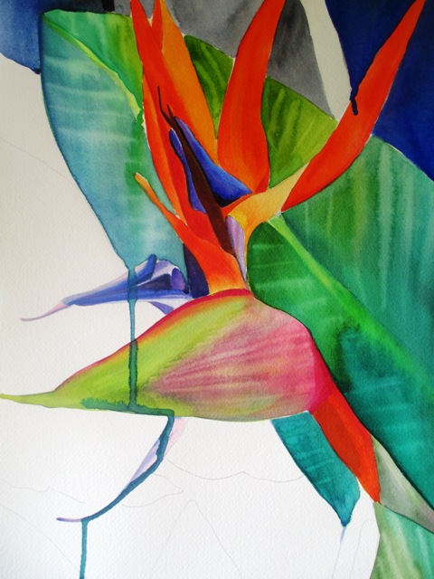
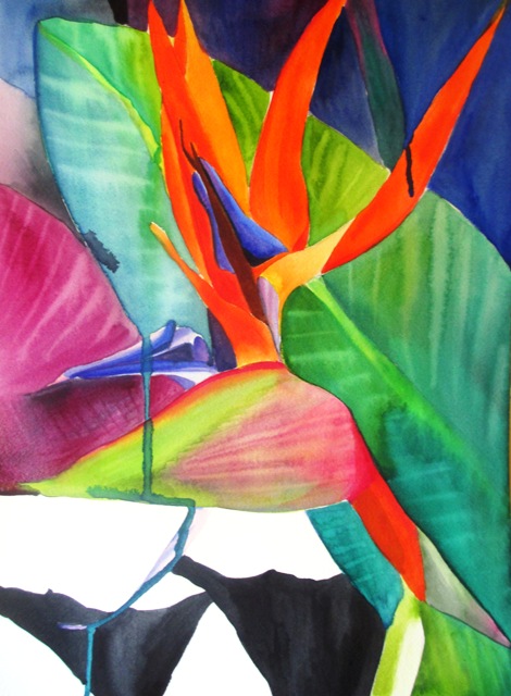
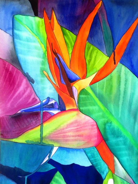
The source photo for this painting was a photo I took of this striking flower in my backyard a couple of years ago. I'd always meant to get around to painting it, but kept getting side tracked by other projects. The official name for this flower is a Strelitzia. The first step was to do a pencil sketch of the outline of the distinctive shapes that make this flower seem bird like. The orange and blue parts of the petals needed to be very bright and striking, as it is in real life - the type of flower that really needs to stand out and be noticed ! It didn't take long to paint the main central flower, but in this painting, the negative space, or background was also quite important, as it actually takes up about half of the space on the page. The actual photo has a dark, dull green background, but I preferred to bring out more blues and purples as well as the main green leaf, as I thought the blue would really make the orange stand out vividly. The shade of bright electric blue in the background gives it a more surreal quality and I think makes the painting look more flat or abstract, as the background is almost as bright as the foreground - almost like a stained glass art painting. I painted the background in segments, which is what a glass painter would presumably do.
|
AuthorSacha Grossel is a practising Visual Artist from Australia. Archive
February 2019
Categories
All
|
 RSS Feed
