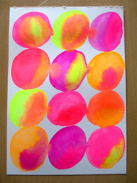
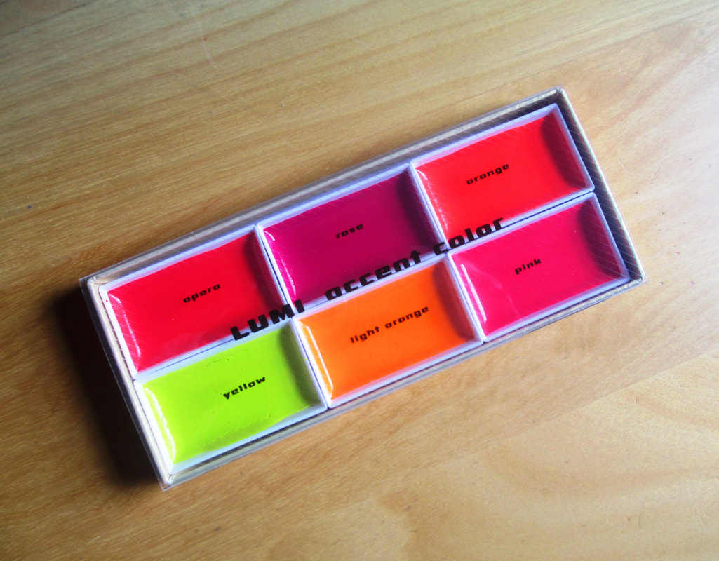
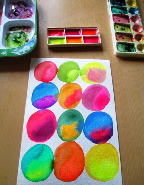
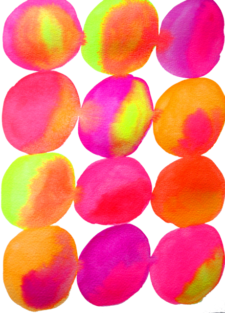
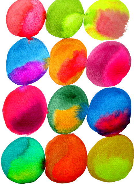
Inspired by neon colours and artists using neon paint and media, I found there are not many brands of neon watercolor paint available - the Japanese brand Kissho Gansai Lumi Accent seems to be the most widely known of neon watercolor paints. I found the paints very smooth and easy to use, sort of a creamy texture so more opaque in their use. I used them by themselves in one painting and together with my other non luminous paint in the other. They are really really neon, so not subtle - but I love the colours !! They will be great for highlights and for some illustration work for my design store juicyhues I would have loved a blue or green colour on the palette. That would be perfect. Also I'm not sure how lightfast the neon will be. There is a good chance it may fade over time. Will be interesting to see if it lasts. Am seriously thinking of getting the box set of all 72 colours to see what they're like.
0 Comments
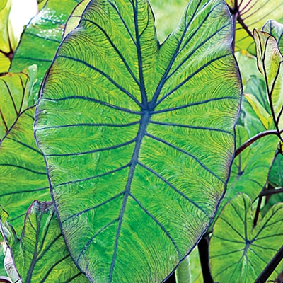
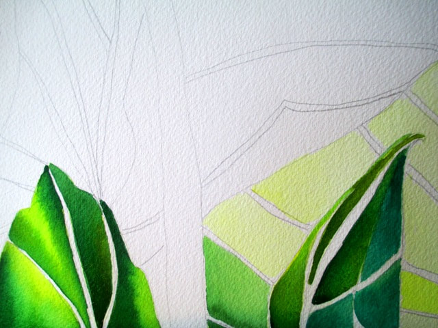
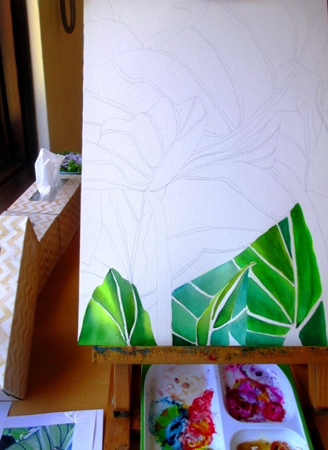
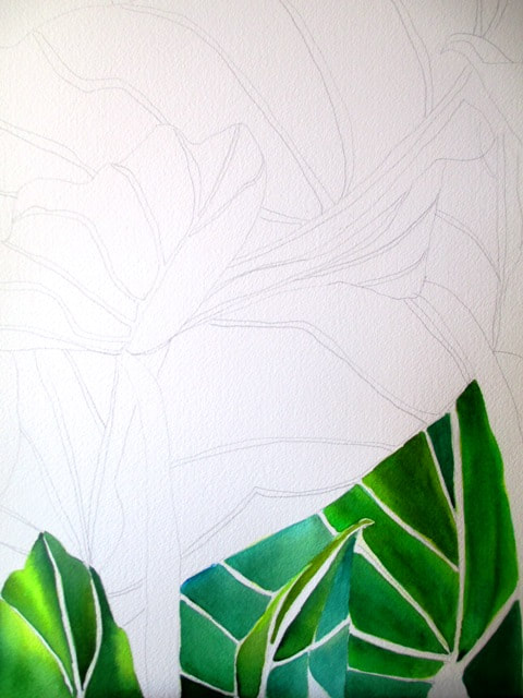
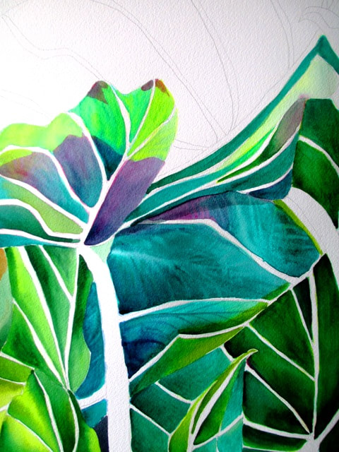
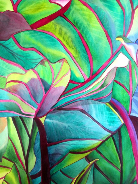
Colocasia Esculenta - or Blue Hawaii. Another name for these tropical foliage wonders are elephant ears because of their large size and shape. These leaves are truly spectacular for their lush green colour and magnificent size. What a pleasure to paint them ! Their edges and veins are typically a bluish, burgundy or cranberry purple colour and the leaves point down to the ground. native to tropical East Asian countries. I love the translucent large leaves, perfect for watercolour layers and washes. I used a variety of yellow and green shades for the different leaves and used light blue and purple /burgundy colour for some parts of the edges and veins. I am really quite happy with the outcome colour combintations. This painting original is now for sale 29x42cm unframed.
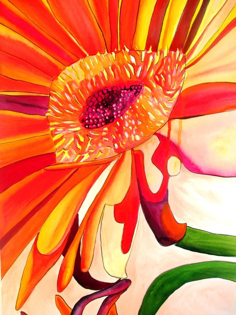
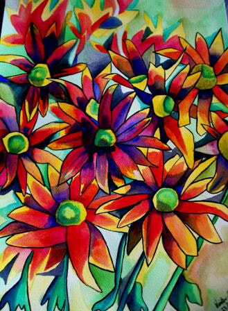
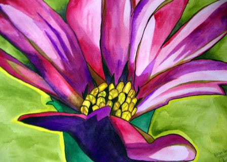
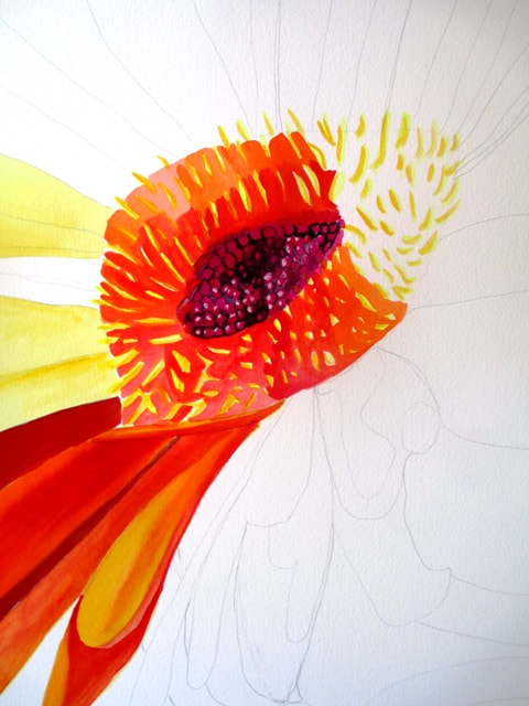
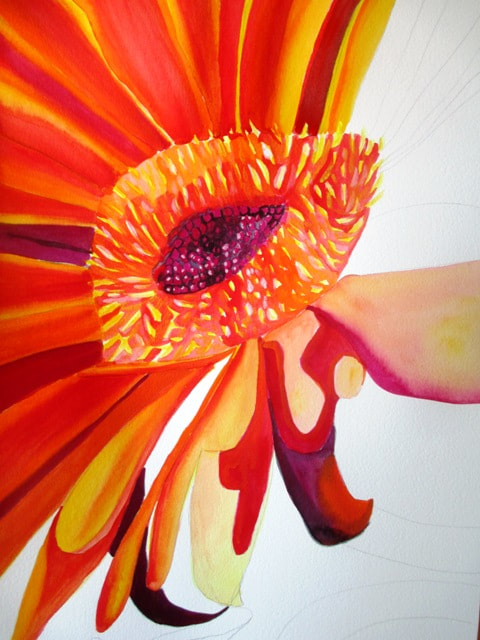
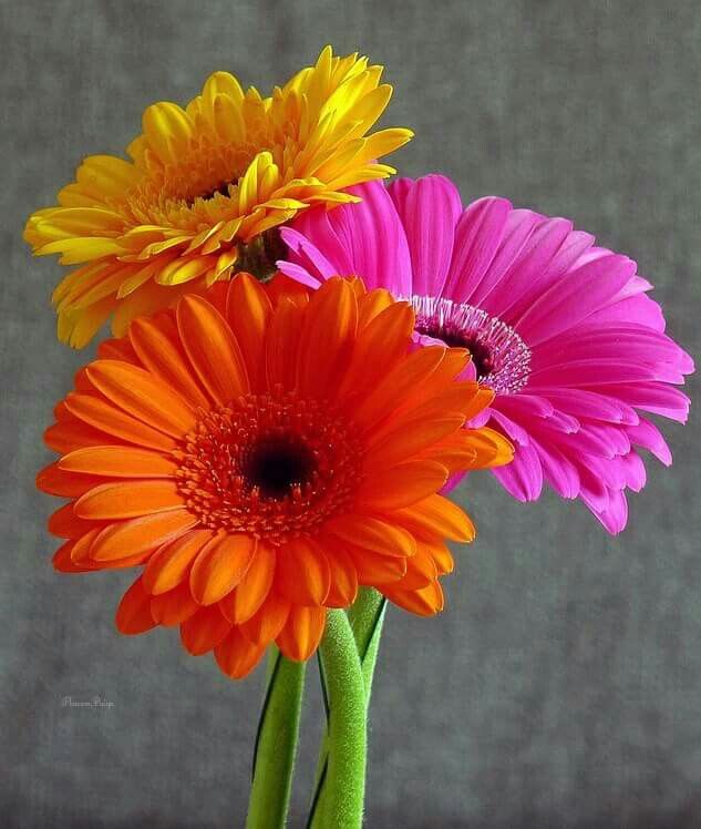
Gerberas are colourful flowers belonging to the daisy family. They are named after German botanist and doctor Traugott Gerbera. Native to tropical areas of South America, Africa and Asia, they are also commonly known as the Afican Daisy (above right is a painting of my African Daisy from about ten years ago). Gerberas are the fifth most popular cut flower in the world after the rose, carnation, chrysanthemum and tulip.
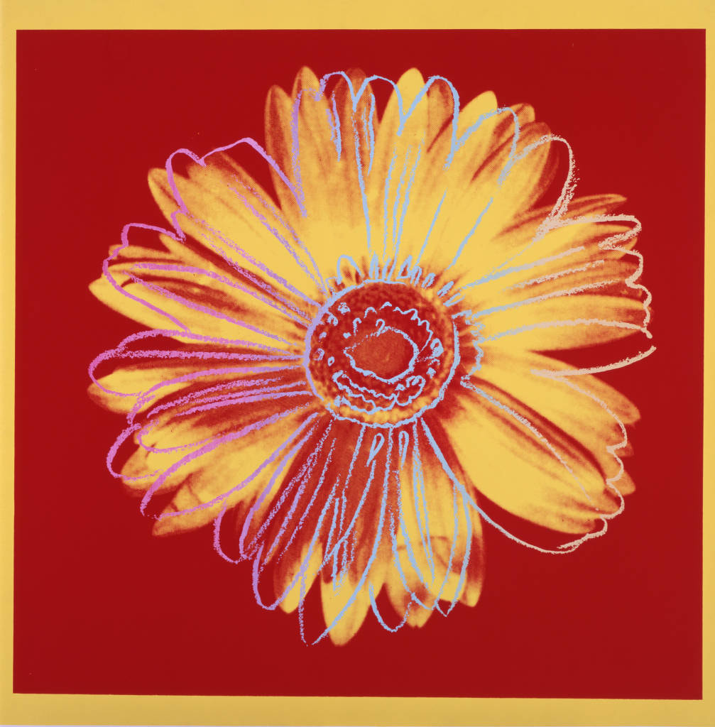
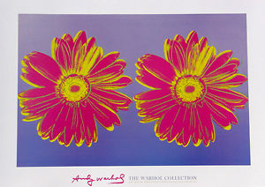
I felt like painting a Gerbera because of the bright colours. I also thought it would be an interesting perspective as a macro close focus style. I love the warm colours of red, orange and yellow which are the dominant colours with a bit of purple here and there to highlight sections. Daisies and Gerberas are such popular flowers, even my favourite artist Andy Warhol has focused on them. He did a series of Daisy art screen prints in 1982, so were some of his later artworks. I love their simple bold colours and design elements (below left). He also did a series experimenting with colours schemes and contrasts with his "Flower for Tacoma Dome" (1982) series (below right) All my daisy paintings are available as prints by clicking on the image. The Gerbera original watercolour painting is now for sale.
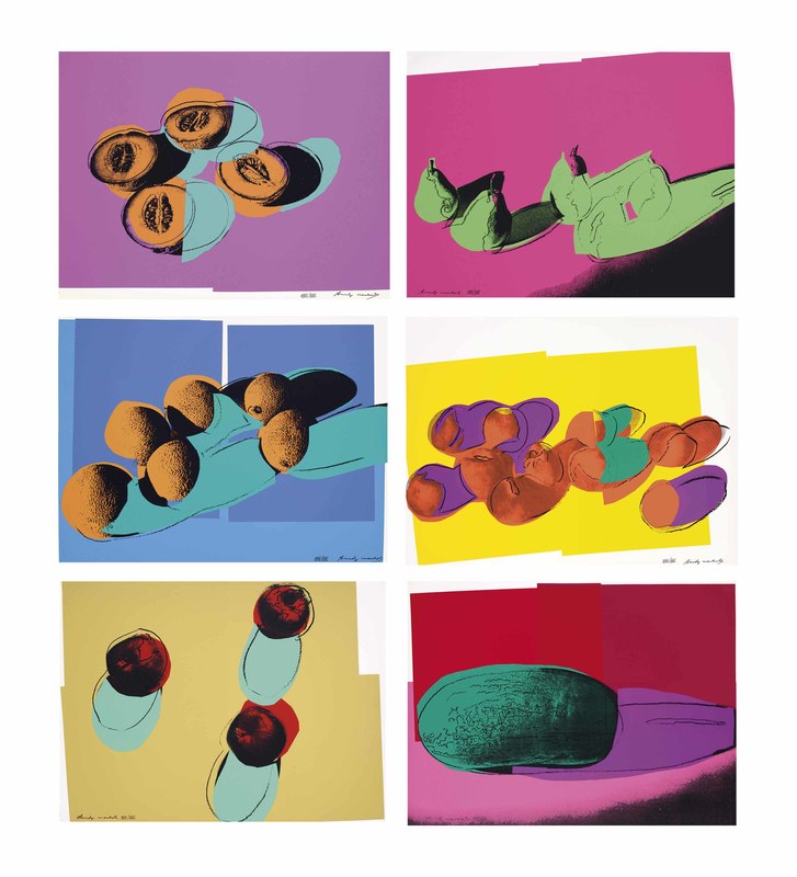
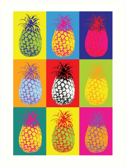
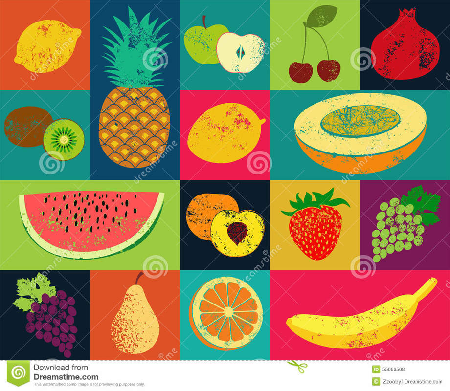
There is so much "Andy Warhol inspired" fruit art for sale on various Print on Demand Shops across the internet, that it's actually hard to decipher where the original inspiration actually came from. It's fairly easy to use a photo of any fruit and create a pop art poster print using Photoshop's "pop art" facility. Some are better than others. I like the one on the right by an online design shop called Hot Hibiscus available at Red Bubble. The above left two artworks are Andy originals from a series of screen prints called "Space Fruit" from 1979. They're pretty colourful and kind of pointless, thus summing up the pop art movement pretty well. In any case, I love the idea of using fruit as a bright and decorative design subject and have been having a lot of fun doing watercolour versions of pop art fruit slices.
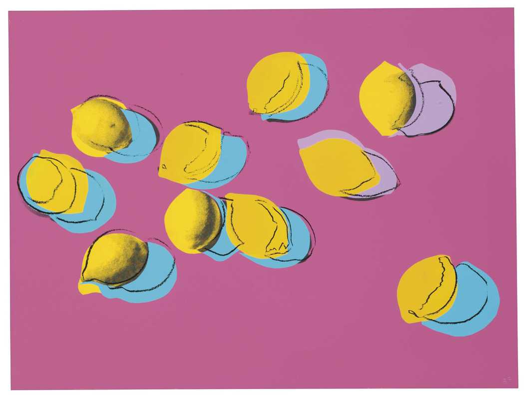
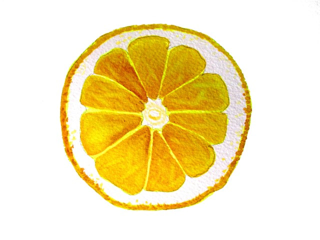
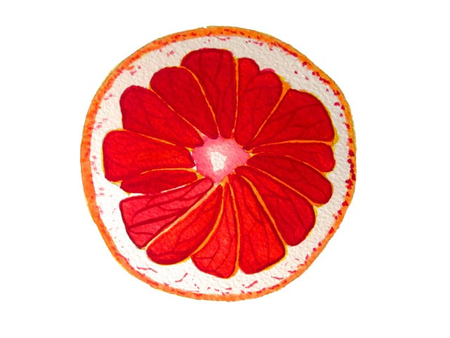
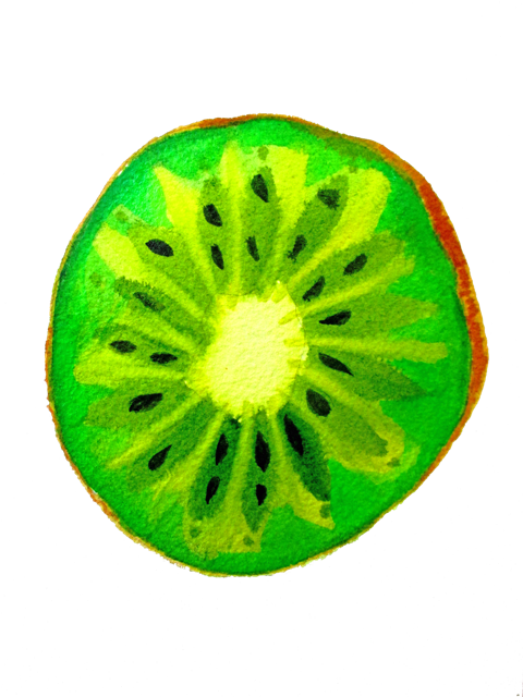
The inspiration for my fruit slice series came from some fruit photography I had seen on Pinterest that grabbed my attention. I liked the idea of being able to create some colourful decor posters and wall art that can be customised to suit interiors. Above are examples of my fruit slices and a collage of the prints I have for sale. I'm pretty happy with the way these illustrations have turned out ! They're bright and colourful and they seemed to have turned out better than I envisioned, which isn't always the case.
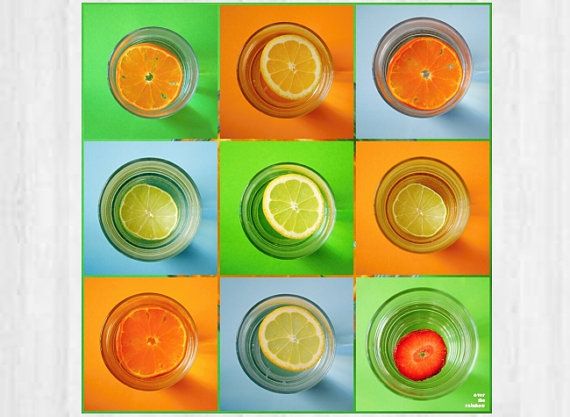
The middle image above is a photography citrus fruit collage by OvertheRainbow on Pinterest that was inspirational for my own paintings. There are hundreds of examples of similar fruit slice photography prints out there. The image on the right is royalty free stock images of retro fruit. So cool. The print market is really overly saturated with these fruity styles, but nevertheless I thought I'd add my flavour to the mix....
My original fruit art is available on a variety of different products including art prints and canvases here: JuicyHues
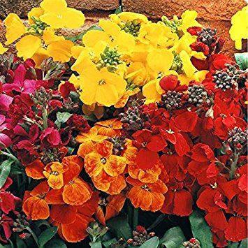
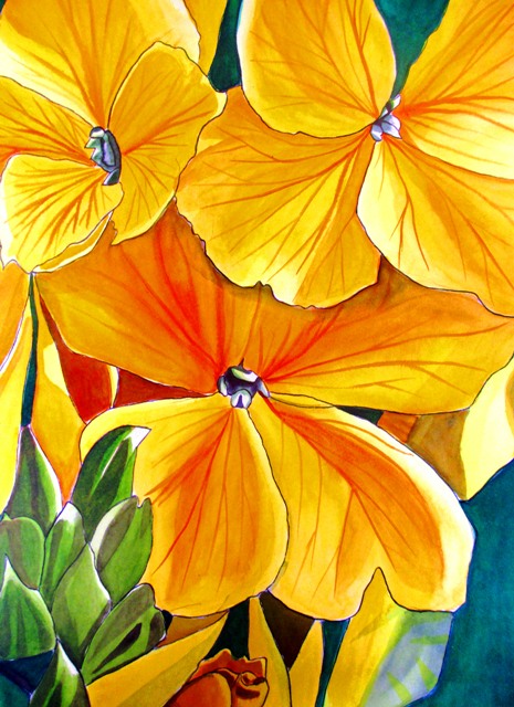
..The Erysimum species of flower, found mostly in Europe, Western Asia and North America is the subject of my latest painting. It is most commonly called the "Wallflower"
As I was painting this vibrant and brightly yellow coloured flower from a photo in an old gardening magazine, I was wondering why it is associated with shy or introverted people avoiding others at a party ? The flower is quite showy. and comes in few different brash colours such as red, orange and mauve. Well, apparently, it has more to do with the way the flower grows rather than its looks. The flower grows best leaning against a wall or in cracks in stone. The flower (and the person) literally prefers standing against a wall rather that mingling with others... This antisocial flower is for sale unframed.
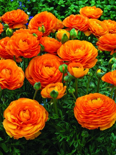
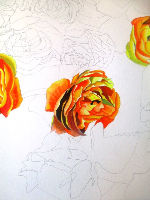
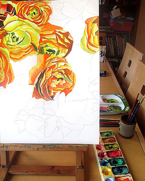
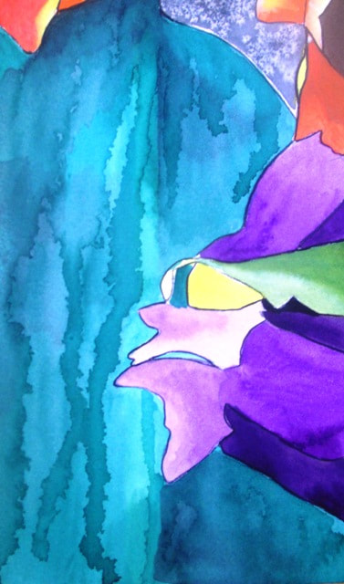
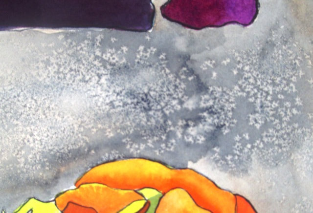
I haven't tried painting the Ranunculus flower before. Although I love the shape and variety of this colourful bulb flower, I've been a bit put off by the intricacy required for the petals. They have a LOT of petals clustered really close together. It looks magnificent, but is a bit time consuming to draw and paint. I used a photo from a gardening magazine for inspiration and tried to get a feel for the pattern shape of the petals whilst drawing, rather than copy each one exactly. I loved the bright orange colour of these particular flowers, though they do come in a wide variety of colours. The bright purple of the iris is a good contrast. The background has some effects to give texture. The bottom left corner is supposed to be a glass vase, so I thought a dripping effect might suffice for that and the middle background has a peach undertone with light grey on top which has been sprinkled with salt for a speckled effect. There's a lot going on with this painting. It feels a bit busy. In the future I think I will try the ranunculus again maybe just concentrating on a macro close up view which I think would be quite abstract and interesting.
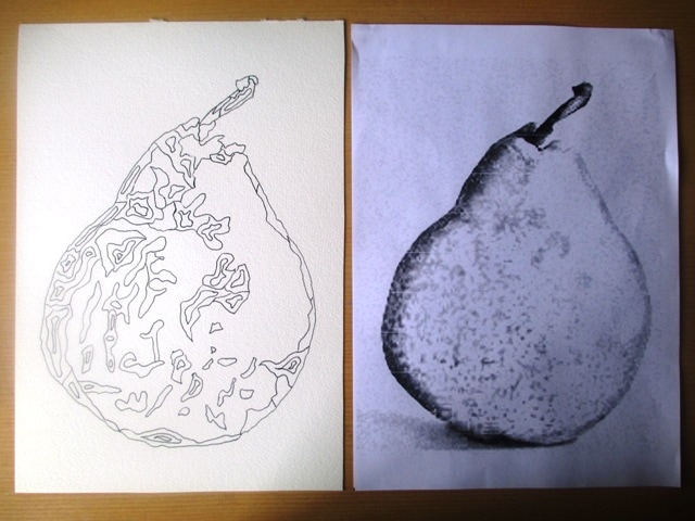
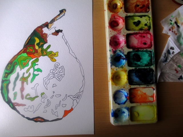
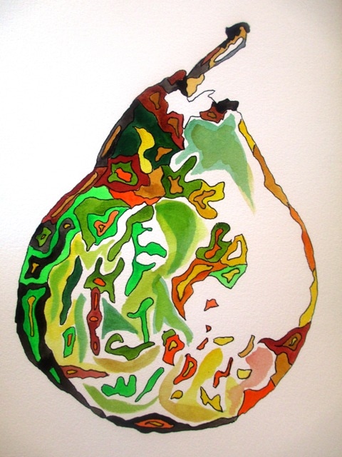
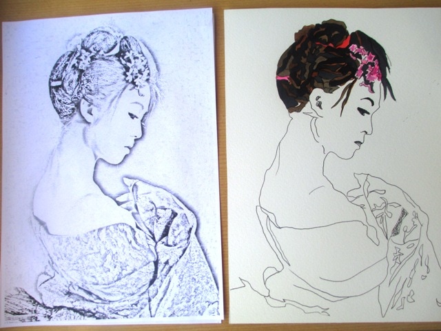
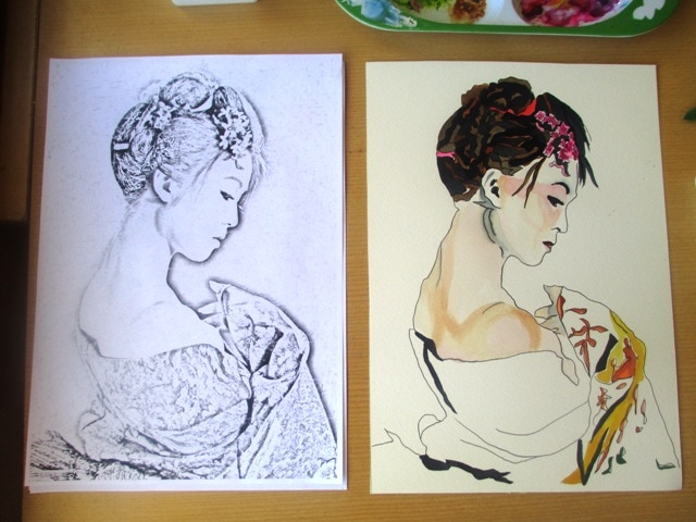
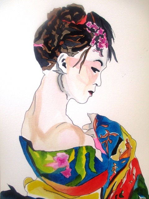
I thought I'd try out a more illustrative style, as I'd seen some examples by other artists of more fluid pen / ink, pen/watercolour types of styles. I chose a pear to start with, as I wanted something with a very simple outline shape. I used a photo of a pear and modified it with photoshop special effects to show the illustration style / outline. I then printed it and used this as a basis for the outline illustration. I used the black and white tones in the photo to guide me to the dark and light parts of the pear. I remembered doing an activity a few years ago from Bert Dodson's "Keys to Drawing" book (pg27) referring to enrichment shapes. It was more in reference to drawing glassware and vases and capturing the reflection of light, but I though it might be an interesting idea to try it with the pear to emphasise the textural and suggest the tonal quality of the pear. The shapes were hand drawn with pen and coloured with watercolour. I think it's a cute style and would like to continue to do some of these style of illustrations every now and then to practice this technique. I tried a similar approach to a more illustrative style of kimono lady. It didn't turn out quite as I wanted, but I don't have high expectations for my portrait styles in general so it was really just an experiment. My Geisha ladies are always popular sellers, so I'd like to try to improve more illustrative styles in this genre as well...
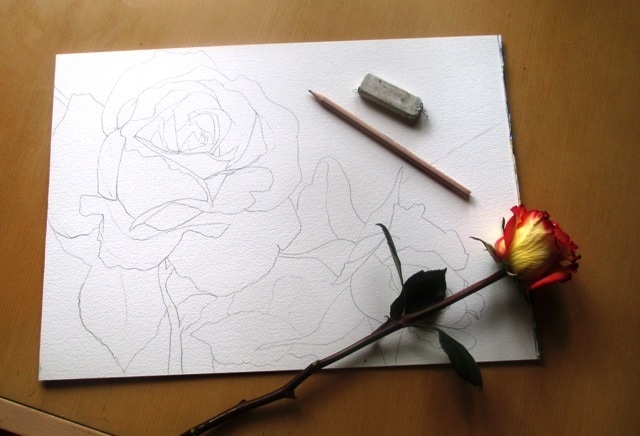
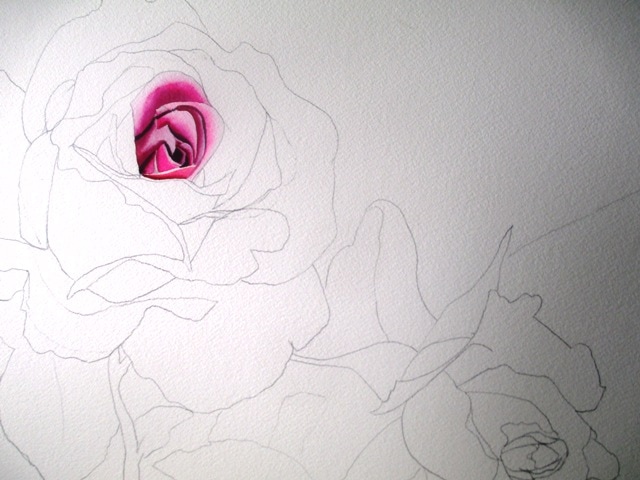
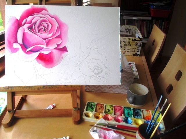
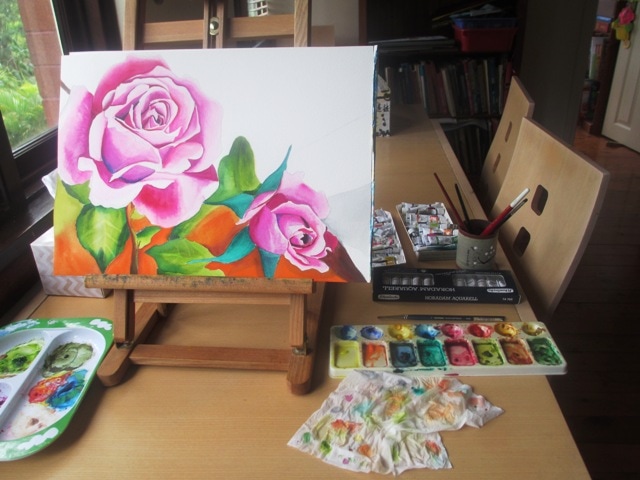
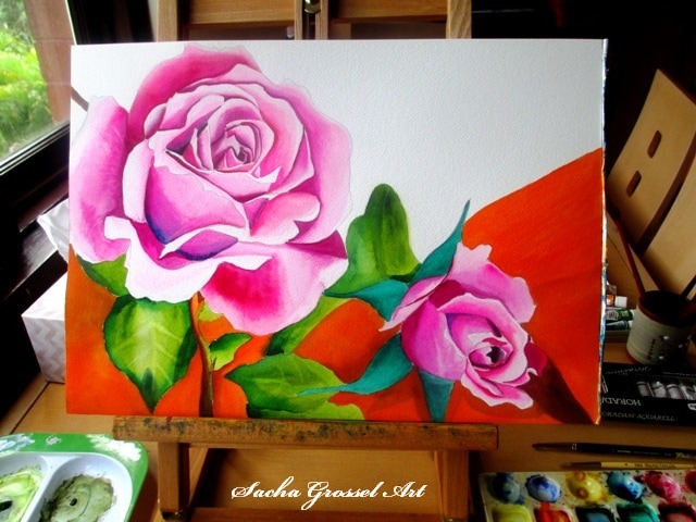
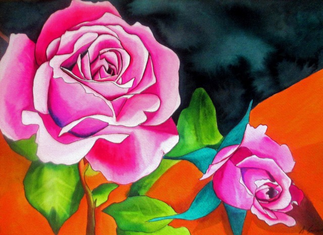
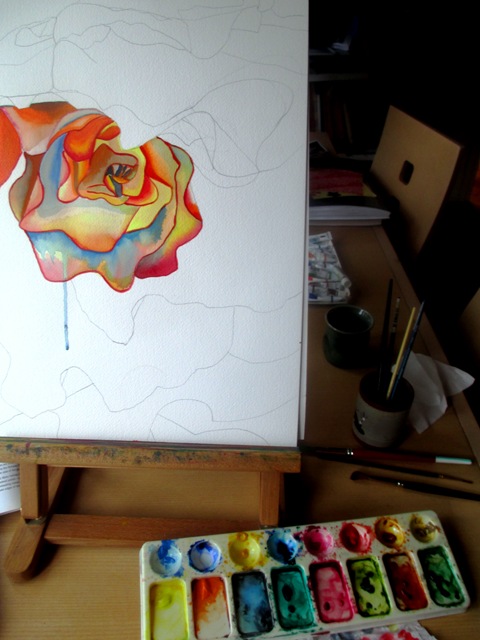
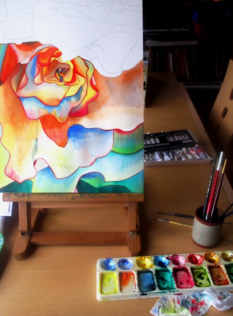
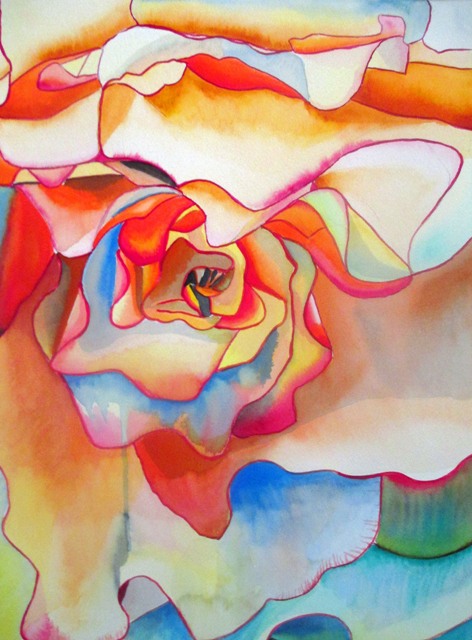
I wanted to paint another rose, as these are very popular paintings that seem to sell quite well. I found a nice composition from an old gardening magazine of two lovely pink roses that I used as a source picture. The two roses were to be the main focus and to get that really pink colour, I wanted it to look candy pink, like a fairy floss colour, a slight exaggeration of reality. The colours used to achieve the petal tones were Art Spectrum Flinders Red Violet, Spectrum crimson and Windsor and Newton Opera Rose, which is one of my favourite colours to paint with as it has a fluorescent dye in the pigment. It's hideously expensive but i love it.
After the leaves were painted (mostly Art Spectrum- Sap Green with Schmincke- permanent green olive over the top of Art Spectrum - Spectrum Yellow), I painted a small section of the background with some brown and orange. I really liked how the orange popped out and highlighted the green leaves, so I did most of the background of the bottom half of the painting in the Art Spectrum Cadmium Orange. It looks like orange sherbet and it's such a fantastic colour ! I really got carried away with it.
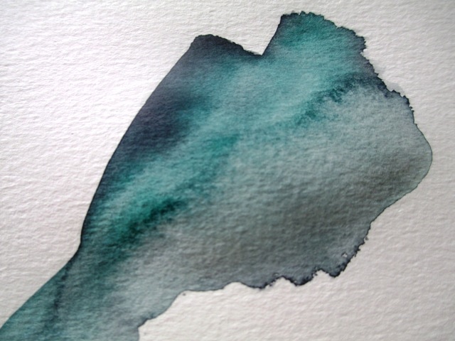
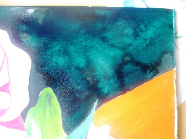
I wanted to create texture for the top right hand corner, as it was an empty space in the painting and needed something that wasn't too plain to balance the painting. The background texture was done quickly with a large paintbrush of very watery Art Spectrum Payne's Grey, quickly followed by Pthalo green over the top. While it was still very wet I squeezed a small sponge of clean water over sections of the background to create the splotchy effect. I practiced this on separate paper before I applied it to the painting to see whether it was what i wanted or not.
I'm happy with the final outcome of the painting. The colours are a bit crazy and reminds me of a lolly shop but I quite like it !
The actual Fred Martin Begonia is primarily a peachy light orange toned begonia. I've used other colours to emphasise the shadows in the tones and to try to capture the spirit and energy of the flower rather than its form in any sort of botanical realism. Well, really, I just wanted to make it more colourful ! I did try to keep and overall base feeling of peach tones.
I enjoy painting the begonias in macro style, as the petals are so large and lush they just invite you to delve in and examine them in more minute detail. The close up inspection invites an abstract quality to the lines. Begonias are really beautiful and one of my favourite species of flower.
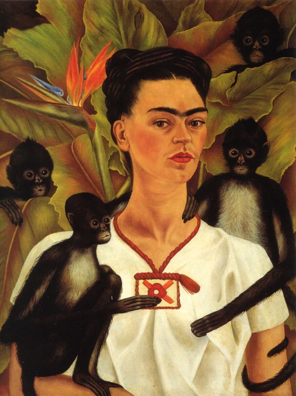
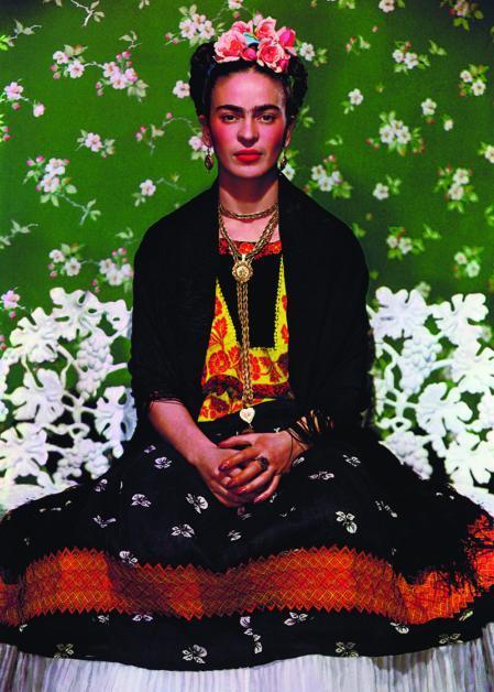
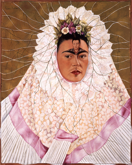
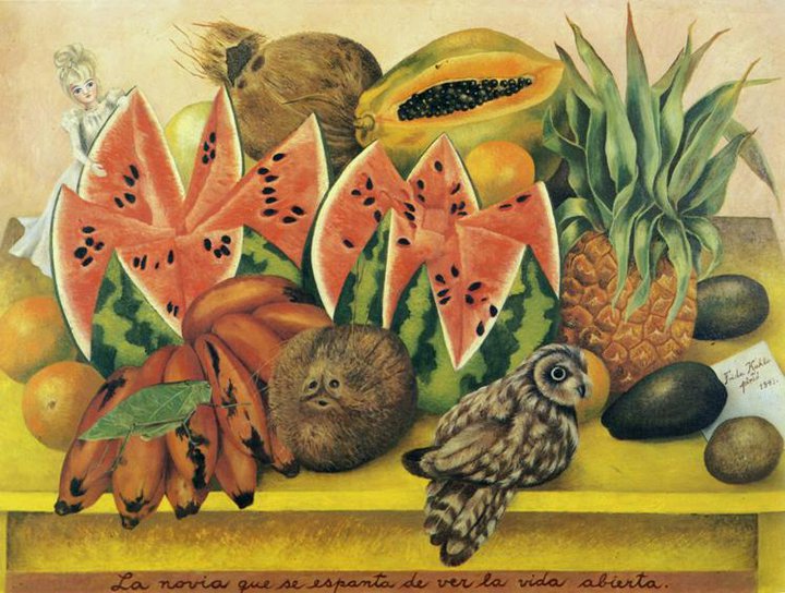
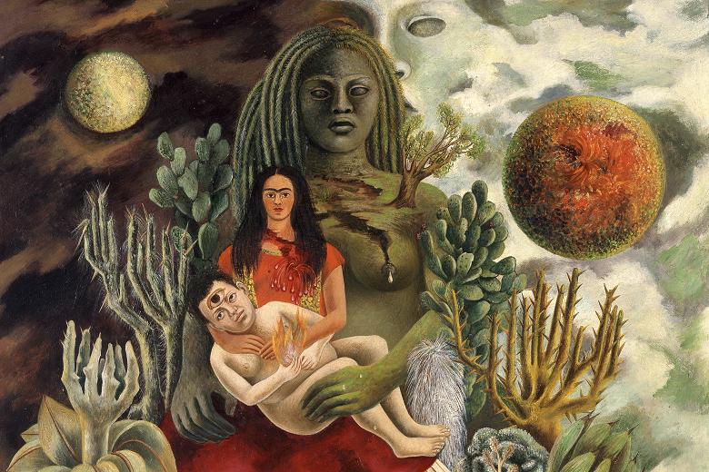
It's always exciting when Sydney gets an exhibition with works from a big name artist. This exhibition of Frida Kahlo and Diego Rivera is so popular that you need to book online in timed sessions which are mostly sold out on weekends. It was amusing to see some young ladies viewing the exhibition all dressed up as Frida with flowers in their hair and colourful clothes. I know she's a popular feminist icon, but I didn't know dressing up as her was a thing !! My friend thought it was a bit silly, as she dressed in traditional Mexican clothes to make a political statement, not for decoration... but I thought it was kind of fun to see people getting into the spirit of the exhibition ! The exhibition focus is on Frida and Diego's relationship and how their lives and relationship with one another shaped their artworks. Heavily documented is her physical and mental anguish from the effects of her earlier polio and later injuries relating to her horrific bus accident which lead to multiple surgeries and bouts of depression throughout her life. The exhibition is a mixture of a few of Kahlo's portraits, drawings, lithographs and sketches, works by Diego Rivera, photos of Kahlo, letters she wrote and video footage. The small sketches included some very moving and confronting drawings relating to her feelings about her miscarriage and pregnancy termination. The larger oil paintings she did on this topic were not included. The photos in the second half of the exhibition were also quite moving and confronting, showing her in her hospital bed with plaster corset and ending with images of her dead in her funeral casket. The actual artwork selection of her famous portraits was rather small considering the output of her works in her short life, but was curated in an interesting way to give an overview of her life as a way of understanding the themes in her artworks. Some of the artworks from the exhibition I've included here are Self Portrait with Monkeys" (1943) - probably the most famous artwork included in the exhibition. The above middle portrait is from a photo session. Above right is the first painting of the exhibition "Diego on my mind" (1943) which sets the theme of the exhibition, as an overview of her relationship with Diego. Below left is "The bride frightened at seeing life opened" (1943) which I find amusing and the bottom right "The love embrace of the universe" (1949) is the last painting in the exhibition which shows a kind of a realisation and resolution of how things are placed in her life with Diego represented as a baby that she is nurturing. This exhibition is on now at the Art Gallery of NSW.
|
AuthorSacha Grossel is a practising Visual Artist from Australia. Archive
February 2019
Categories
All
|
 RSS Feed
