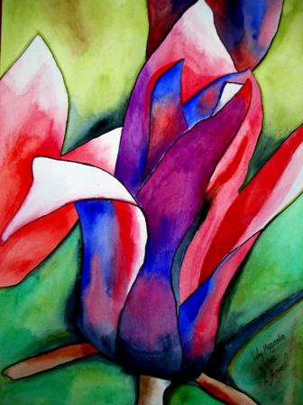
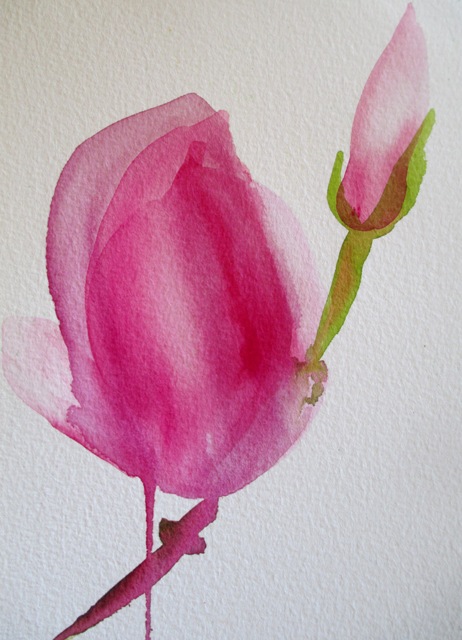
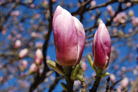
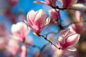
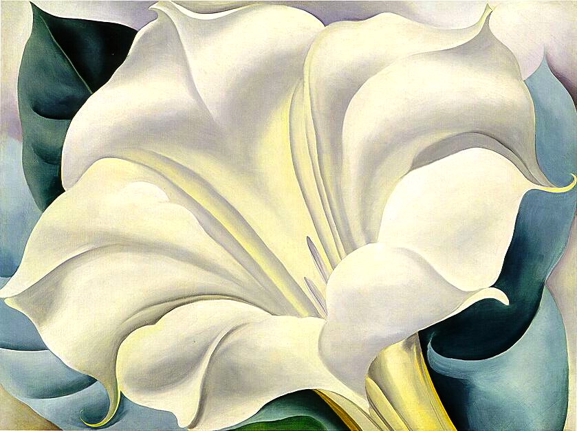
Today I thought I would start a "flower of the week" series to celebrate some beautiful seasonal blooms. As the Spring weather is warming up Sydney at the moment, I've noticed the striking Magnolia trees coming into bloom around the streets where I live, so here is the perfect Spring flower to start the series off. The Magnolia genus has about 210 flowering plant species and is named after a French botanist Pierre Magnol. This flower is native to Asia as well as North, Central and South America and the West Indies. The colours range from pinkish white to purplish white. These beautiful flowers bloom from late Winter to early Spring. The top two paintings above are my paintings of Magnolia flowers. The one on the left (2005) tries to capture the purplish colour and the one on the right (2014) is a minimalist free form depiction of the pale pink type of Magnolia with distinctive petal formation - similar to the photo on the right. http://fineartamerica.com/featured/pink-magnolia-sacha-grossel.html http://fineartamerica.com/featured/magnolia-sacha-grossel.html Below on the left is another photo showing the distinctive petal shape and colour of the Magnolia. The painting on the right is by Georgia O'Keeffe (1932) "The White Flower" showing her depiction of the Magnolia flower.
0 Comments
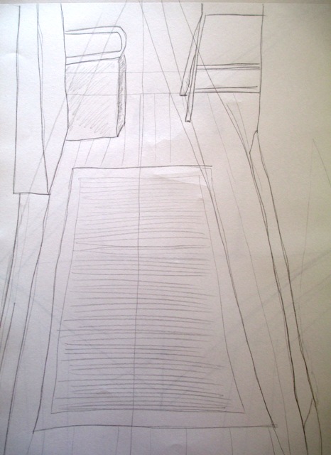
Smagula describes the study of perspective as a systematic method of determining the placement of forms in space. Basically the use of it helps convey three dimensionality on a two dimensional flat surface. It can get a bit technical, but since my aim here on this blog journey was to learn a few more technical skills, I think I can try to manage some of that !
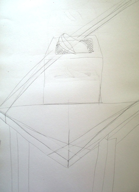
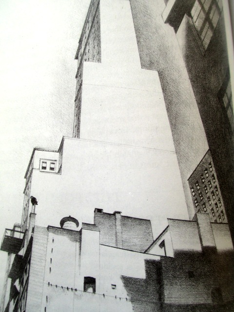
The Creative Drawing textbook by Smagula gives a good historical overview of the use of perspective and I remember learning some of this in my Fine Arts theory course at university many years ago. An important thing he mentions in terms of the technical application is that the most important element in linear perspective is the establishment of the horizon line or eye level line. The exercises above are one point perspective (left) with one vanishing point (a single point on the horizon where all lines converge), two point perspective (middle) with two vanishing points and three point perspective (right) a lithograph by Charles Sheeler (1926) The practice of one point perspective was of my hallway where all the parallel lines move away from me and converge at the horizon line or eye level. I was just doing a quick sketch, but looking back, I should have used a ruler to make the lines and angles very accurate. The two point perspective was from the corner of my dining table. The two vanishing points are at the edges of the triangle corners. I don't think the angles of the table are quite right. This more unusual perspective would take more practise to get right. The three point perspective is shown in an artwork "Delmonico Building" by Charles Sheeler (1926). Its use is required when drawing a tall building from positioned at the base. It has the two horizontal vanishing points as with a two point perspective, as well as the lines converging at the top to form a third vanishing point. It's all a bit architectural for me.... Next topic is "Multiple Perspectives".. sounds super technical ! am feeling apprehensive...
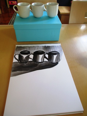
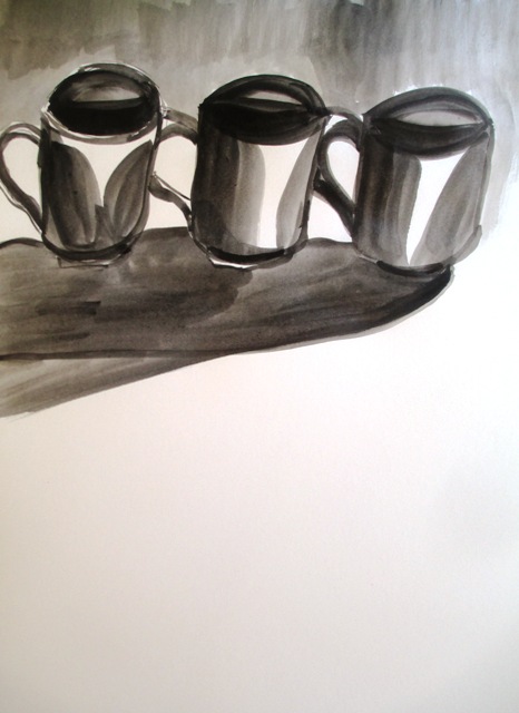
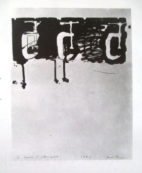
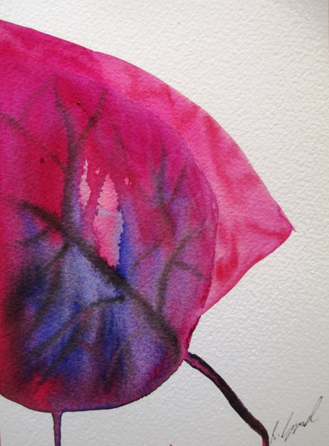
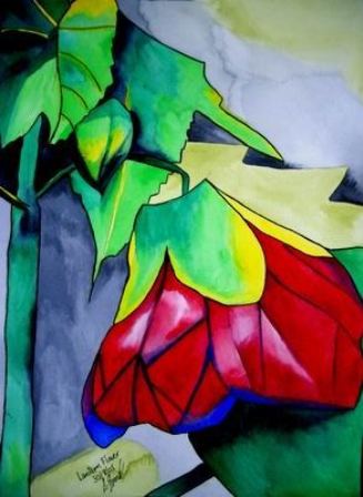
This week's topic is balance with symmetrical and asymmetrical components. Most works of art or drawings will not be completely symmetrical, but should include elements of both. The example piece this week was (right) Jim Dine's "Four C Clamps" Lithograph (1962). This piece demonstrates his use of asymmetrical balance, where unequal elements are harmoniously organised. The small dark section at the top of the composition is balanced by the white space underneath resulting in a dynamic composition due to the particular spatial relationships. The practice this week was to become more aware of the role of balance in compositions by doing an exercise focusing on asymmetric balance. A row of coffee cups was to be lined up on the table and drawn in the upper portion of the drawing's picture plane. So the aim is to achieve asymmetric balance that still has a sense of unity. Well... I guess it does... Actually this topic is again a bit vague as I was not sure exactly what I was supposed to achieve... It made me think about my use of space in my watercolour flower compositions. This one of a Lantern Flower (right) I painted some years ago is quite asymmetrical, with the bulk of the petal flower head in the lower portion of the picture plane. Another one is the Red Leaf (left) painted recently with the bulk of the leaf on the bottom right hand side of the page. I'm not sure if the asymmetry affects the harmony of the paintings... maybe it makes them more dynamic ? Hmmm ...
|
AuthorSacha Grossel is a practising Visual Artist from Australia. Archive
February 2019
Categories
All
|
 RSS Feed
