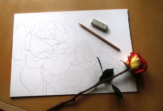
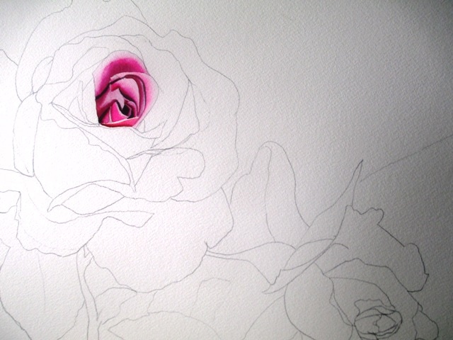
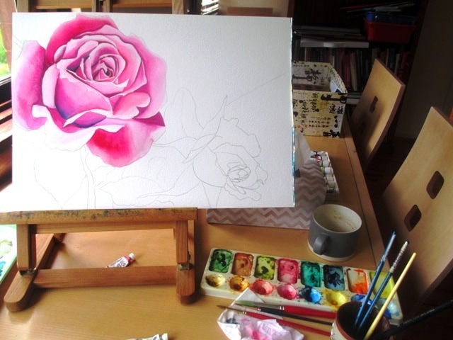
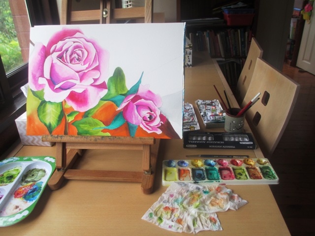
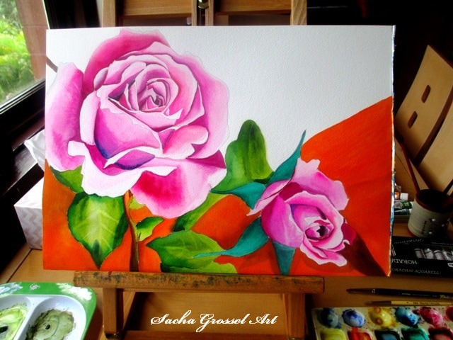
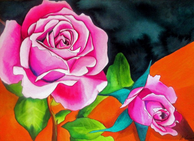
I wanted to paint another rose, as these are very popular paintings that seem to sell quite well. I found a nice composition from an old gardening magazine of two lovely pink roses that I used as a source picture. The two roses were to be the main focus and to get that really pink colour, I wanted it to look candy pink, like a fairy floss colour, a slight exaggeration of reality. The colours used to achieve the petal tones were Art Spectrum Flinders Red Violet, Spectrum crimson and Windsor and Newton Opera Rose, which is one of my favourite colours to paint with as it has a fluorescent dye in the pigment. It's hideously expensive but i love it.
After the leaves were painted (mostly Art Spectrum- Sap Green with Schmincke- permanent green olive over the top of Art Spectrum - Spectrum Yellow), I painted a small section of the background with some brown and orange. I really liked how the orange popped out and highlighted the green leaves, so I did most of the background of the bottom half of the painting in the Art Spectrum Cadmium Orange. It looks like orange sherbet and it's such a fantastic colour ! I really got carried away with it.
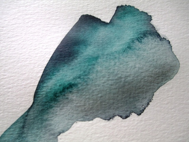
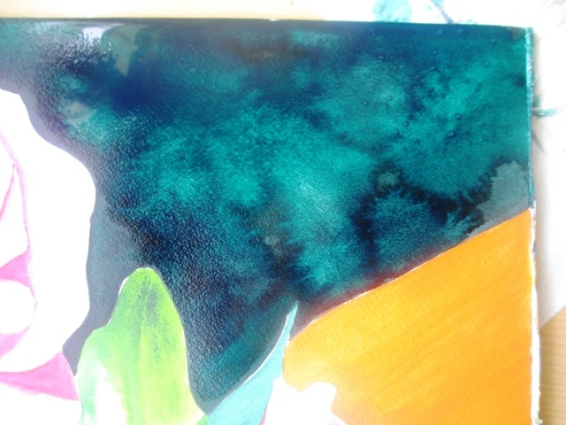
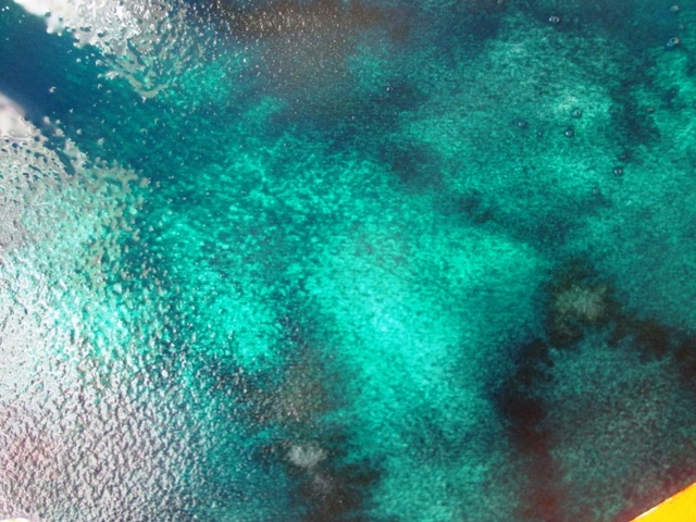
I wanted to create texture for the top right hand corner, as it was an empty space in the painting and needed something that wasn't too plain to balance the painting. The background texture was done quickly with a large paintbrush of very watery Art Spectrum Payne's Grey, quickly followed by Pthalo green over the top. While it was still very wet I squeezed a small sponge of clean water over sections of the background to create the splotchy effect. I practiced this on separate paper before I applied it to the painting to see whether it was what i wanted or not.
I'm happy with the final outcome of the painting. The colours are a bit crazy and reminds me of a lolly shop but I quite like it !
0 Comments
|
AuthorSacha Grossel is a practising Visual Artist from Australia. Archive
February 2019
Categories
All
|
 RSS Feed
