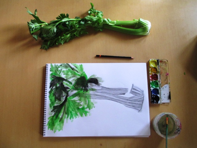
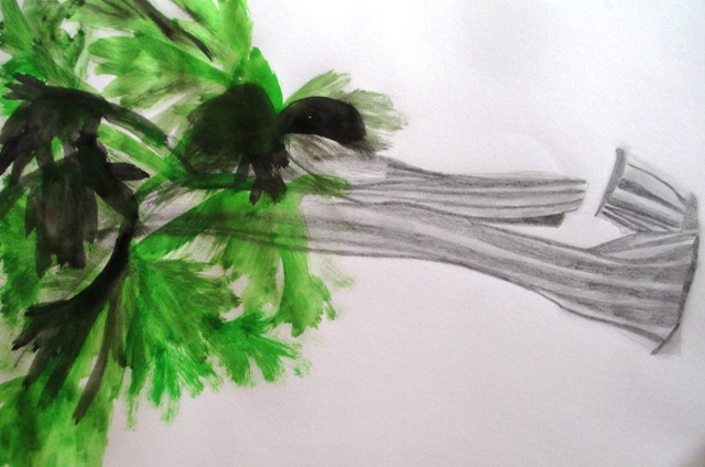
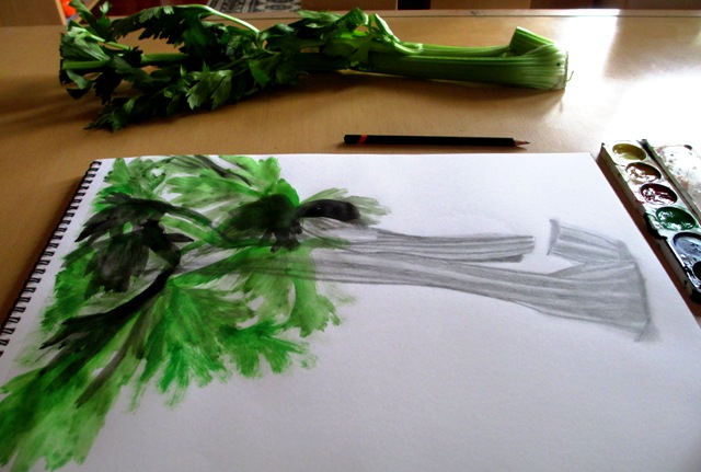
In this section, Smagula (Creative Drawing guru) points out that as artists mature, their work tends to evolve into distinctive styles that reflect their choice of themes, materials, ways of using space and textural patterns used. In this activity, it is encouraged to explore your own distinctive style that integrates a variety of textures. The brief for this activity was extremely vague to say the least, though it managed to waffle on for four paragraphs and nearly put me to sleep !... nonetheless, I tried to choose a subject that I thought could incorporate both smooth and rough textures in the same drawing. I found some celery in my fridge and could visualise the drawing that could be done using both pencil smooth sections for the stalk and rough, scratchy paint for the leaves.
The most coherent thing Smagula says at the end of this chapter is that drawing is an evolutionary activity that over time can sharpen our visual capacity and heighten our awareness so that we can return to familiar places and see things in new ways with new understandings.... so ends chapter six on texture.. onwards and upwards !
0 Comments
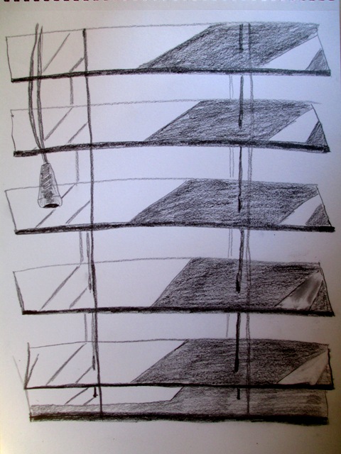
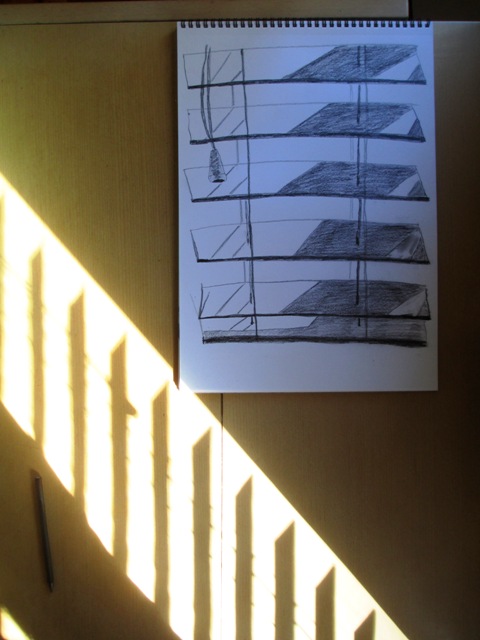
This week we're looking at repetitive shapes that range in tone from white to black - or pattern. The project this week was pretty simple and straightforward. I was supposed to look for patterns created by the interaction of light on three dimensional surfaces.. Examples of this would be light filtering through the blinds (above) or even a macro view of the texture of a wall with the play of light and dark. That also sounded interesting to me, but I found a good example of the light pattern on the blinds, so I thought I would draw that and find the pattern that the light was creating.
An interesting exercise to consider the everyday surfaces around your house and examine them closely to find interesting patterns. There are many interesting inspirations for future drawings when you view your immediate environment in this way. I enjoyed this weeks task !
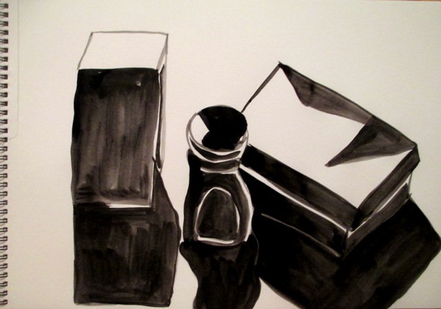
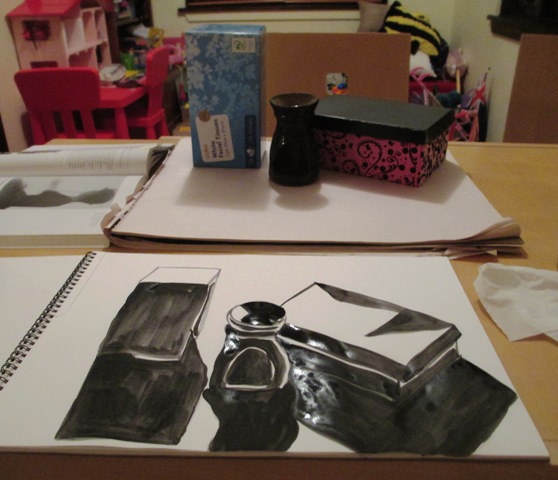
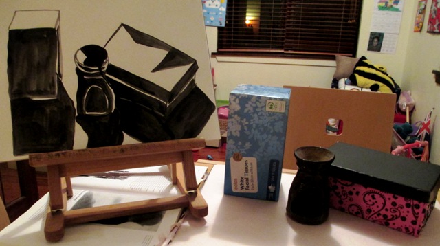
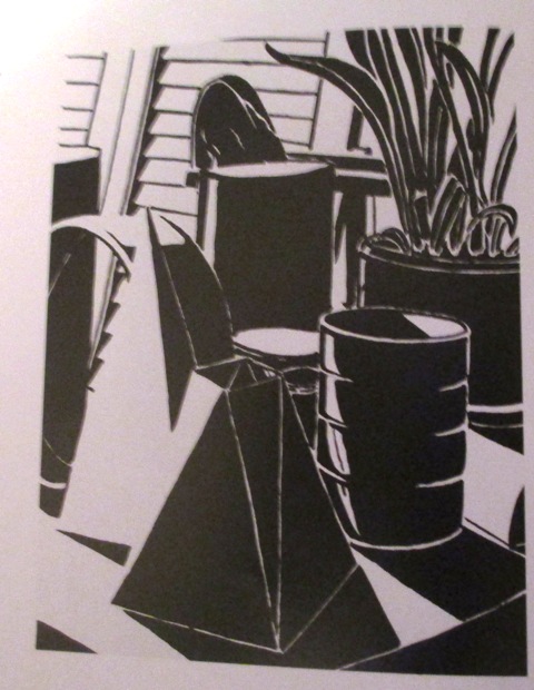
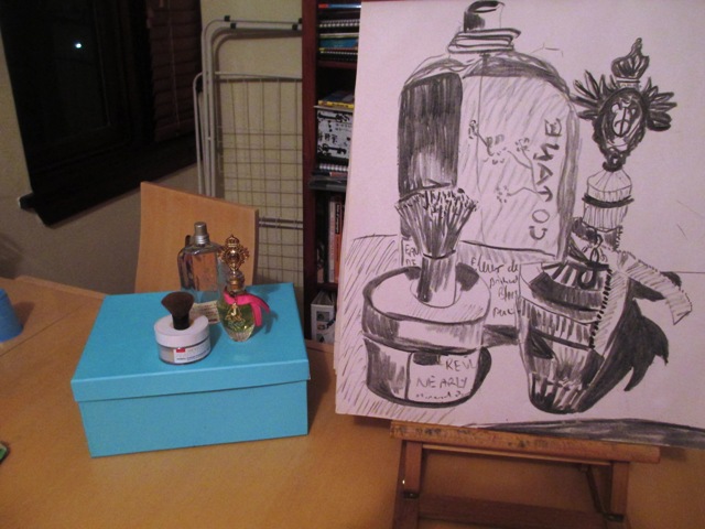
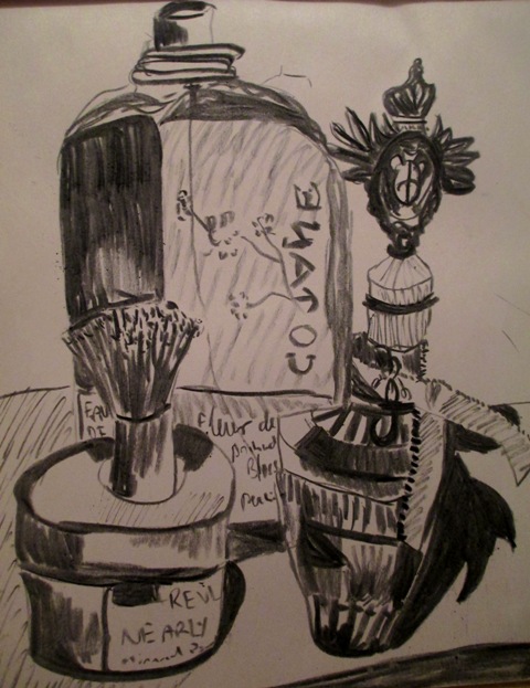
This week we're exploring the interplay of black and white shapes to create these high contrast values and strong tonal juxtapositions to create an expressive visual impact. This is done by setting the blackest shapes against the whitest negative shapes to create a visual exaggeration. So the activity was to use black ink and paper and draw a still life. You needed to have strong directional lighting to create the bright highlights and deep shadows. I needed to analyse the positive and negative shape arrangements and used the brush (a round watercolour brush) to create the black shapes against the negative white space. It was an interesting and enjoyable analytical exercise. I like the overall effect of this high contrast style of drawing. Below is an example of another student drawing from the textbook to show the style I should be aiming for in the exercise.
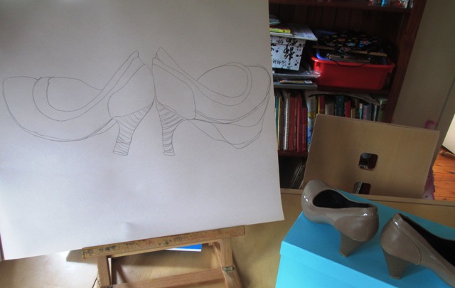
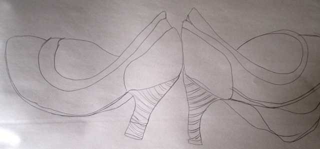
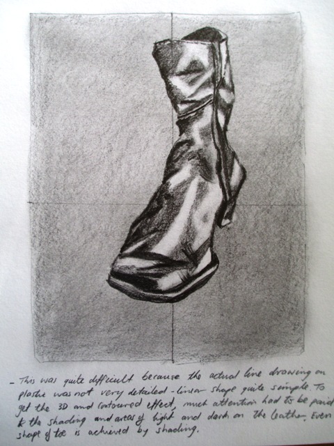
So, the next chapter is all about the contour line and a good explanation is given by Smagula about the difference between gestural lines and contour lines, in that gesture lines are used to visually express the basic shapes, movement and feel of the forms, whereas contour lines more accurately describe the exact shape of the form by carefully recording the placement of the edges and contours. Being confident with recording line accurately is obviously really important for improving drawing skills and being able to record line expressively to recreate 3D forms onto 2D paper is a skill that takes a lot of practice to be able to achieve a variety of visual effects. Above is a drawing with graphite pencil of a pair of my shoes, trying to carefully observe the shapes I am outlining. I tried to keep an eye on the subject rather than on the paper and followed the contours of the shoes with continuous lines. Shoes seem to be a popular subject for contour line practice ! 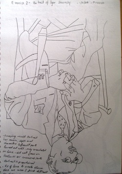 This was an exercise from Drawings on the right side of the brain by Betty Edwards I did a few years ago where you had to copy a line drawing by Picasso (Portrait of Igor Stravisnky) upside down and covered up, only revealing a bit at a time. The outcome was a very accurate copy of the drawing and accurate placement of the lines, as your mind was tricked into only observing the shape of the line and not on the overall image of a man.
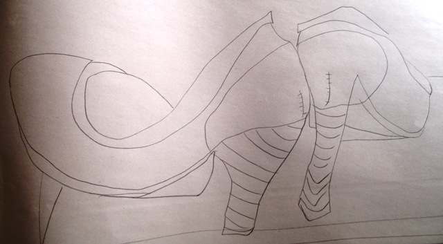
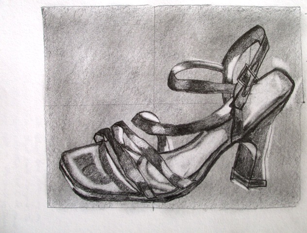
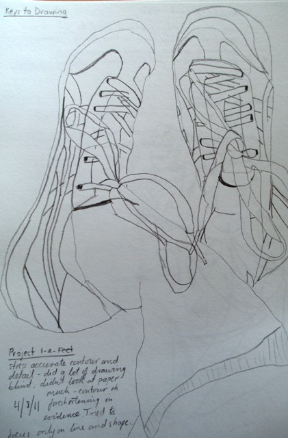
Some more shoe drawings from a few years ago. The first two were contour exercises from Drawings on right side of the brain and using a picture plane. Obviously a greater degree of realism or photo realism can be achieved with a picture plane, as the proportions are accurate. The drawing on the right is a contour exercise of my Onisuka Tigers from Keys to Drawing by Bert Dodson. As I said... shoes... shoes.. .shoes... !!
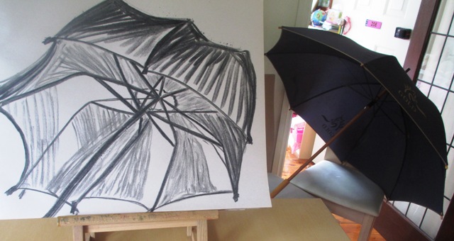
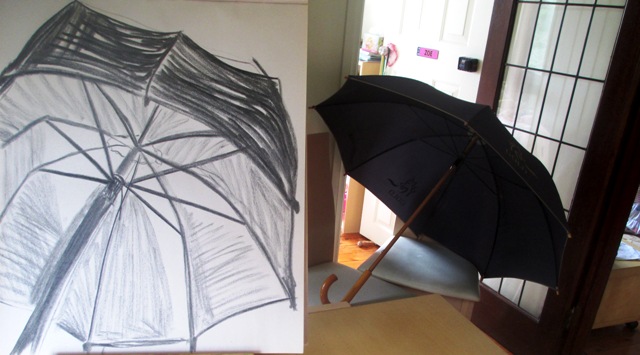
The above drawing of the umbrella is with charcoal and is more practice with sighting angles and proportional drawing of shapes and angles. Initially I was unhappy with the results I'd achieved with this and once again lamenting my poor ability to draw things in proportion, but now on second thought, although not absolutely correct, the form is not too bad (well, at least it looks like an umbrella !) The spokes are actually angled reasonably correctly I think and most of the problem is with the canopy shape. Anyway, the project did stipulate it was a "complex" subject...
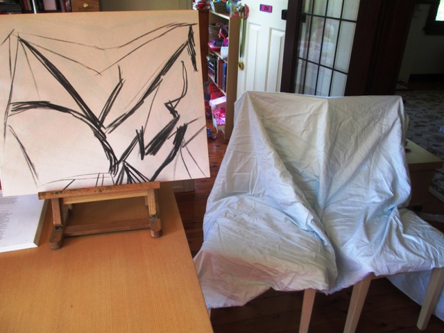
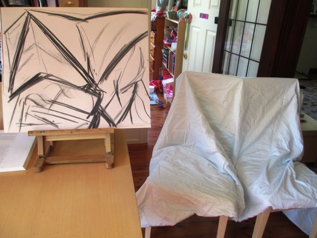
Welcome to my blog ! Its' not quite the start of the New Year, but close enough, so I'm going to share my journey here in blog form for those who are interested in following my art journey and even for those considering embarking on one of your own. It's Summer school holiday time here in Australia, so as I have two young children home from school until February, I probably wont be able to start any new major watercolour paintings until the house returns to some peace and quiet. However, I am going to do some practice drawing and sharpen up my skills of perception and artistic response by working through some exercises, mostly from the book "Creative Drawing" by Howard J Smagula. You can join me in these exercises if you like. Feel free to post your progress and leave comments. I'm a self taught artist, keen to improve, not an art teacher, so these blogs are not necessarily instructional, just a way to share my journey.... 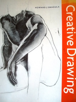 A copy of the book I'll be using for my drawing exercises. The first few projects are to practise gesture drawing. These are rapid line drawings made in order to record basic visual information in a short period of time. They're supposed to be full of energy and are concerned with communicating the essence of an idea, not its detail. The point is to define the basic shape, proportion and position in space in a fluent and expressive manner. The first few exercises are drawings of bedsheets draped over chairs. I've used charcoal on paper and tried to capture the flowing line forms and suggest the shadow areas. These drawings took around 2-3 minutes each.
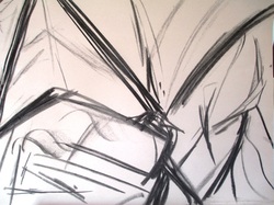 I think the drawings have turned out a bit more jagged and were supposed to be more flowing, as in drapery mode, but I think there is energy in the lines and I tried to use my whole arm and utilise the whole page. Need to work on using longer, more flowing line...
|
AuthorSacha Grossel is a practising Visual Artist from Australia. Archive
February 2019
Categories
All
|

 RSS Feed
