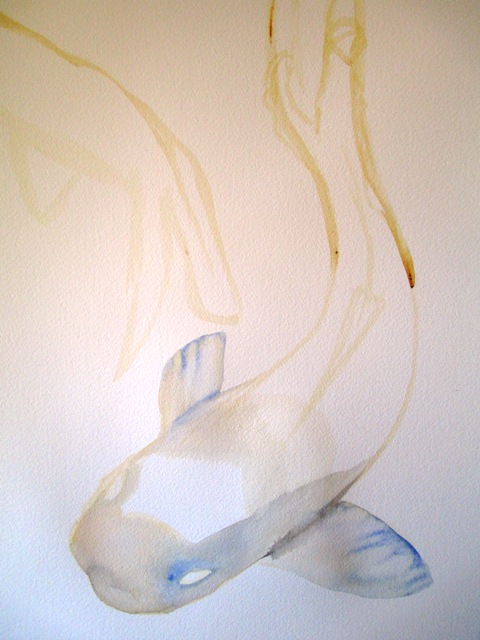
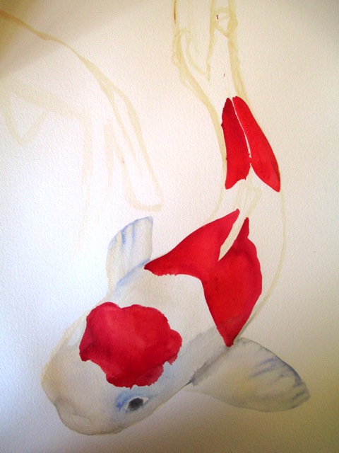
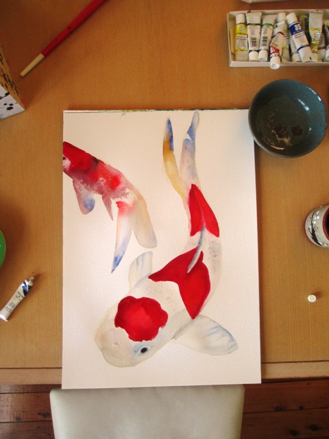
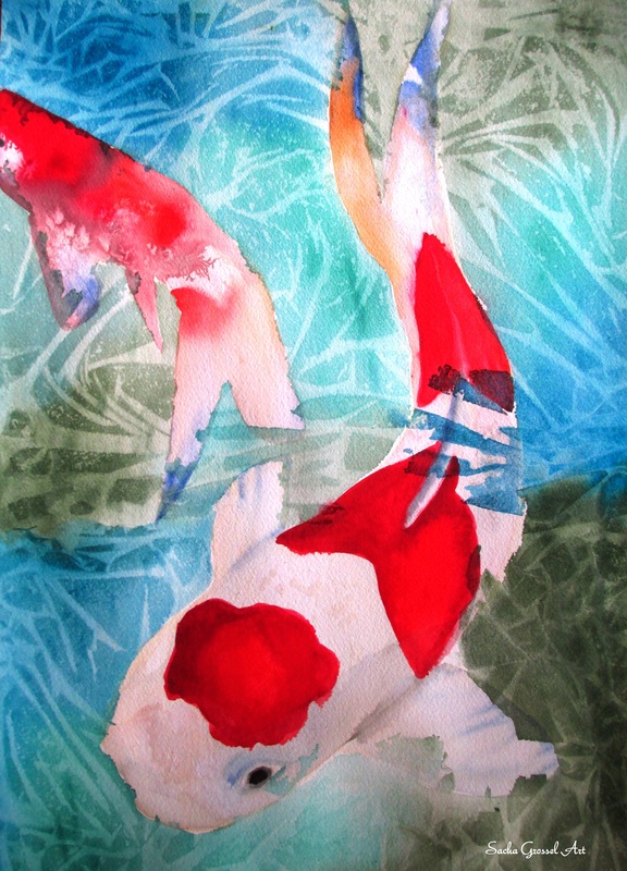
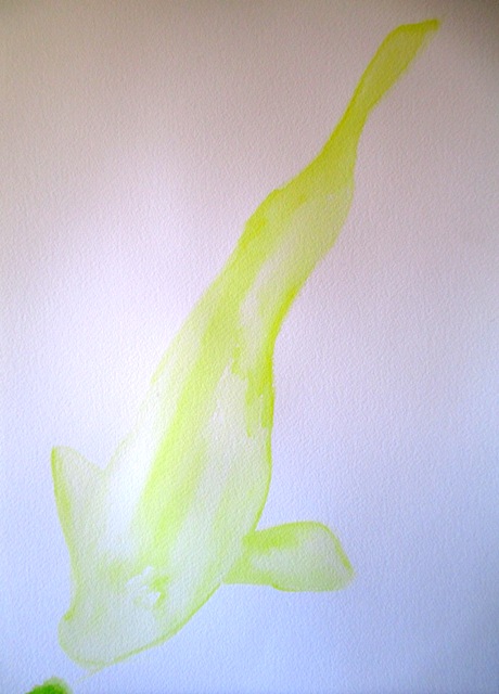
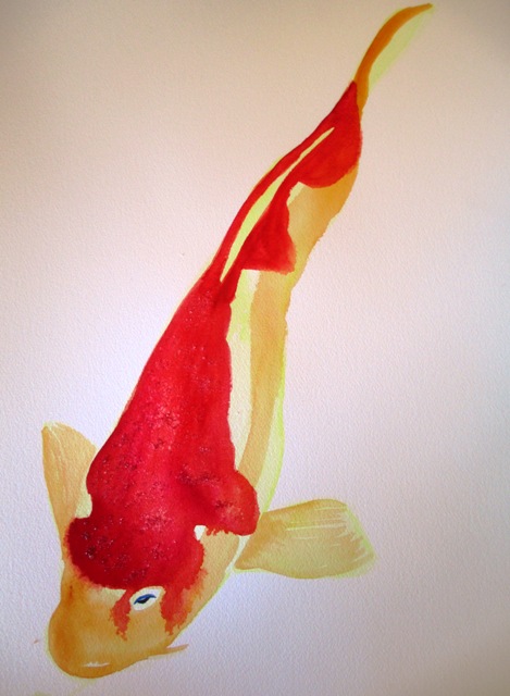
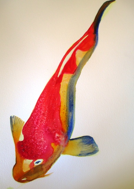
For some reason, I'm still in the mood to paint fish... and I wanted to refine some things I wasn't entirely happy with in the first Kohaku Koi painting a few weeks ago. The source was from a photo of Koi. These Koi were the very traditional red and white Kohaku Koi, which apparently actually means "red and white". The first step was to just lightly outline the shapes of the fish and do a very pale wash with a very watered down Australian Red Gold (Artists Spectrum watercolours) with touches of Ultramarine blue along the fins. I then thought out where the white parts of the fish were going to be and left them blank and filled in the red splotch parts on the body with Permanent Crimson on the outer edges and spectrum red towards the middle of the red parts.
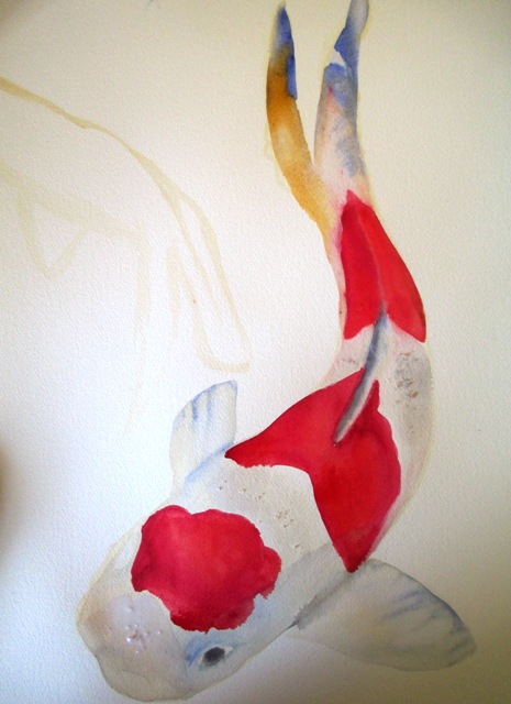
I then painted the tail a little multi-coloured, with Yellow Ochre and Ultramarine Blue, with Chinese white for the highlights. I did a wash with Chinese White over the "white areas" and some of the surrounding colours seeped through that in places which was what I wanted to create a bit of tone and interest along the body. I did the salt thing again, this time sprinkling it on the white part of the body to try to create some splotch effects, however the effect was not very noticeable in the end - it works better on bright colours.
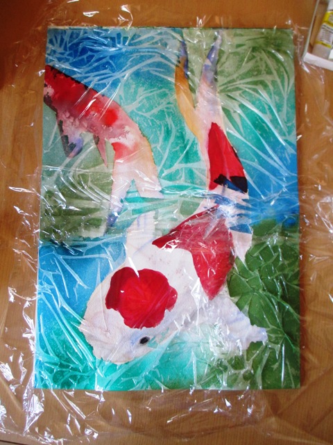
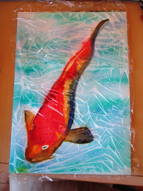
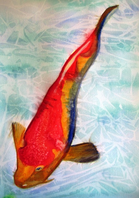
Now for the water special fx, I did a wash of clear water over the background, then went over while still wet with a turquoise (Winsor & Newton), Pthalo Green (Artists Spectrum) and Oxide of Chromium (Artist Spectrum). The painting was left to dry for a couple of hours and ...voila !
0 Comments
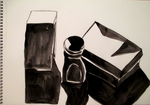
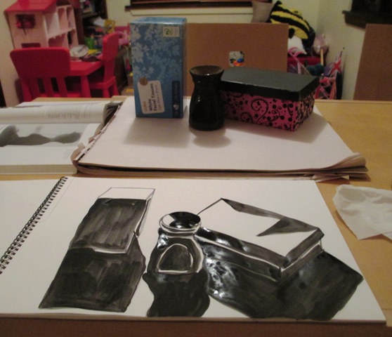
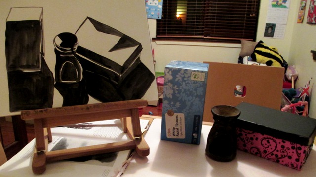
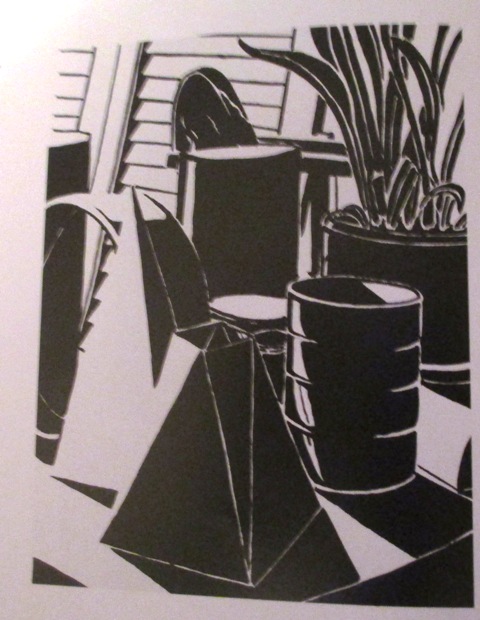
This week we're exploring the interplay of black and white shapes to create these high contrast values and strong tonal juxtapositions to create an expressive visual impact. This is done by setting the blackest shapes against the whitest negative shapes to create a visual exaggeration. So the activity was to use black ink and paper and draw a still life. You needed to have strong directional lighting to create the bright highlights and deep shadows. I needed to analyse the positive and negative shape arrangements and used the brush (a round watercolour brush) to create the black shapes against the negative white space. It was an interesting and enjoyable analytical exercise. I like the overall effect of this high contrast style of drawing. Below is an example of another student drawing from the textbook to show the style I should be aiming for in the exercise.
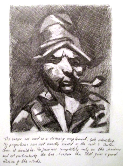
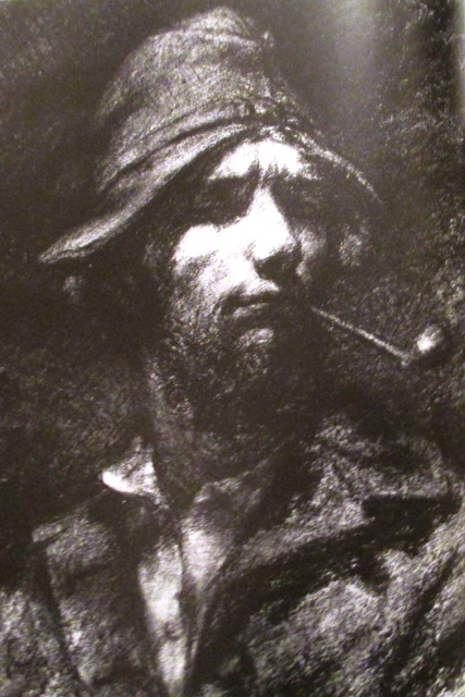
To continue my study of the chiaroscuro concept from a couple of weeks ago... on the right is the famous self portrait of Gustav Corbet (Self Portrait with a pipe 1849) with charcoal on paper. His use of chiaroscuro shows the portrait emerging out of a dark, mysterious background, using the lightest tone for his facial features to emphasis this important aspect of the portrait. On the left is an exercise from Drawings on the right side of the brain by Betty Edwards that I did a few years ago. It is a copy of the Corbet drawing using graphite pencil and using an eraser as a drawing implement to show the highlighted areas of importance, thus creating the chiaroscuro juxtopositions. 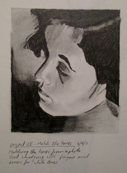 This is another exercise if chiaroscuro I did a few years ago from Bert Dodson's Keys to Drawing book. It was to use a black and white photograph and draw the picture to match the tones from the photograph. It was done with a soft graphite pencil and an eraser was again used to highlight the lightest tones on the side of the face.
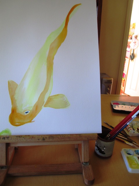
This week's blog will focus on a new painting I completed last week. The source photo was from a library book from the pets section about keeping Koi. I like the shape of Koi with their plump bodies and bright splotchy colours on their heads and I've been wanting to do a couple more fish paintings for a while, as there were a few people interested in an old fish painting I did some years ago which I wont sell because it was more of a practice thing on scrap paper. Anyway, this one is on good quality Arches 300gsm cotton paper and I'm using Artists Spectrum watercolour paints. Here are some photos of the process. The form of the body was important at first with a light wash of lemon yellow colour. Next the tonal / darker areas were overlayed with a red Gold colour.
Next for the red splotchy part - it was important to get the right shade of red - I didn't want it too pink or crimson, so I tested all the reds on scrap paper first to get the right shade. I ended up just using spectrum red but making sure it wasn't too watered down. I've also sprinkled salt on the head area which will make white splotchy effects when it dries. Next for blue highlights along the fins and body.
The next step is the background, so I washed the background with clean water using a large brush and while it was still wet, added some blue and green wash for the water. Then while everything was wet, I overlaid some cling wrap and scrunched it up as you can see in the photo. I waited an hour or so until everything was completely dry before removing the cling wrap and brushing the salt off for a few neat fx. Voila !
|
AuthorSacha Grossel is a practising Visual Artist from Australia. Archive
February 2019
Categories
All
|
 RSS Feed
