|
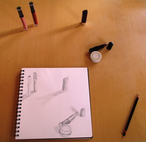
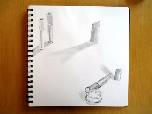
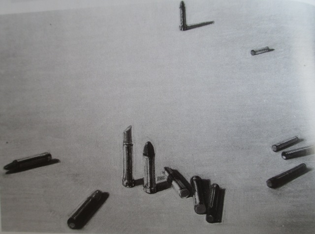
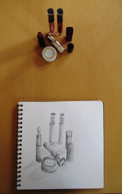
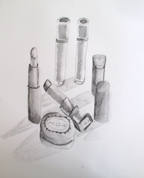
This week, my drawing activity and practice was to concentrate on the idea of placement of objects and how to create lively, interconnected spaces in a composition that would add to viewer interest. Sometimes, putting the subject in the centre of the page can limit the visual movements of your composition. A good example Smagula gives of a decentralized structure is (right) Wayne Thiebaud's drawing "Untitled Lipsticks". By placing the objects around the page, throughout the space, he creates a dynamic composition that holds our attention.
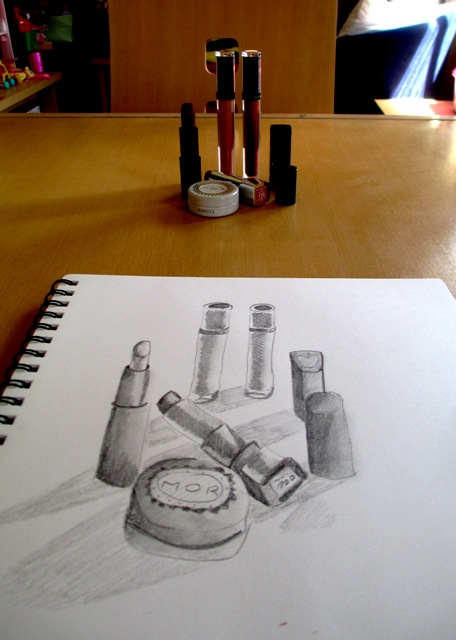
So for the first exercise, I took inspiration from the lipstick drawing and practised my own version of a decentralized drawing of lipstick and makeup. To get the proportion correct and placement correct, I had to close one eye to try and force myself to see the image in a 2D form and kind of used my hands to visually create a viewfinder so that I'd know where to place the objects on the page. You could also make yourself a cut out cardboard viewfinder to use - it would be useful for this exercise. The next part was to arrange the objects as a central placement and do a second drawing. I can see that the first arrangement is more interesting and dynamic for a viewer. I've never really considered using decentralized space composition before, so this was a useful and interesting exercise for me...
1 Comment
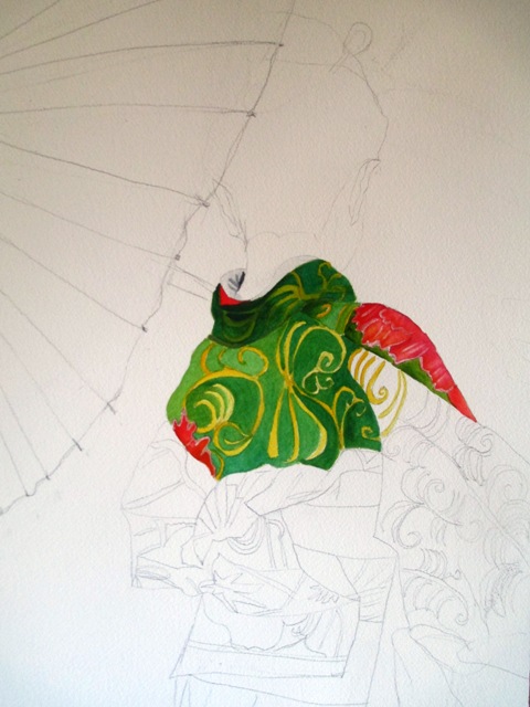
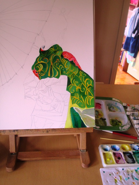
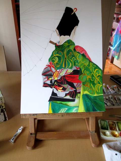
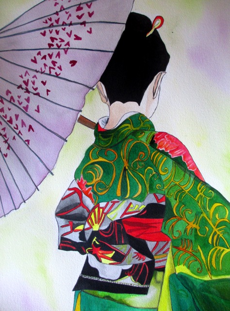
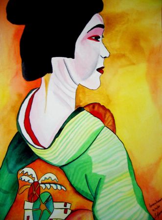
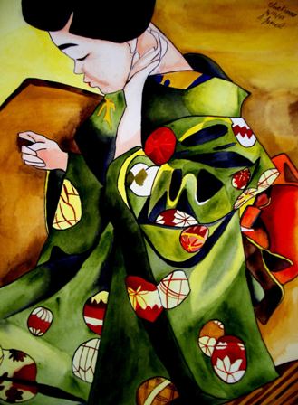
I have been working on this new painting for the last week or so of a Geisha with a green kimono and black and red obi. She is carrying a decorated purple umbrella. The hardest part for me with these portrait paintings is the initial pencil drawing, as I find body shapes and heads hard to draw proportionally correct. I don't do a lot of figure drawing, and so it takes me a while to get the initial drawing on the paper and be happy with it. The kimono and obi for this Geisha was fairly detailed and took some careful analysis of the folds and shapes on the obi (belt) form the photo I was using. The paint was applied in a couple of layers of different shades of green for the kimono and the red highlights used were just a Spectrum Red from Art Spectrum brand watercolour paints. The new Geisha with Green Kimono and purple umbrella is now complete - on the left. Here are my other two green kimono clad Geisha. They are both available for sale as prints at:
http://fineartamerica.com/profiles/sacha-grossel.html?tab=artworkgalleries&artworkgalleryid=449741 and are also available on various products such as postcards, cards, and various giftware here: http://www.zazzle.com/sachagrosselart/gifts?cg=196388714253283747 Now I'm up to chapter 7 in Howard Smagulas "Creative Drawing" textbook and the theme is Composition and space. He gives a nice introduction about how artists define the space in personal ways into a unified "composition". This weeks project was all about choosing a format - the proportional relationship of the paper's length to its height. He goes on to say that the format you choose will be related to the subject matter you are drawing - eg: tall buildings go well in a vertical format, panoramas more suited to rectangular format etc.... Pretty obvious stuff I suppose...
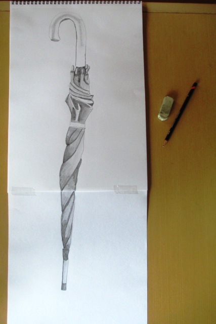
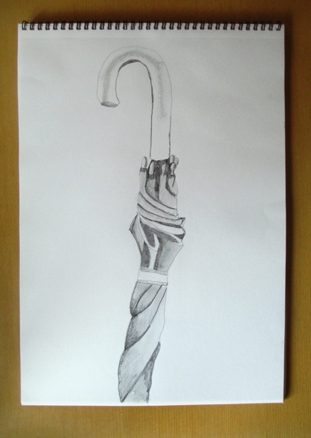
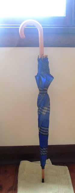
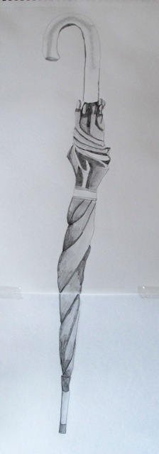
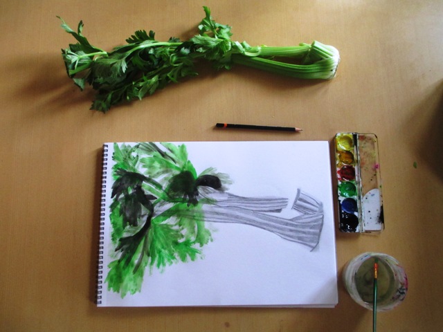
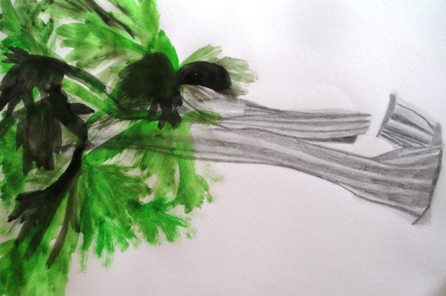
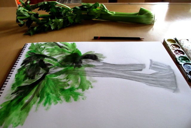
This weeks project was to plan and create a drawing on an elongated format that takes into consideration the special qualities of the subject. A broom was suggested as a good subject, but as it was raining outside and I didn't want to trek out to the garage to fetch it, I chose my umbrella - a perfect subject for a rainy day ! So, as you can see in the second photo, although the paper was vertical, I still didn't judge the proportion correctly and the whole umbrella didn't fit on that sized paper - because the umbrella was so elongated, it needed a more exaggerated format to capture the length than a standard sketchbook size paper. So I continued the drawing on another page and stuck them together to show the paper size that was needed to correctly capture this tall, elongated form of the umbrella. By doing this I think the exaggerated quality of the elongation was achieved, so I'm happy with the result... In this section, Smagula (Creative Drawing guru) points out that as artists mature, their work tends to evolve into distinctive styles that reflect their choice of themes, materials, ways of using space and textural patterns used. In this activity, it is encouraged to explore your own distinctive style that integrates a variety of textures. The brief for this activity was extremely vague to say the least, though it managed to waffle on for four paragraphs and nearly put me to sleep !... nonetheless, I tried to choose a subject that I thought could incorporate both smooth and rough textures in the same drawing. I found some celery in my fridge and could visualise the drawing that could be done using both pencil smooth sections for the stalk and rough, scratchy paint for the leaves.
The most coherent thing Smagula says at the end of this chapter is that drawing is an evolutionary activity that over time can sharpen our visual capacity and heighten our awareness so that we can return to familiar places and see things in new ways with new understandings.... so ends chapter six on texture.. onwards and upwards ! This weeks topic from Smagula's Creative Drawing textbook is how to create Visual texture through illusion or simulation of roughness and smoothness - different from the last couple of weeks where we explored how the roughness or smoothness of various media or drawing paper affects mood through texture.
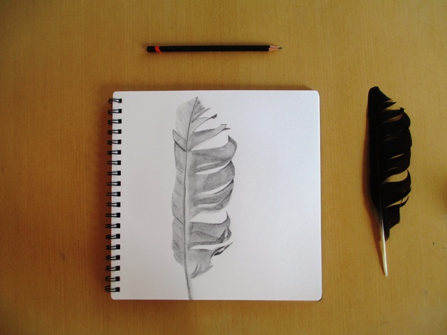
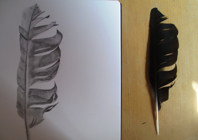
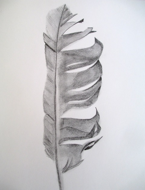
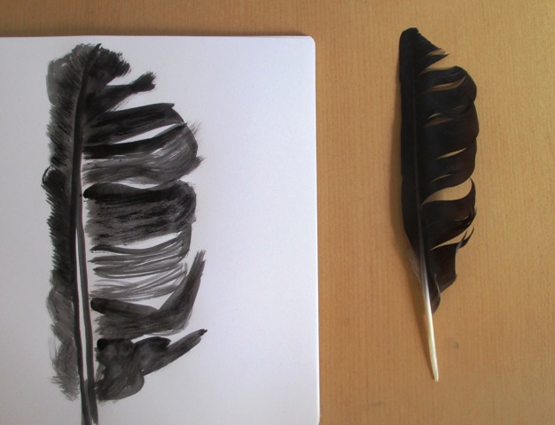
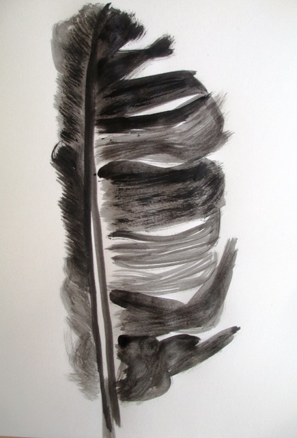
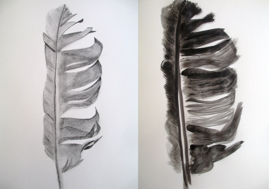
Visual texture is used to communicate expressive possibilities in art. Texture can be used to create a violent or discordant mood, or conversely, a mysterious, smooth and elusive mood. The activity this week was to choose a subject and draw it in two different visual textures. I chose a feather - as it was one of the suggestions - and used a sharp H graphite pencil to draw the smooth version, using my finger to blend the tones to create a diffused texture. This is contrasted with the drawing in black paint of the feather using tonal contrasts for discordance as well as sharp, bold and scratchy vigorous, more agitated lines. I actually think I could have gone further with the agitated lines and made them even rougher for more of a contrast. I enjoyed this particular activity and enjoyed drawing the same subject in different ways to explore this textural contrast. |
AuthorSacha Grossel is a practising Visual Artist from Australia. Archive
February 2019
Categories
All
|
 RSS Feed
