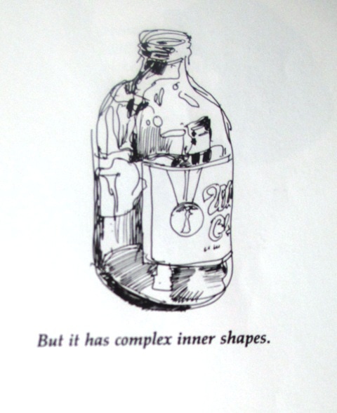
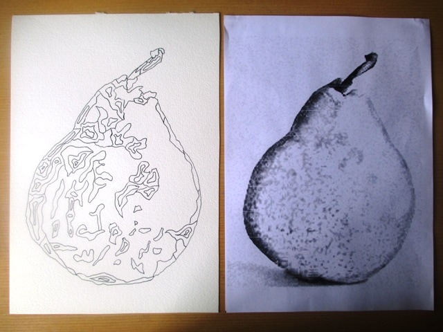
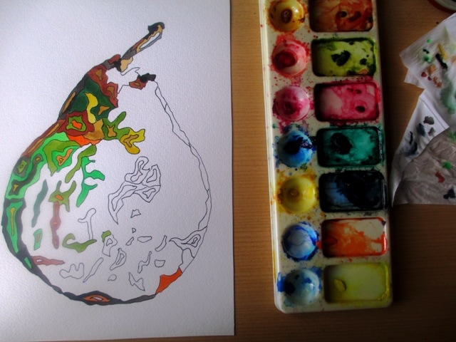
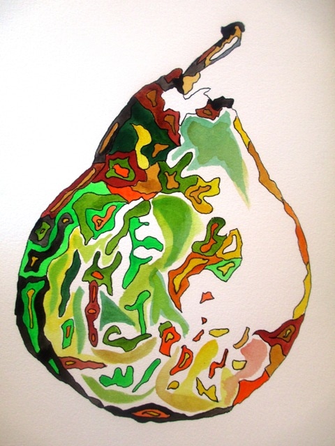
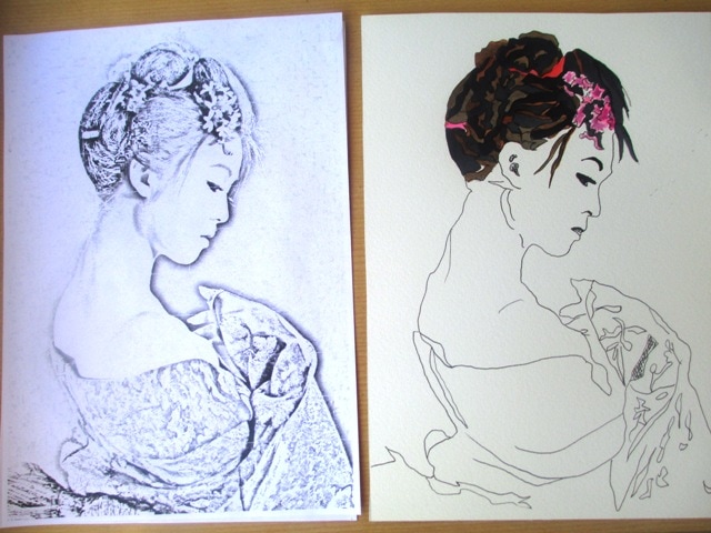
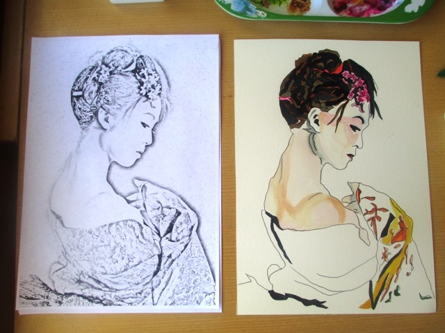
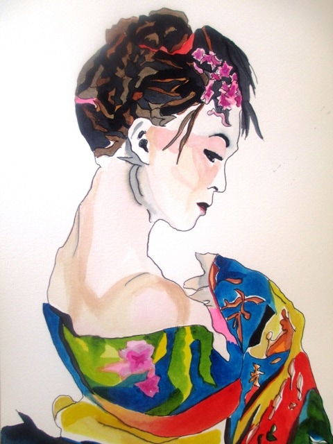
I thought I'd try out a more illustrative style, as I'd seen some examples by other artists of more fluid pen / ink, pen/watercolour types of styles. I chose a pear to start with, as I wanted something with a very simple outline shape. I used a photo of a pear and modified it with photoshop special effects to show the illustration style / outline. I then printed it and used this as a basis for the outline illustration. I used the black and white tones in the photo to guide me to the dark and light parts of the pear. I remembered doing an activity a few years ago from Bert Dodson's "Keys to Drawing" book (pg27) referring to enrichment shapes. It was more in reference to drawing glassware and vases and capturing the reflection of light, but I though it might be an interesting idea to try it with the pear to emphasise the textural and suggest the tonal quality of the pear. The shapes were hand drawn with pen and coloured with watercolour. I think it's a cute style and would like to continue to do some of these style of illustrations every now and then to practice this technique. I tried a similar approach to a more illustrative style of kimono lady. It didn't turn out quite as I wanted, but I don't have high expectations for my portrait styles in general so it was really just an experiment. My Geisha ladies are always popular sellers, so I'd like to try to improve more illustrative styles in this genre as well...
0 Comments
|
AuthorSacha Grossel is a practising Visual Artist from Australia. Archive
February 2019
Categories
All
|
 RSS Feed
