So, as I explored rough texture drawing last time, now I'm practising achieving a smooth textured drawing. This type of drawing is more tightly controlled and invokes feelings of tranquillity and calm.
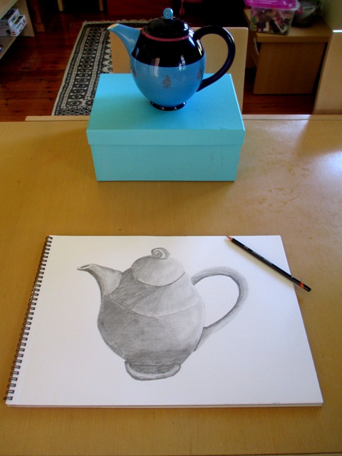
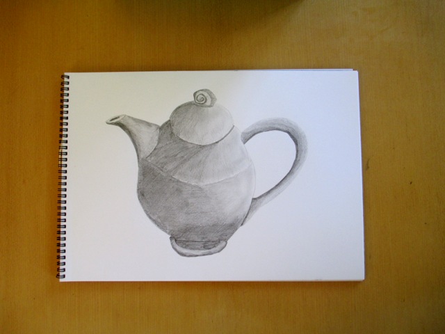
So the exercise this week was to choose a still life subject that had smooth and perhaps slightly reflective surfaces. I also wanted to choose a subject that had a sense of calmness attached to it. What could be more calming than a cup of tea? I've used smooth drawing paper with a 1H (fairly hard) drawing pencil. This exercise took about half an hour. The three dimensionality is achieved with subtle tonal gradations with the pencil and has been blended with my finger to create a very smooth finish. Am actually quite happy with the outcome of the teapot, I think smoothness has been achieved and am even happy with the proportions of this drawing...
0 Comments
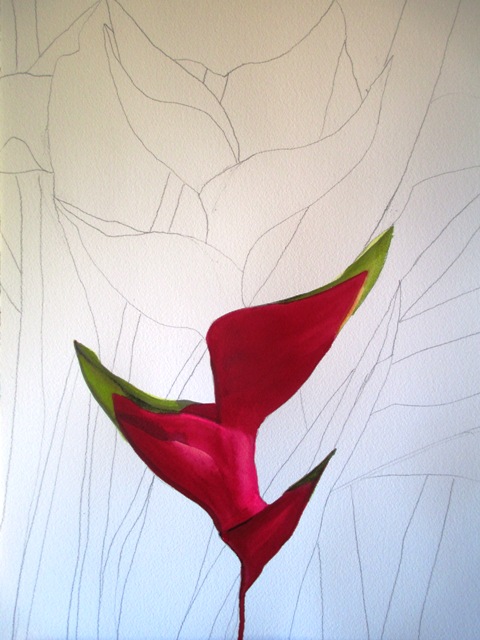
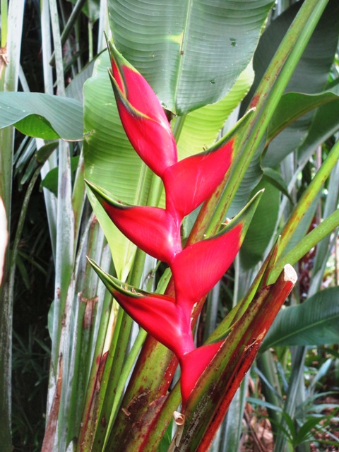
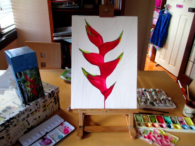
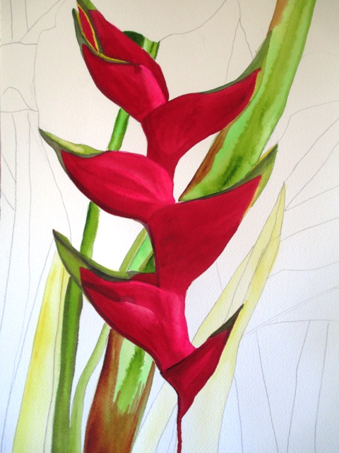
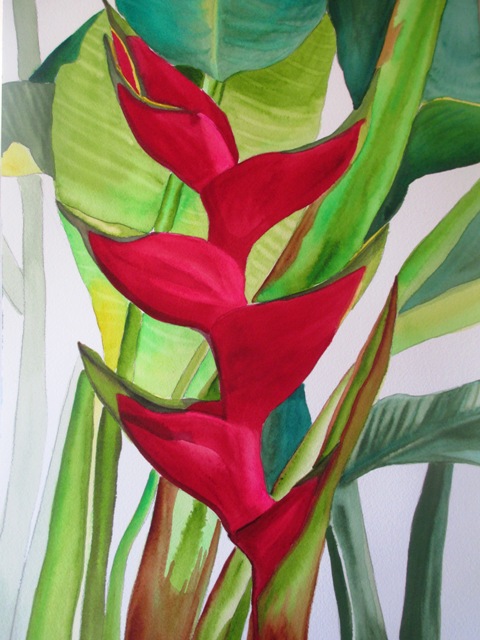
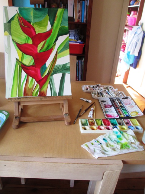
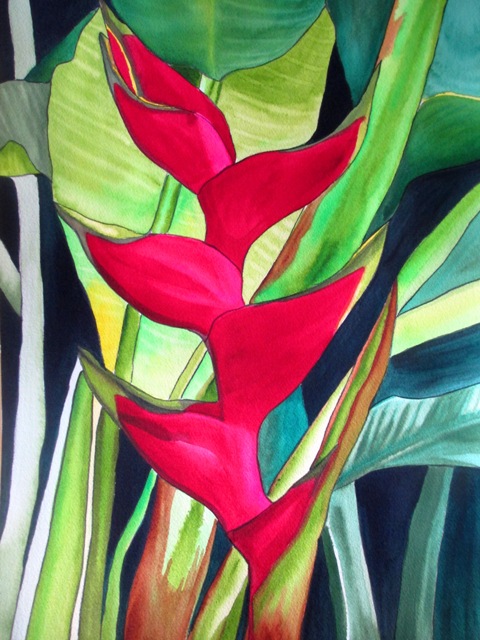
This week I've had time to start and complete The Giant Lobster Claw (Heliconia) tropical flower, one of the hundreds of flowers that I took photos of on my recent trip to Cairns in Far North Queensland (Australia). I love the colours and exotic splendour of tropical plants. They really are my favourite kind of flowers and foliage to paint. Heliconias are found in rainforest areas and are native to South America and some Pacific Island areas. The flowers are actually small white parts in the middle of brightly coloured, waxy bracts (not visible in my above photo). This Heliconia is nicknamed Lobster Claw for the obvious resemblance. These plants are related to bananas and have similar large bright green leaves. They have similar growing conditions to gingers and Cannas.
The first steps were to draw the sketch of the main shapes I wanted to use from my reference photo. Then I filled in the main red areas of the Lobster Claw. I use Art Spectrum brand paints and the dark red colour was Permanent Crimson and the lighter pink parts are Opera Rose (This was a Windsor and Newton). To create the intensity of colour I desired, I did a couple of layers of the Crimson. For the green parts and surrounding foliage, I've used Spectrum Yellow underneath, then as that has dried, have layered it with Sap Green and Australian Green Gold. For the darker foliage, I've used Pthalo Green and Oxide of Chromium. I've also used brown highlights with Burnt Sienna Hue.
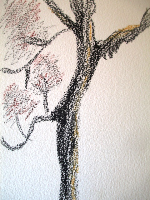
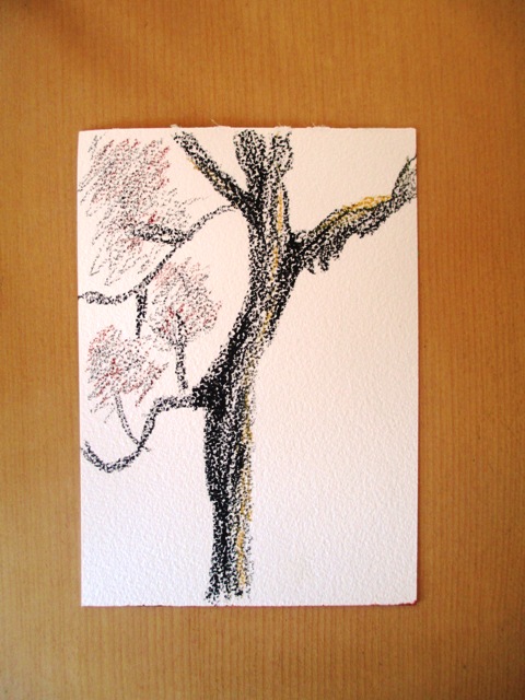
So this week I'm working from Chapter 6 in "Creative Drawing" textbook by Howard Smagula. This chapter focuses on texture and various textural effects that can be achieved using various drawing media and various paper.
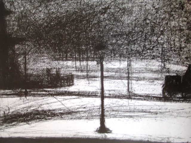
An example of the expression that can be achieved by varying the texture of the paper can be seen in (right) Georges Seurat's conte drawing on rough, handmade paper "Place de la Concorde, Winter" (1882). The roughly scrawled black crayon marks against the rough paper depict a stark, bleak Winter scene. This mood would not be conveyed as clearly if the drawing was on smooth paper using light pencil. This week's project was to experience the expressive possibilities of rough media. I've used black and brown crayon on rough watercolour paper to do my drawing of a barren looking tree in my backyard. The rough paper creates a good bark textural effect appropriate to the subject. The black colour creates a bleak expressive quality. |
AuthorSacha Grossel is a practising Visual Artist from Australia. Archive
February 2019
Categories
All
|

 RSS Feed
