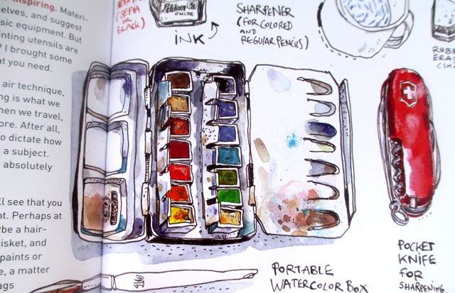
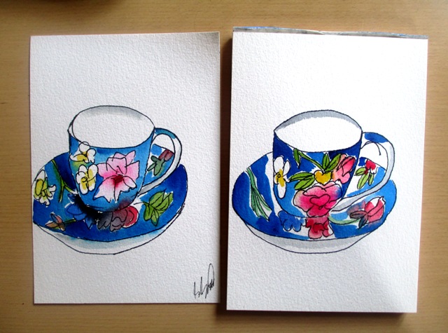
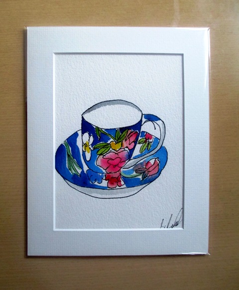
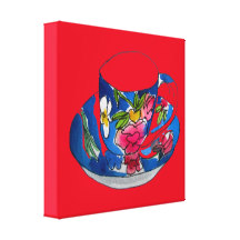
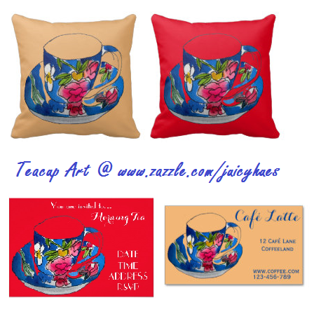
Last week I had some time to once more delve into my "Urban Watercolours Sketching" book by Felix Scheinberger 2011 (above left). I really like his freehand illustration style and the book is so cute and easy to read... So I thought I'd focus on the chapters "What is beauty anyway" and "Less in more". He encourages you to paint what is around you and look for your own subjects for inspiration. Artists ought to be authentic and tell something about their world. So anyway, I thought my teacup and saucer would make a cute illustration. This was a lovely designer teacup given to me for Christmas last year from one of my students that I teach - hence I've called it "Becky's teacup" I did two similar versions, but thought the second one turned out slightly better. In the Less is More chapter, Felix encourages us to be economical with colours when illustrating. Hence, I tried to deliberately not paint every space in the picture, but left some parts completely untouched. I tried to make use of the white paper as an element. I do like the effect of this technique for these urban illustration styles. It is my aim to do more of these illustrations over the coming months...I think they look great on the products in my design shop www.zazzle.com/juicyhues
0 Comments
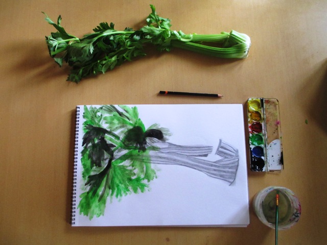
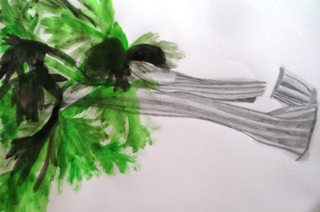
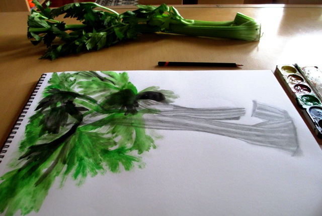
In this section, Smagula (Creative Drawing guru) points out that as artists mature, their work tends to evolve into distinctive styles that reflect their choice of themes, materials, ways of using space and textural patterns used. In this activity, it is encouraged to explore your own distinctive style that integrates a variety of textures. The brief for this activity was extremely vague to say the least, though it managed to waffle on for four paragraphs and nearly put me to sleep !... nonetheless, I tried to choose a subject that I thought could incorporate both smooth and rough textures in the same drawing. I found some celery in my fridge and could visualise the drawing that could be done using both pencil smooth sections for the stalk and rough, scratchy paint for the leaves.
The most coherent thing Smagula says at the end of this chapter is that drawing is an evolutionary activity that over time can sharpen our visual capacity and heighten our awareness so that we can return to familiar places and see things in new ways with new understandings.... so ends chapter six on texture.. onwards and upwards !
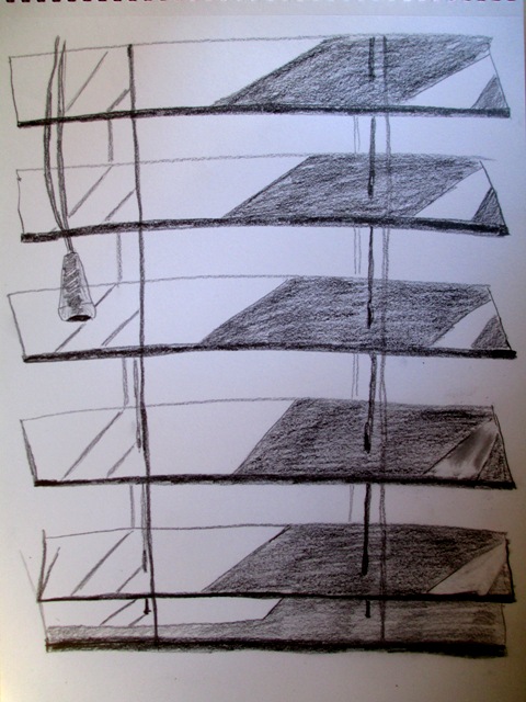
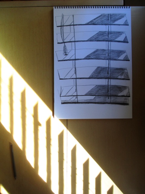
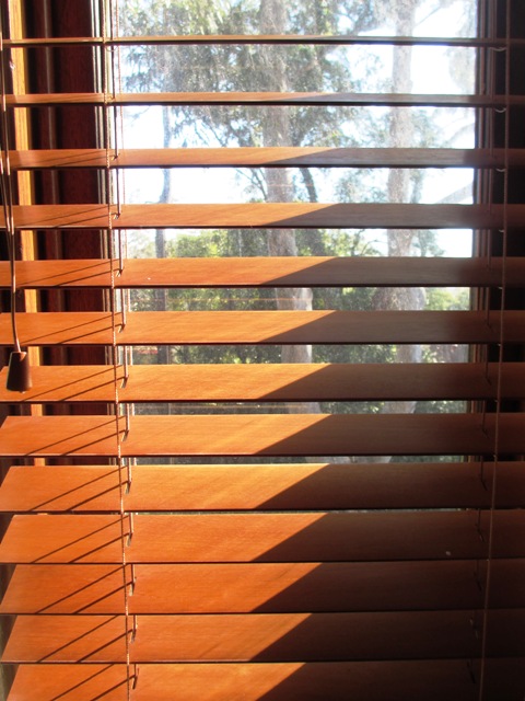
This week we're looking at repetitive shapes that range in tone from white to black - or pattern. The project this week was pretty simple and straightforward. I was supposed to look for patterns created by the interaction of light on three dimensional surfaces.. Examples of this would be light filtering through the blinds (above) or even a macro view of the texture of a wall with the play of light and dark. That also sounded interesting to me, but I found a good example of the light pattern on the blinds, so I thought I would draw that and find the pattern that the light was creating.
An interesting exercise to consider the everyday surfaces around your house and examine them closely to find interesting patterns. There are many interesting inspirations for future drawings when you view your immediate environment in this way. I enjoyed this weeks task !
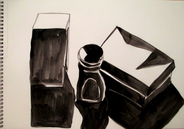
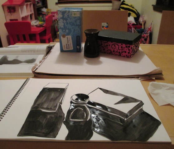
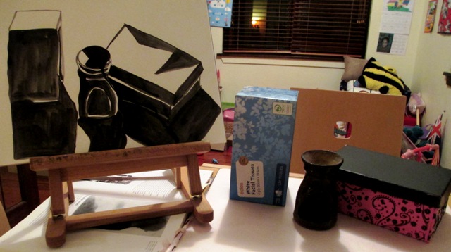
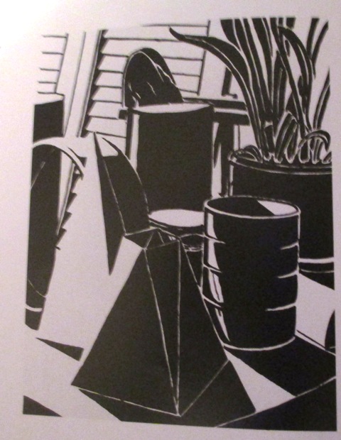
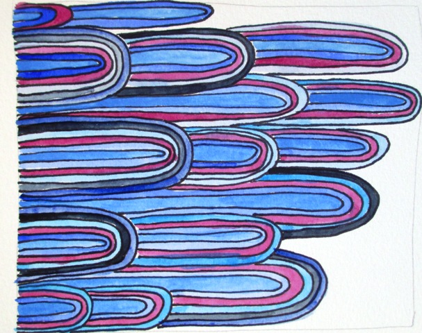
This week we're exploring the interplay of black and white shapes to create these high contrast values and strong tonal juxtapositions to create an expressive visual impact. This is done by setting the blackest shapes against the whitest negative shapes to create a visual exaggeration. So the activity was to use black ink and paper and draw a still life. You needed to have strong directional lighting to create the bright highlights and deep shadows. I needed to analyse the positive and negative shape arrangements and used the brush (a round watercolour brush) to create the black shapes against the negative white space. It was an interesting and enjoyable analytical exercise. I like the overall effect of this high contrast style of drawing. Below is an example of another student drawing from the textbook to show the style I should be aiming for in the exercise.
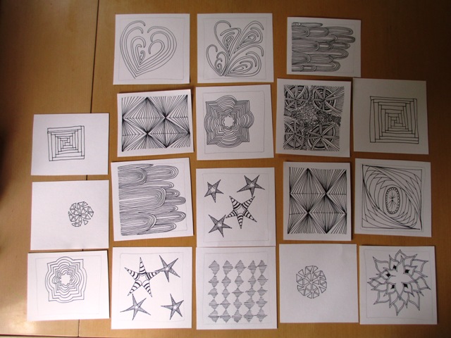
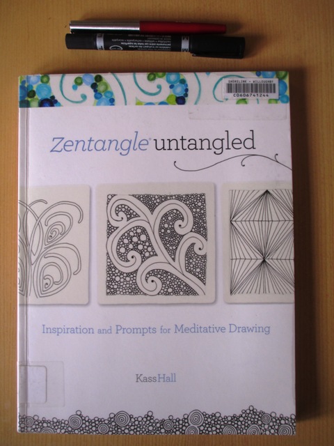
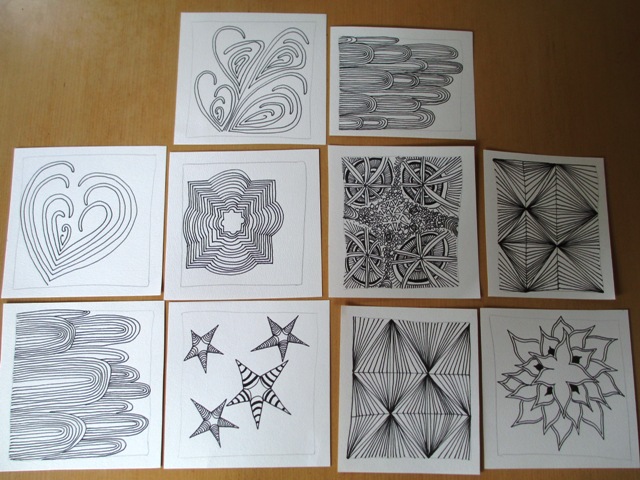
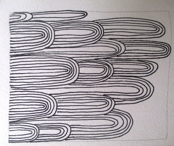
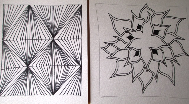
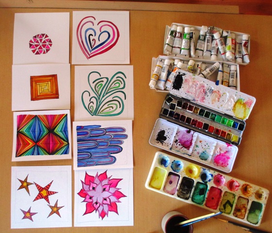
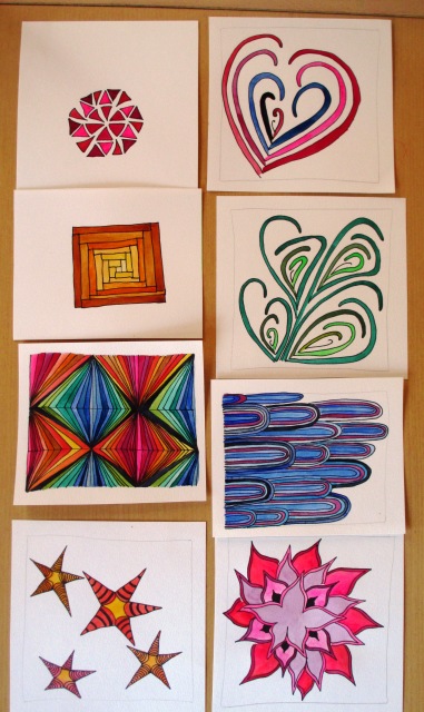
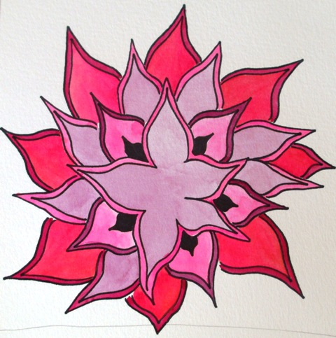
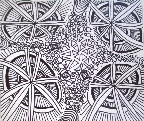
So this week is a bit of a diversion from Smagula and his Creative Drawing course. I borrowed a book from the library art section that happened to catch my eye called "Zentangle Untangled" by Kass Hall and decided to have a go at some of the Zentangle exercises. Well, everyone knows how to doodle, but it seems someone has renamed and rebranded this idea into a type of philosophical movement called Zentangle, which is quite interesting ! So it's now used as a meditation technique, the idea being that using repetitive line work to create patterns helps you get into a meditative, fully relaxed state of mind. You can do courses in this, become a certified Zentangle teacher and buy your own Zentangle kit ! Well someone had a good business idea - wish I'd thought of it !www.zentangle.com Well... I wont get too carried away, but I really enjoyed having a go at these doodle patterns. The instructions in the book were very easy to follow and much easier to do then they look.
Was the experience meditative? Yeah I suppose so.. It was certainly relaxing and I spent the best part of a day last week doing the black and white versions, then another few hours another day colouring them in with watercolour paints.
|
AuthorSacha Grossel is a practising Visual Artist from Australia. Archive
February 2019
Categories
All
|

 RSS Feed
