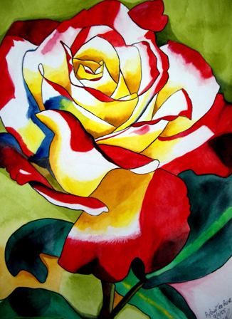
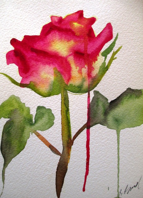
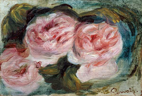
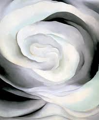
The Autumn weather has arrived in Sydney with the mornings and evenings noticeably cooler in temperature. Roses bloom well into Autumn and the Hybrid Tea Rose is the most popular variety of rose. Hybrid Tea is a classification for a group of garden roses that has been crossbred. It has been the world's most popular type of rose for the past one hundred years. The Hybrid Tea roses typically produce only one blossom at the end of a stem, rather than a cluster, such as with other rose varieties. These flowers have been cultivated in almost every colour except for blue. I can see why the Hybrid Tea rose is the world's most popular variety of rose. They come in such an amazing variety of colour and the way the two hybrid colours blend into each other on the petals is marvellous to observe and try to paint. Below is an Impressionist painting of Three Roses (left) by Renoir and on the right is a modernist painting by Georgia O'Keeffe of "Abstraction of White Rose" (1927). I'm very interested in exploring the abstraction of nature in the flower forms, so the modernist style appeals to me so much more than Impressionist flower styles..
0 Comments
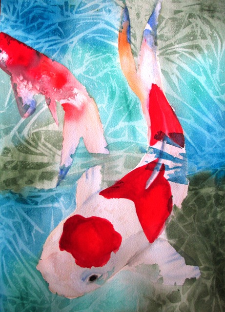
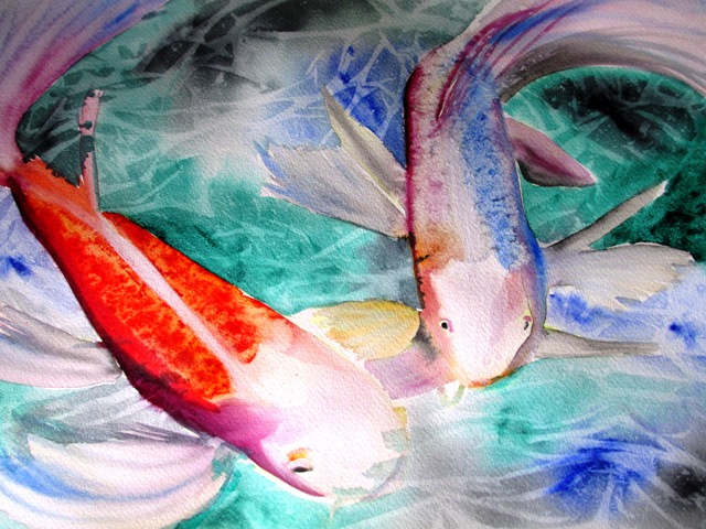
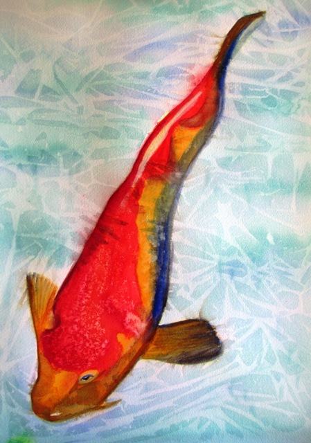
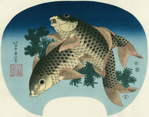
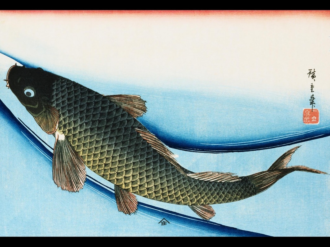
The word "Koi" is used in the west to describe the variety of carp - a freshwater fish - that the Japanese refer to as "Nishikigoi". It is an ornamental type of domestic carp. Japanese Koi art originally took inspiration from Chinese carp art, as the carp is said to physically resemble a dragon - a symbol of strength and endurance in China. Carp are a popular motif in Chinese art. In Japan, the carp represents good luck and good fortune. It is regularly painted swimming either up or downstream and these both have different meanings. It was a very popular motif in a number of famous Ukiyo-e woodblock prints - including the ones below by Hokusai - one of the most famous artists of the Ukiyo-e era. There is a lot of good information on the history of koi art here: http://hubpages.com/hub/koi-fish-art
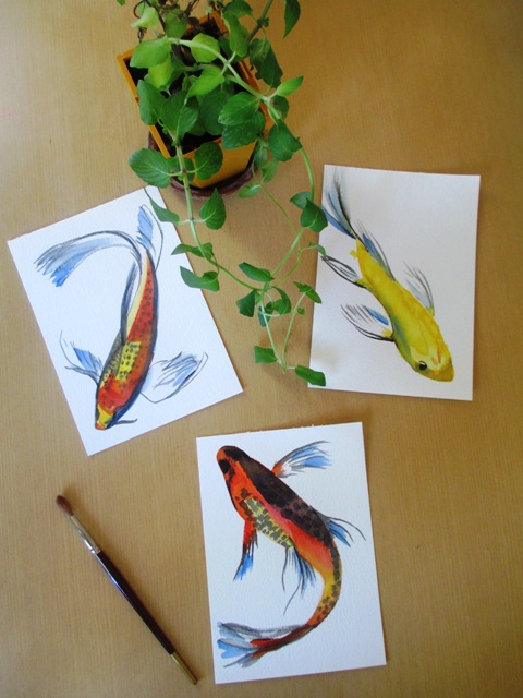
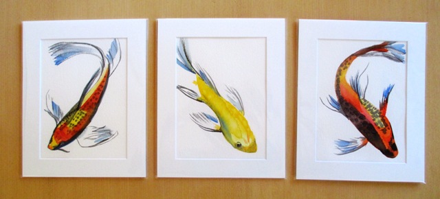
Painting the koi fish is one of my favourite subjects at the moment. I love the colours of these ornamental fish and love trying to capture their movements in simple style brush strokes such as in the simple, minimalist paintings below.
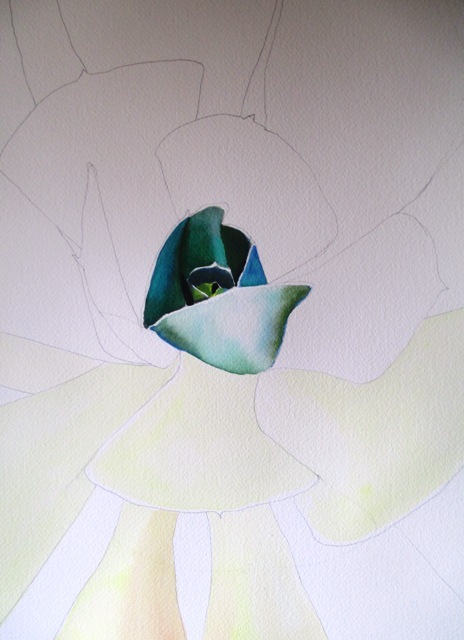
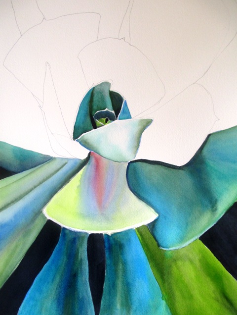
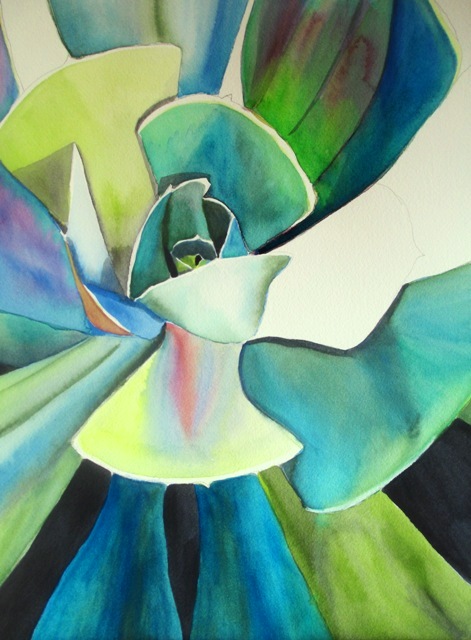
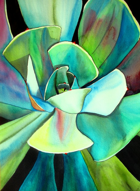
I've been wanting to paint a new succulent plant artwork for a while now. I'd painted a really interesting "Mexican Snowball" succulent plant in macro style some years ago in a beautiful shade of blue and white. The original sold and unfortunately I later could not find the high definition digital file of the painting, so am unable to offer it for sale as a poster or print ! So this is my attempt to rectify the situation. This succulent is slightly different to the Mexican Snowball. It incorporates more greenish tones. The first step was to draw the shapes of the plant. I usually like to start the painting at the most detailed part of the plant - usually in the middle - and work outwards. The fleshy leaves (not sure of the correct name in succulents..) have used colour combinations, mostly in layering effects , of Art Spectrum lemon yellow, sap green, oxide of chromium, Pthalo Green, Tasman Blue and a Windsor and Newton brand turquoise. In certain sections for highlights I've also used Art Spectrum Flinders Red Violet and Payne's Grey for shadows. Spectrum red was used on the tips of the leaves. The original painting is 29 x 42cm (A3 size) on Arches Medium 300gsm paper. It is for sale at this present time - price is listed under "Original works for sale". It is also available as a high quality print by clicking on the photo below right.
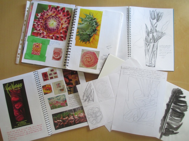
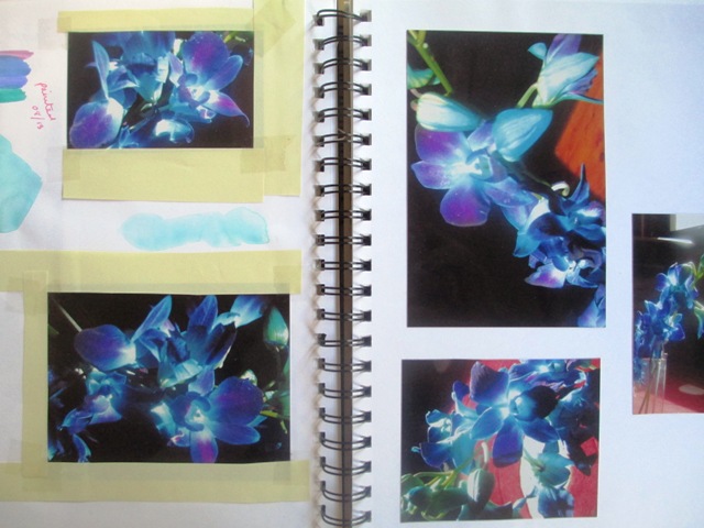
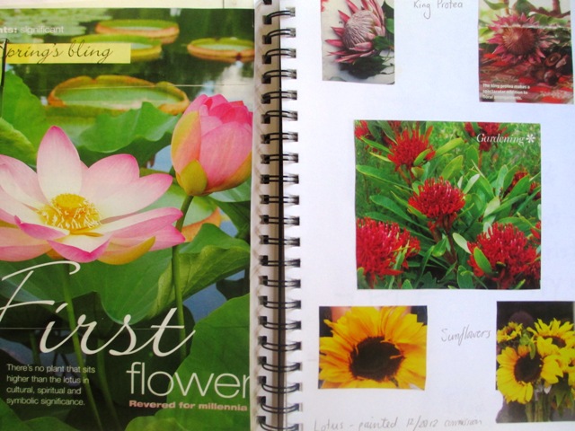
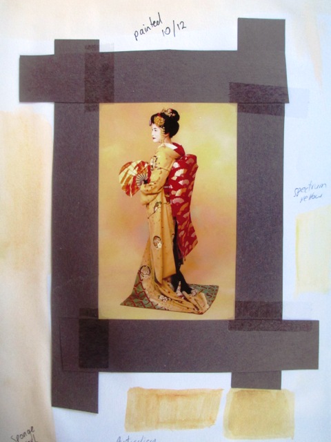
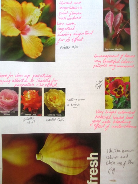
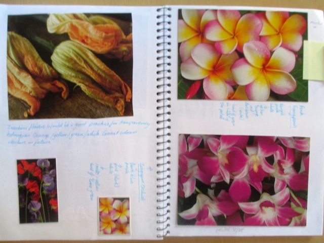
How do I get ideas for paintings ? Like most artists, I keep a visual diary. In fact this was the first step in my road to becoming an artist more than ten years ago now. Before I even put paint to paper, I had started collecting "inspirations" and pasting them into a visual diary with captions. The main reason to keep a diary (I have several full ones now) is basically to remember any ideas I have for future use, to make notes on developing these ideas so that I can come back to the ideas later, to think about the process of what I am doing - I tend to make a lot of notes about the colour of things and what layers of colour I can sense in the image and to experiment with composition of images before I paint them. I also make notes on the line, form and shape of images. I also write my opinions on other artists works that have captured my attention and try to note why I like their work and why their work moves me to include it in my diary. So my diary is basically made up of: -cuttings from magazines / old calendars - mostly flowers / fruit and geisha - quotes - cuttings or greeting cards by other artists I admire or who are doing things I aspire to - Newspaper articles on other artists I admire - ideas jotted down - sketches - test colours - photos of flowers from different angles comments, opinions and ideas for the future Some artists - more illustrator types - spend a lot of time on their diaries, which are fascinating pieces of decorative artworks in themselves, however, mine is more of a practical usage diary that I use as a reference. You can see some examples above and below where I use it to experiment with composition, colour and collect reference pictures for my paintings...
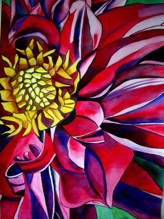
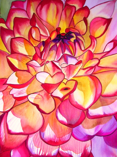
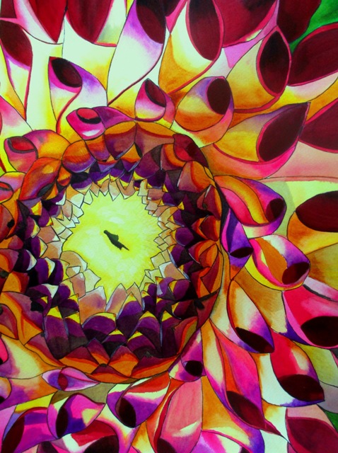
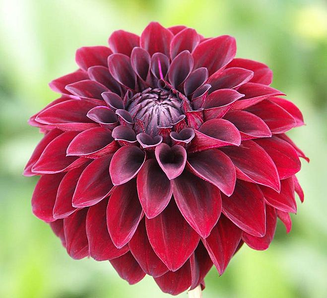
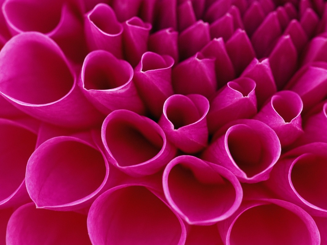
Dahlias are bushy perennial plants native to Mexico - in fact they are the national flower of Mexico. They are predominantly found in Mexico, Central and South America.. They are found mainly in mountain ranges and grow naturally in climates that do not experience frost, but have plenty of sunlight. There are nine different flower types, each characterised by different petal structures and formations. I find Dahlia flowers fascinating to paint. The petal structure is so intricate and beautiful. A lot of the modern macro photography of the Dahlia flowers have really influenced my macro style of painting them. The Dahlia painting on the upper left was one of my earlier paintings - I quite like the off centre section approach to painting in macro style - it leaves your imagination to fill in the space around the flower to envision the whole flower from just a section. All three Dahlia paintings took the longest to paint out of all the different flower styles I have painted due to the detail involved in each petal. They are very popular flowers of mine and the originals all sold very quickly. They are all available as poster prints or canvases. You can click on the pictures for more details. Below - some examples of the styles of macro photography that have influenced my Dahlia paintings.
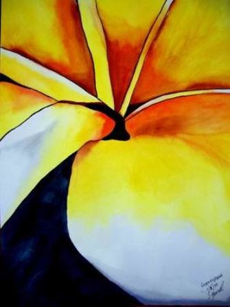
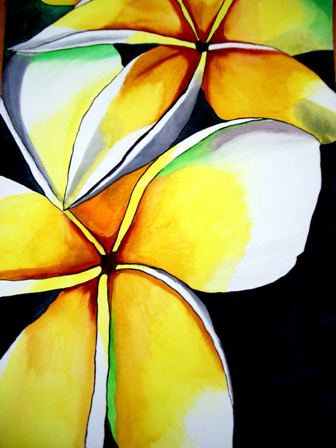
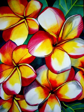
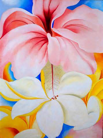
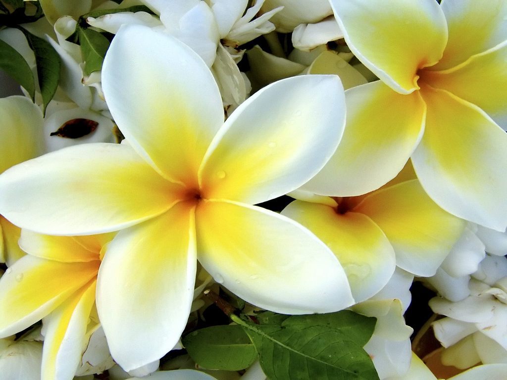
We have a large Frangipani tree in our front garden and you always know that Summer is well and truly here when these beautiful flowers start blooming to make you feel like you could possibly be living in a tropical region of the world. Their proper scientific name is Plumeria and these flowering shrubs are native to Central America, Mexico, The Caribbean and South America. They can be grown in any tropical or sub tropical region. The common name Frangipani comes from the sixteenth Century when an Italian Marquee invented a Plumeria scented perfume and named it "Frangipani". The flowers are most fragrant at night to lure moths to pollinate them. Frangipani flowers are popular in Pacific Island nations and in Polynesian cultures for making leis. Also the flower can be worn by women to indicate their marital status. My paintings of the Frangipani flowers were all painted quite a few years ago now. They are one of my favourite flowers, so I really enjoyed painting their simple form . The macro style Frangipani on the left was painted for a friend's birthday present and the other two originals sold very quickly, as these are very well known and popular flowers. They are all available for sale as prints, just click on the pictures and it will take you to the link. Below is Georgia O'Keeffe's "Hibiscus and Plumeria" 1930 painting. This was the only painting of Frangipani that I could find of hers.
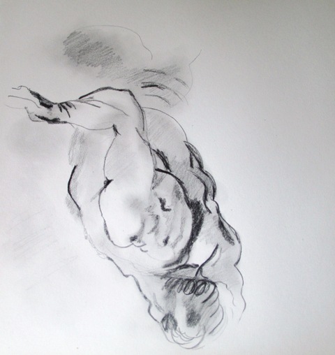
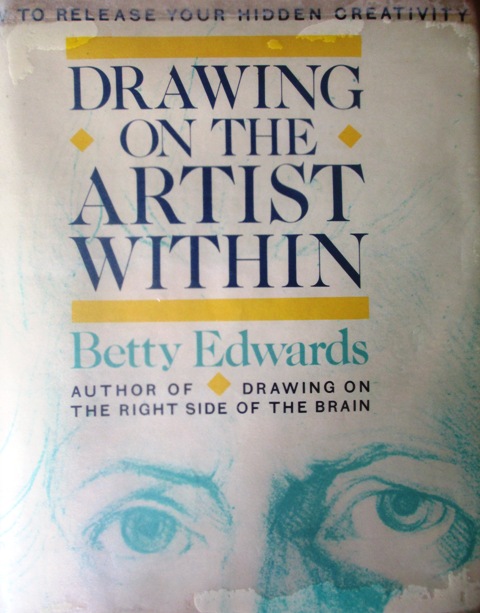
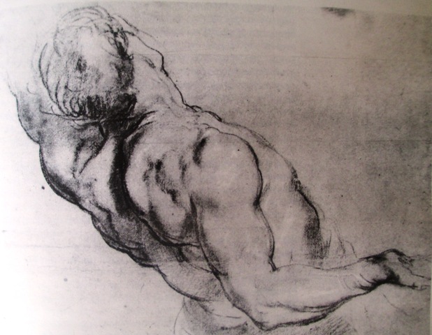
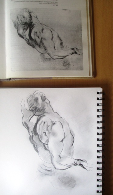
So to start the new year, I've borrowed a book from the library by Betty Edwards called "Drawing on the Artist Within". I've already worked through her other brilliant book "Drawing on the right side of the brain" and have dipped in and out of her book on colour theory. This book is less practical than her first book and delves much deeper into the theory of what happens to your brain and mind when you enter a creative mode or right brained mode. It's super interesting and she uses a lot of research from various philosophers, scientists and psychologists to try to explain how creative people think and how to awaken your own creative consciousness. So to get back into the drawing mood, I've done a couple of simple exercises she recommends just to practise getting into that creative Right Brained mode. I've copied two drawings from her book - the first :"Study of a nude" by Rubens and the second a drawing by Matisse. The drawings in the book were upside down and I drew them upside down - essentially drawing them following the lines and shapes without knowing what I was drawing. The drawing above is my upside down Rubens.
Above left is the original Rubens right way up and above right is my upside down drawing turned right way up. It always kills me doing these exercises because I don't generally draw figures or portraits and I actually have real difficulties with proportion when drawing people, so it's actually subject matter I usually shy away from drawing.. but when I do these upside down drawings, the proportions seem mostly accurate and it looks like I've been studying figure drawing for years and years !! As Betty Edwards quotes from philosopher Michael Polanyi "We know more than we know we know." We all know proportions in drawing and we all know what bodies look like, it's just a matter of tapping into this knowledge and to be able to draw what you perceive, not what you think.
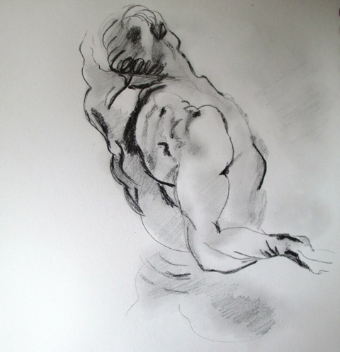
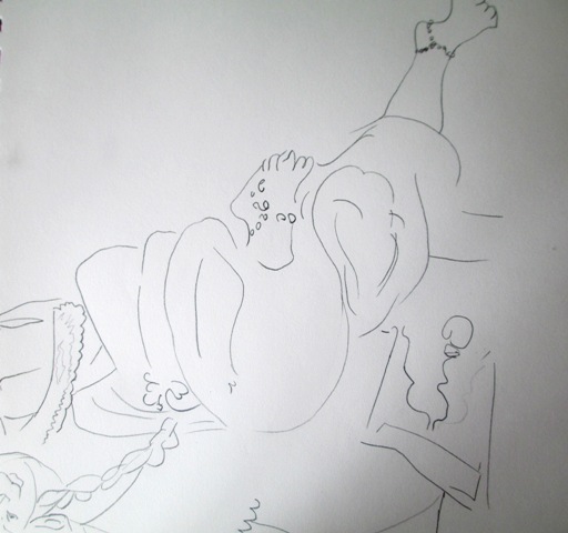
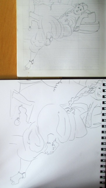
A similar upside down activity with the Matisse drawing (above).
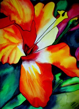
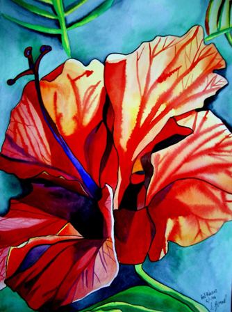
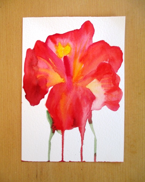
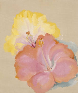
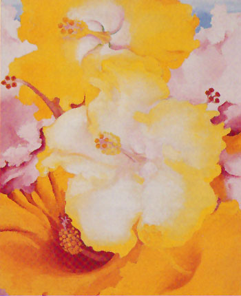
Hibiscus is a genus of flowering plant with several hundred species. The flowers are large and trumpet shaped with five or more petals and colours ranging from white to pink, red, orange, purple or yellow. Hibiscus are native to warm temperate, sub tropical or tropical regions of the world. They are the national flower of South Korea, Malaysia, Haiti and the state flower of Hawaii. Hibiscus are traditionally worn by Tahitian and Hawaiian girls in their ears - left ear if you're married or right ear for singles. Hibiscus are one of my favourite Summer flowers. We have a plant in our backyard that produces huge crimson red coloured Hibiscus flowers every year around Summer. They are just so beautiful and dramatic - you can't help but notice them when they are in bloom. The Orange hibiscus painting on the left was one of my earlier paintings and really inspired my love of painting tropical flowers for the large petals where the colours can be blended in various effects. The Red Hibiscus painting in the middle is one of my favourite paintings for the way I was able to capture the light and translucency of the petals. The blue and purple highlights also worked very well to contrast with the orange and red. The small Hibiscus painting on the right was a bit of an experiment to see if I could capture the essence of the flower in a very quick painting style. Below are three paintings by Georgia O'Keeffe of Hibiscus flowers painted around 1939. I like the one on the left the best. I actually think watercolour is a better medium for these flowers, as you can use the effects to create a lot of interest in the petals with this medium, whereas the oil or acrylic paintings don't really bring out the dramatic nature of the flower as well.
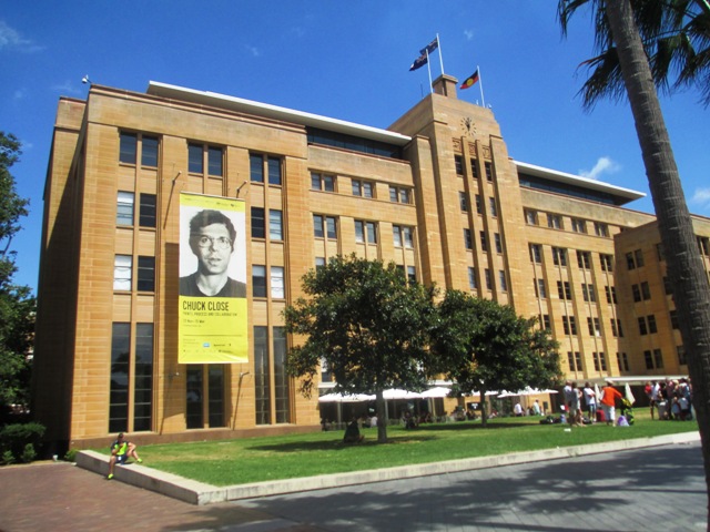
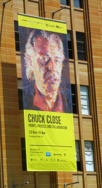
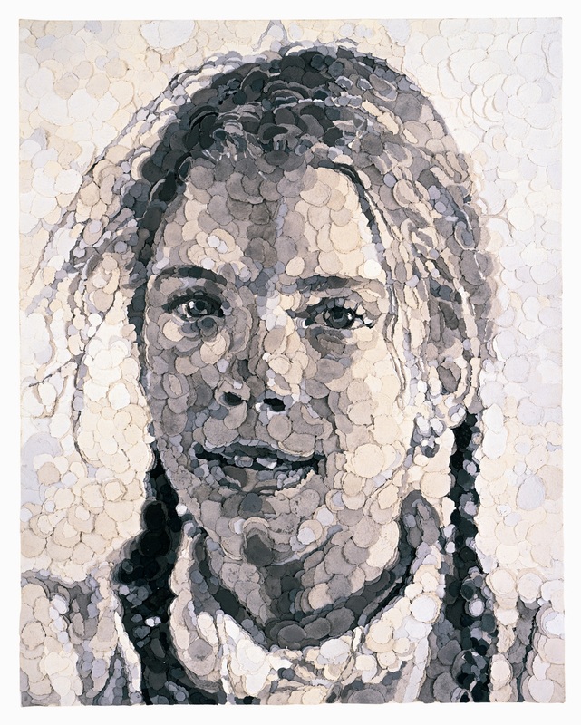
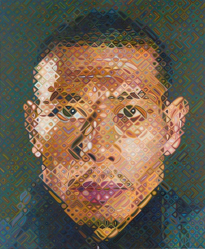
I was really only familiar with American Chuck Close's large photorealism airbrushed portraits, such as the famous one titled "Bob" which has been used on the banner to advertise this exhibition (above left). I wasn't expecting to be quite so enthralled and blown away by the genius of this artist's explorations of portraiture. The exhibition of his large scale photo based portrait paintings is currently being held at the Museum of Contemporary Art in Sydney. It's a great venue for modern art - large rooms, high ceilings - perfect for large paintings and installations. I took my kids along, as I thought that the theme of portraits might be fairly accessible for them, and they actually got a lot out of the exhibition and really enjoyed the "kids corner" activities related to Chuck Close's work. They spent ages in there drawing their own grid style self portraits and adding them to the kid's gallery. What I learnt was that although the theme of photo based portraits has not changed, Close's exploration of various techniques to produce these portraits has been very innovative and experimental over the years.
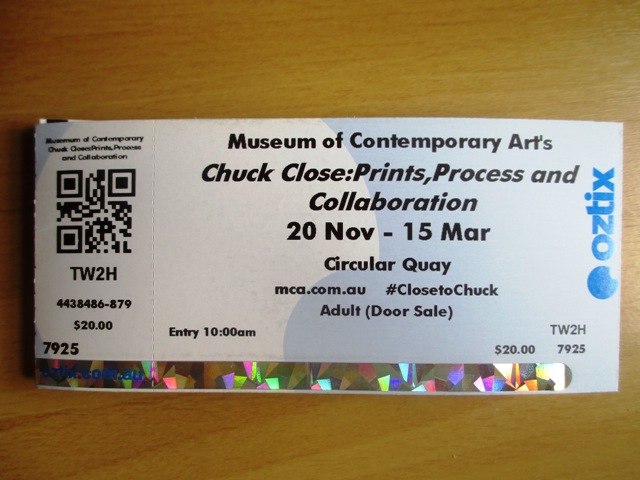
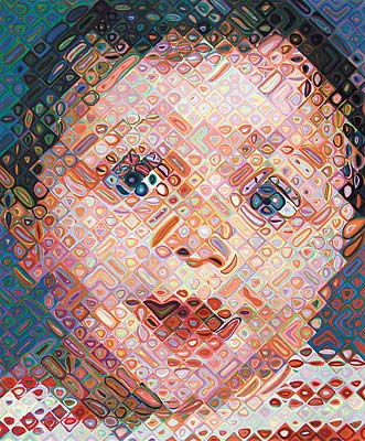
Various drawing and painting techniques that he has used over the years to create these portraits have included: ink, graphite, pastel, airbrush, watercolour, conte, finger painting, stamp pad ink, printmaking, etching, lino and woodcuts, silk screen, hand made paper collage, rags, tapestries.. Above left is an example of collage work made from left over rag pulp squeezed into round discs in various shades of grey. The best part of the exhibition was detailed descriptions and examples of his technique of using gridded photographs and applying shades of colour or greyscale one stroke after another methodically in the grid cell by cell. There was also a lot of technical descriptions and examples of his printmaking process and examples of his portraits in various stages of completion. I found it really fascinating ! Below you can see a close up of each cell of the portrait - just abstract shapes, but from a distance, the whole portrait is recognisable - really genius and amazing ! I thoroughly recommend this exhibition of Chuck Close for people of all ages including kids. I found it fascinating ! 5 stars ! On at the MCA Sydney until March 2015 http://www.mca.com.au/exhibition/chuck-close-prints-process-and-collaboration/ 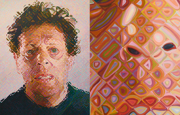
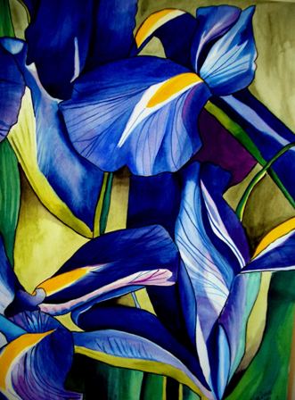
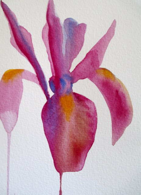
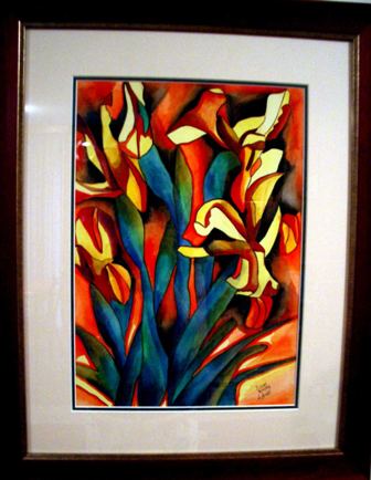
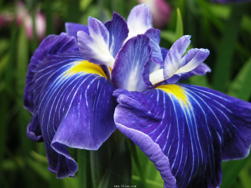
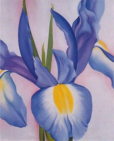
As we've approached Summertime in Australia, it's time to focus on those flowers that bloom during this warm to hot season. The Iris is a species of flowering plant with showy flowers in a variety of colours. It's named after the Greek word for rainbow. These are popular garden flowers, the most popular being the bearded Iris, which blooms primarily in the Summer months. The Iris is found natively in the Northern hemisphere zones, mostly in Eurasia and Asian countries. They are predominantly found in dry areas. I've painted a few artworks of this beautiful and popular flower. The two on the left were painted from photos and the originals have sold. The Blue Iris on the left is actually one of my favourite paintings that I've done. The framed one on the right currently hangs in my dining room - is not for sale at the present time - and was painted from a bunch of Irises in a vase. Prints of these artworks are available here and here.
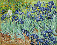
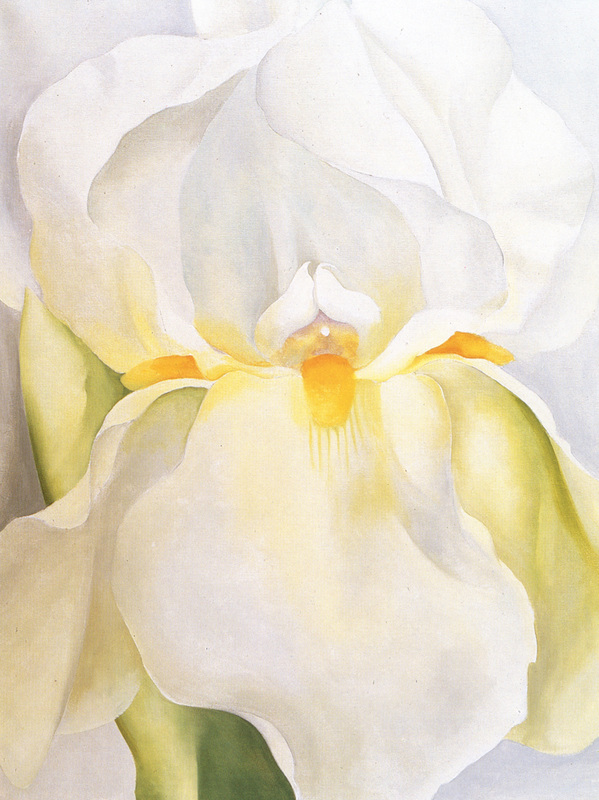
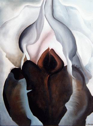
The Iris has been a popular subject for famous painters and artists over the years. Vincent Van Gough painted this artwork of a field of "Irises" in 1889 above on the right. Georgia O'Keeffe also painted a number of Irises, mostly in the 1950s. Below are three of her Iris paintings - "White Iris no.7", "Black Iris" and "Lavender Iris"
|
AuthorSacha Grossel is a practising Visual Artist from Australia. Archive
February 2019
Categories
All
|

 RSS Feed
