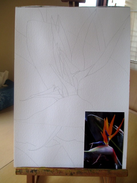
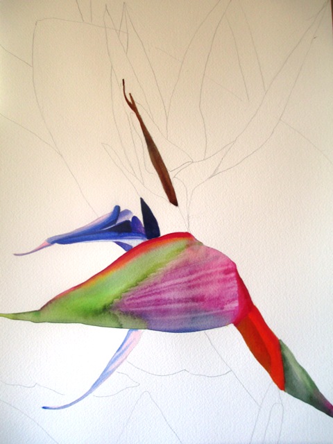
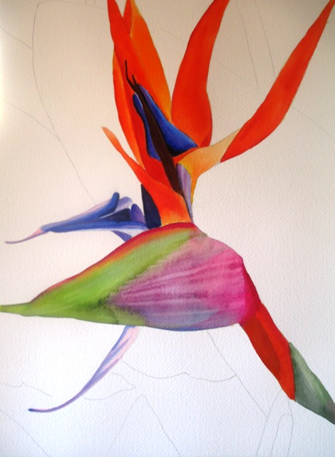
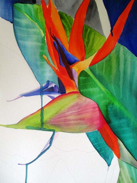
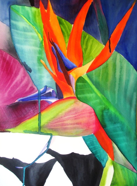
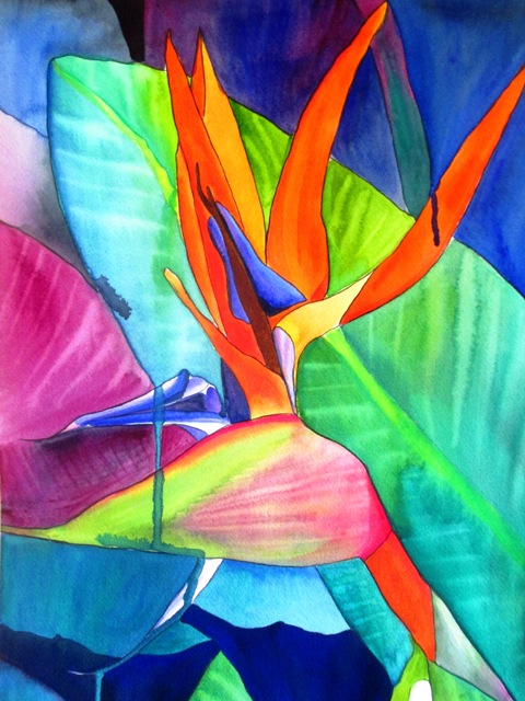
The source photo for this painting was a photo I took of this striking flower in my backyard a couple of years ago. I'd always meant to get around to painting it, but kept getting side tracked by other projects. The official name for this flower is a Strelitzia. The first step was to do a pencil sketch of the outline of the distinctive shapes that make this flower seem bird like. The orange and blue parts of the petals needed to be very bright and striking, as it is in real life - the type of flower that really needs to stand out and be noticed ! It didn't take long to paint the main central flower, but in this painting, the negative space, or background was also quite important, as it actually takes up about half of the space on the page. The actual photo has a dark, dull green background, but I preferred to bring out more blues and purples as well as the main green leaf, as I thought the blue would really make the orange stand out vividly. The shade of bright electric blue in the background gives it a more surreal quality and I think makes the painting look more flat or abstract, as the background is almost as bright as the foreground - almost like a stained glass art painting. I painted the background in segments, which is what a glass painter would presumably do.
0 Comments
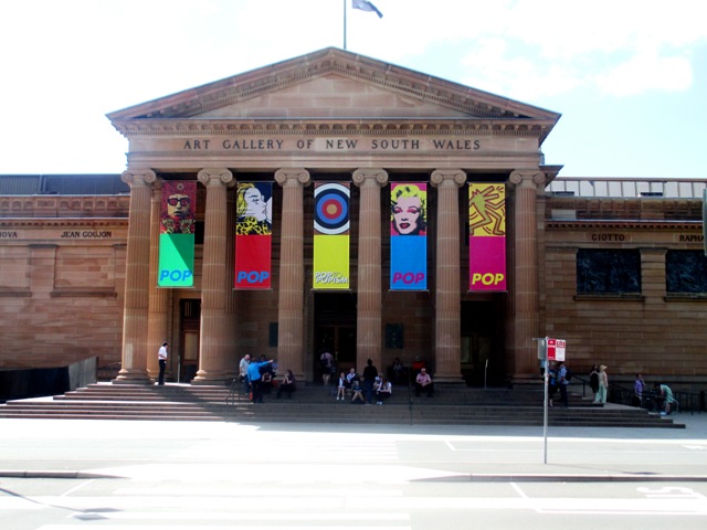
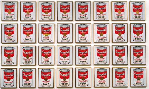
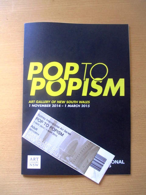
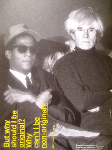
So I took myself along to the Art Gallery of NSW for the "most extensive exhibition of Pop Art ever showcased in Australia". Being a big fan of popular culture and the Pop Art movement, it was exciting and very informative to have this retrospective exhibition on in town. At the entrance was large sign with Richard Hamilton's famous definition of Pop Art, being that Pop Art is: popular, transient, expendable, low-cost, mass produced, young, witty, sexy, gimmicky, glamorous and Big Business. This idea has very much influenced my Juicy Hues design store - a gift shop full of brightly coloured, fairly expendable designs that aim to capture the essence of what is popular for the mass market. The exhibition was divided up into sections according to various groups and time frames, such as the American artists, focusing more on mass media / fame and consumerism ideas, the Euro pop and British pop artists, focusing more on post war notions and more political or social ideas and the Australian artists, some of whom were trying to make social statements, a lot of collage work some more commercial artists. It was interesting that a lot of the pop artists had backgrounds in commercial or graphic art. It was satisfying to see a good representation of fairly famous works from the most famous pop artists. Andy Warhol was well represented from early work such as Elvis and Marilyn prints, his Campbell's soup cans were on display, through to his Mao prints and ending with his collaborations with Basquiat and one of his last self portraits. Other famous artists on display include Lichtenstein, Rosenquist, Martin Sharp...many others... There was even a cool "pop café" where you could buy caramel popcorn and various other drinks and fun treats and a game of pop twister that you could join in with. I tried to restrain myself in the "pop shop" and only bought a small book of Andy Warhol quotes, though I was seriously considering the blow up pink flamingo !! If you live in Sydney, the Pop to Popism exhibition is on until March 2015.
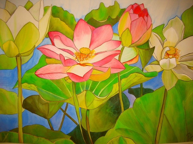
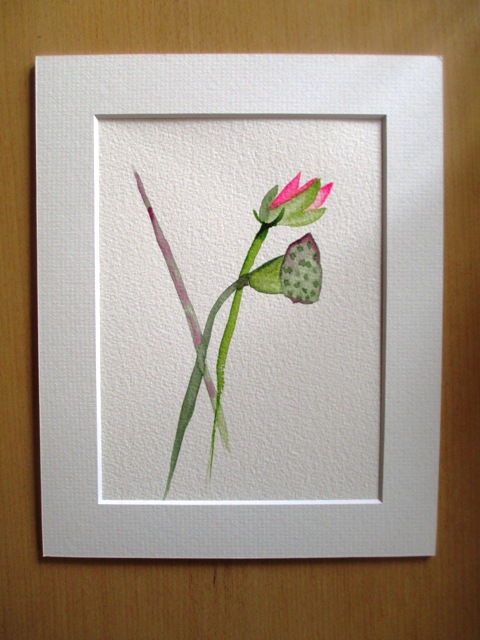
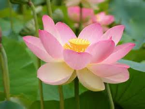
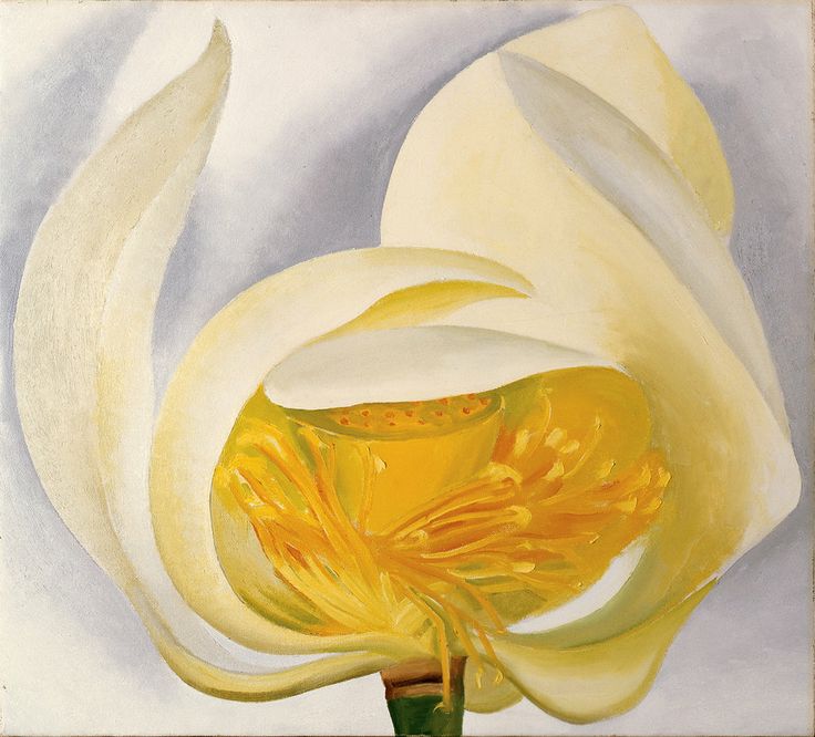
The Lotus flower, or Nelumbo Nucifera is one of two species of aquatic plant in the family Nelumbonaceae. This flower is native to Tropical Asia and Northern Queensland, Australia. It is also the national flower of India and Vietnam. In India, the lotus is symbolically associated with purity and non-attachment. The lotus is often confused with the Water Lily plant, but in fact they are practically unrelated. . The roots of the lotus are planted in the bottom of the pond and the leaves float on top of the water surface or are held above it. The flowers are found on thick stems rising several centimetres above the leaves. An individual lotus can live for over a thousand years. Lotus roots are often used in Asian cooking. My painting of the Lotus flower above left is one I did for a commission a couple of years ago. It's quite a large A2 size painting and I was trying to capture the tropical greens and unique shape of the pink petals. The petal shape of lotus flowers are more rounded than Water Lily flowers. I use this painting design as the logo for my facebook fan page, website title page and gift shop storefront, as I think it's a good representation of my style. The painting on the top right is more of a minimalist version showing the seed pod/ fruit of the plant. These paintings are both available as prints here and here. Below right is a painting of a White Lotus by Georgia O'Keeffe (1939). It shows the centre of the flower hidden and protected and pure.
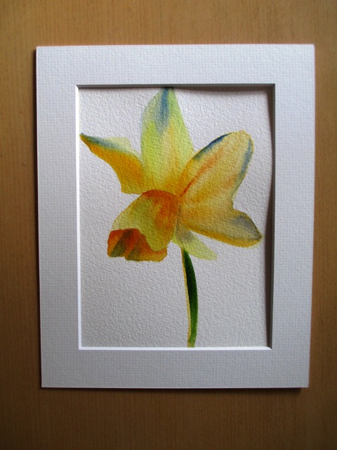
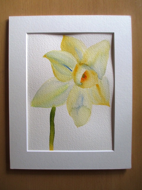
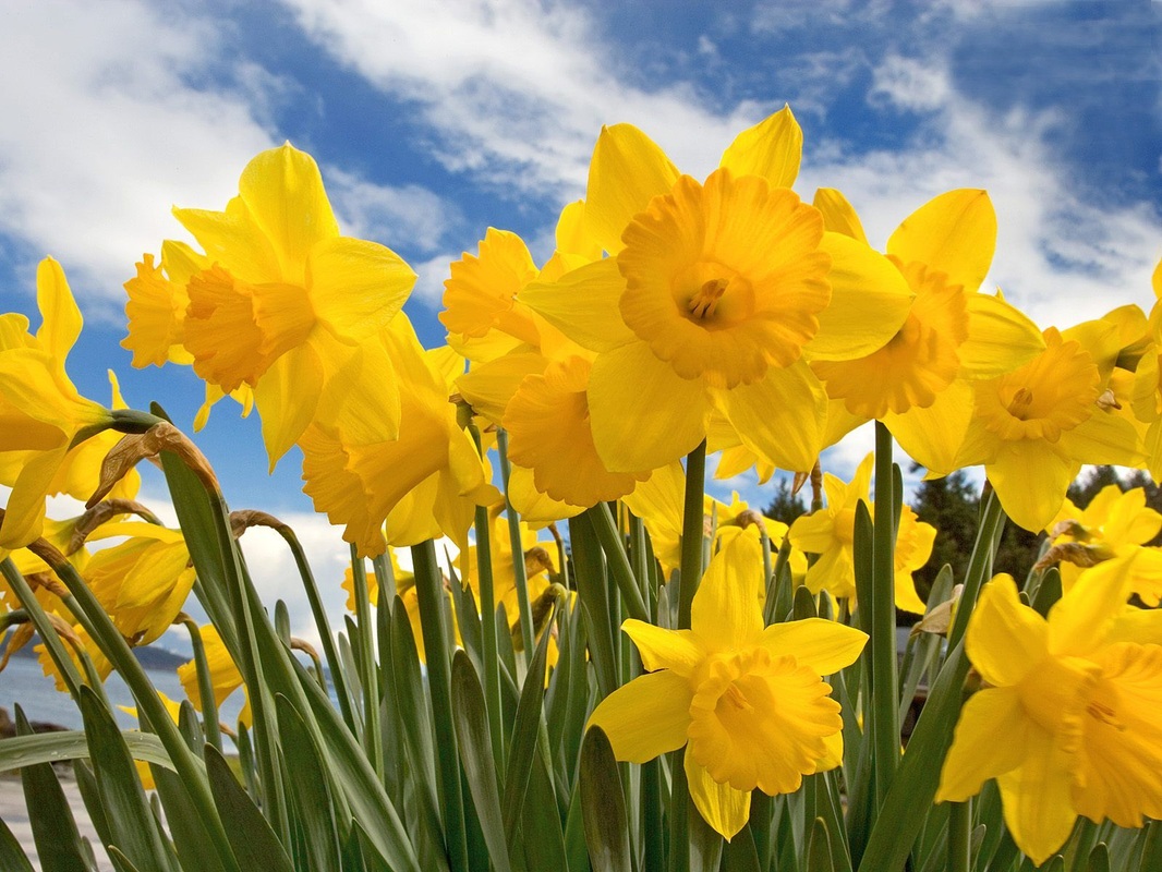
Narcissus is the genus name of this hardy bulb Spring flowering plant. Common names include Daffodil and Jonquil. Narcissus flowers are brightly coloured, generally yellow or white and consist of six petal like tepals surrounding a trumpet shaped corona structure. These flowers are native to meadows and woods in South Western Europe and North Africa. They are popular symbols of Spring in many countries. Above are two small A5 sized paintings I did recently of Daffodils in a quick, fluid style, trying to capture the colours and essence of the flower. I think the simple structure of the petals lends itself to a more simple and fluid rendition of the flower. These are both available in larger sized prints here and here. Below is a painting titled Jonquils #3 by Georgia O'Keeffe. She has chosen to paint a bunch of the Narcissus flowers showing their pale yellow colouring. Her picture is more detailed than mine and I like the way she has used the green / blue colour for the tonal component. 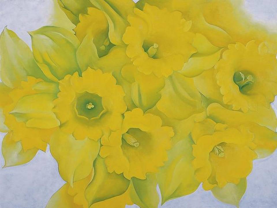
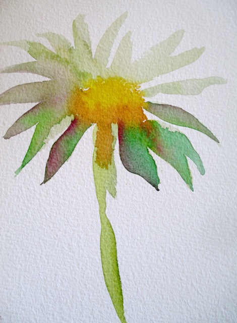
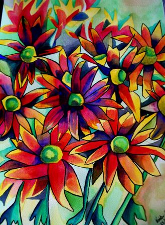
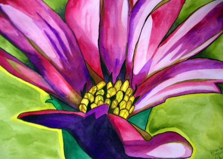
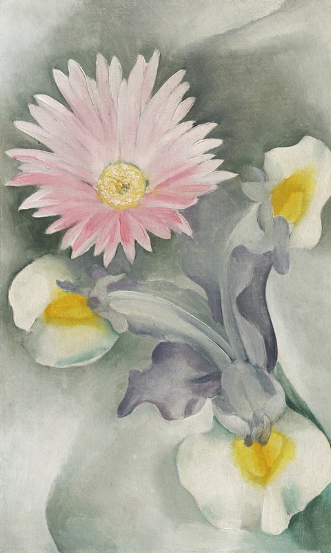
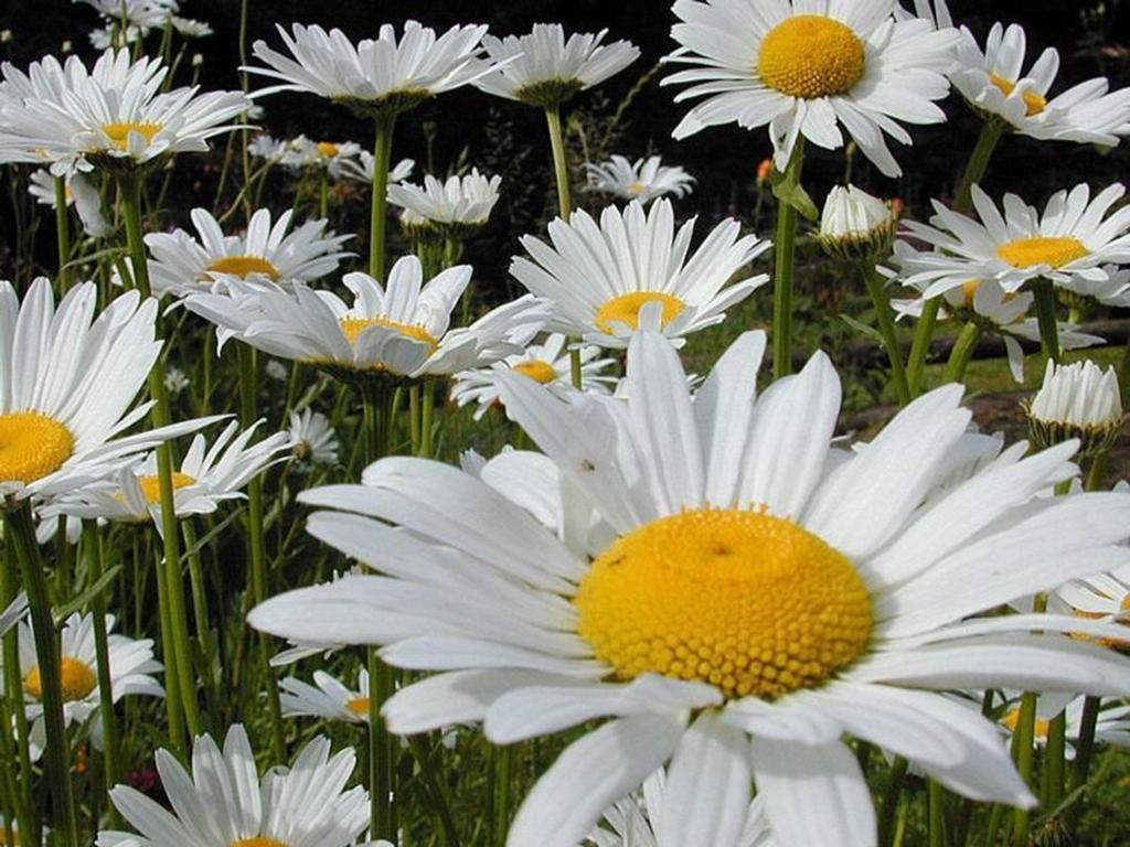
Still celebrating Australian Spring season and Daisies are another flower that is commonly associated with Springtime. This is a very diverse type of flower with around 20,000 different species worldwide. Around 1,000 different species are actually native to Australia. The other types are mostly native to North and Central Europe. The daisy usually has white petals and a yellow centre, but can also be pink or purple in petal colour. The symbolic meaning for daisies is innocence, purity and new beginnings. The painting of the free form daisy on the left is fairly recent from my series of small paintings where I was trying to capture the essence of the flower in just a few brush strokes. The painting in the middle - Daisy Straw Flowers - is about ten years old and I really like the multi-coloured and bright colour composition. It really has a Spring / Summer feel to it. The painting on the right - African Daisy - is one of my earliest paintings and one of the first paintings to be done in a macro close focus style. Below is an oil painting by Georgia O'Keeffe of Pink Daisy with Iris 1927. I quite like the pink and grey pastel colour scheme.
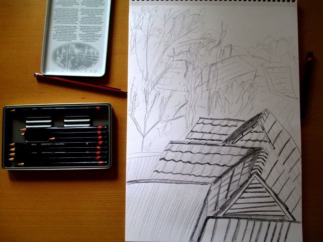
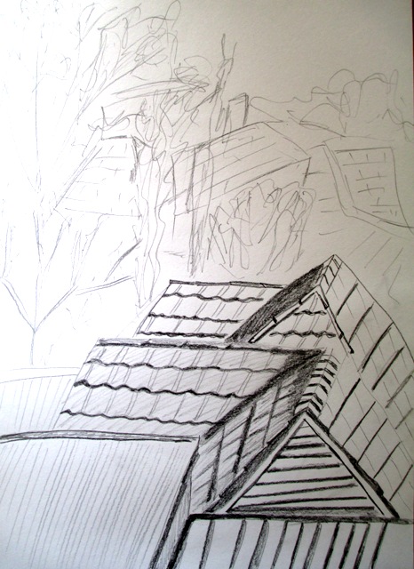
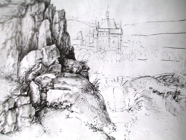
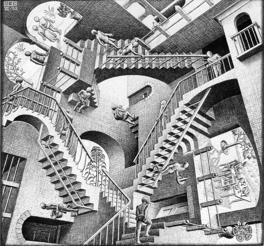
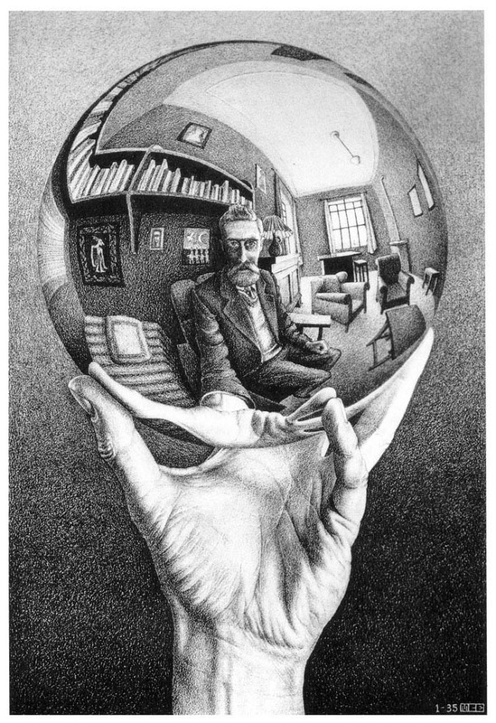
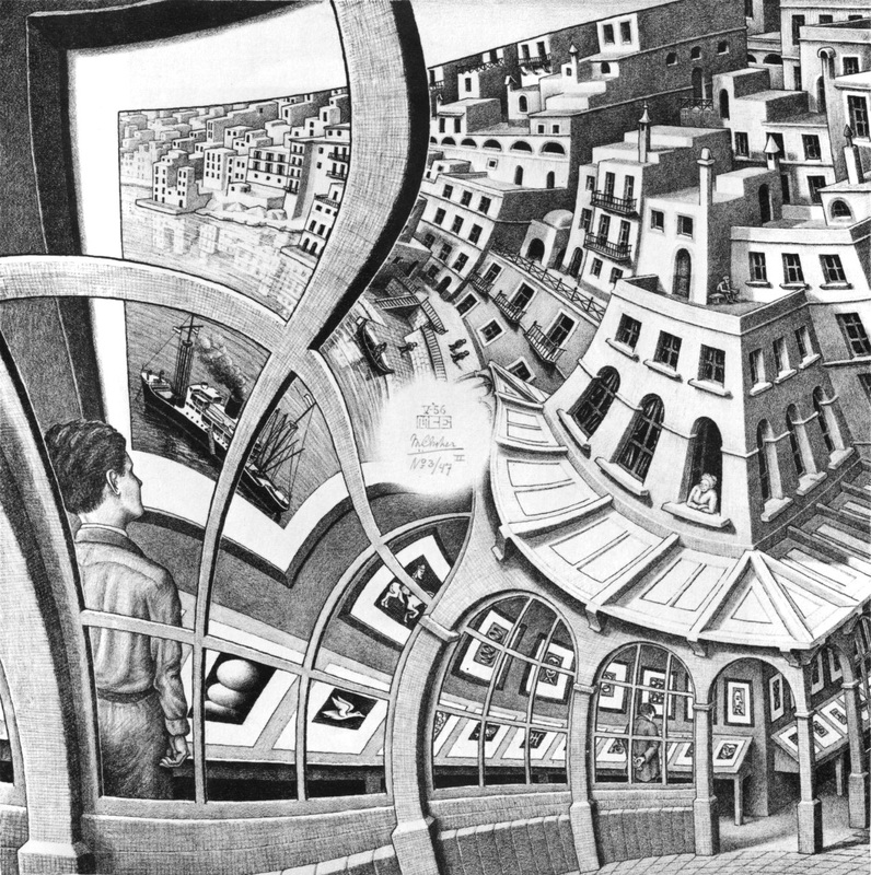
Back to my Creative Drawing course book this week and the topic is Atmospheric or aerial Perspective. This is how spatial illusions are created by controlling the sharpness and relative contrast of receding forms in a drawing (Smagula - Creative Drawing). Foreground shapes are sharper than the shapes in the background and far distance. Fairly logical concept. Albrecht Durer's Rocky Landscape (1495) on the right shows a good example of the technique by rendering his foreground rocks in a detailed, sharp manner and background castle less distinct, showing a spatial separation. My drawing is of the view out my window, showing my neighbours' roofs in the foreground in a more detailed and sharper / darker focus, and the roofs and trees in the receding background less distinct to exaggerate the illusion of depth. If I'd had more time I would have worked more on the foreground roofs to add more detail and shading etc.. but I think the point of the exercise was achieved. The last part of the chapter on perspective goes on to mention some artists that purposefully use or distort our knowledge of perspective to create imaginative and unpredictable worlds. The most famous being M.C Escher (1898 - 1972), known for creating visual puzzles and using his knowledge of perspective to manipulate and play mind tricks on us. I love mind tricks so he's one of my favourite artists !... Some examples of his best perspective illusions are below, the most famous "Relativity" (1953) with the distorted staircases...
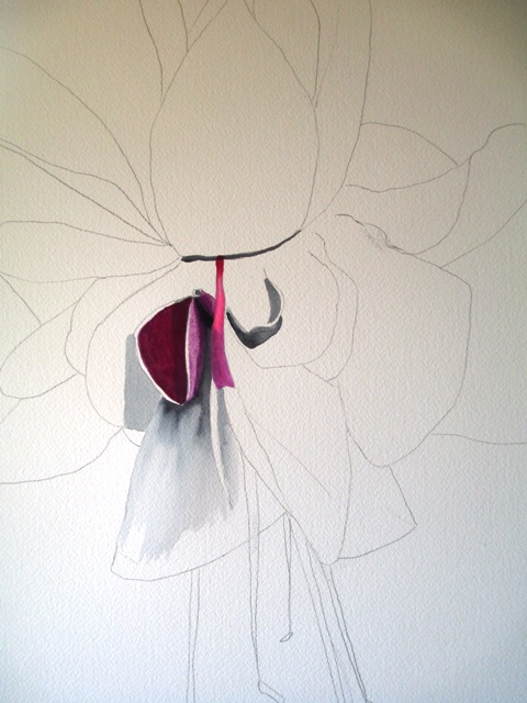
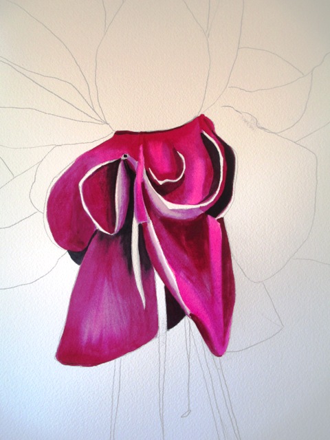
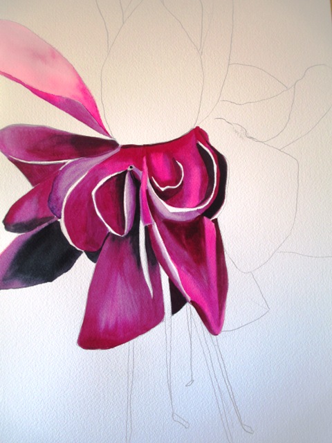
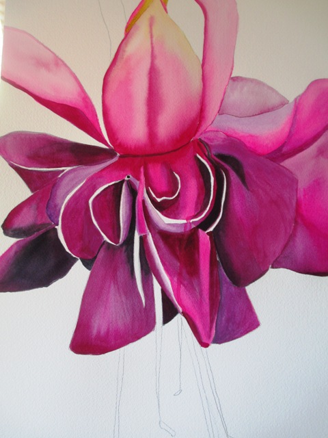
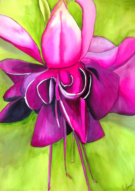
I find Fuchsias weirdly fascinating. I think they look like some sort of alien flower experiments that have not quite been able to hide themselves on planet Earth. They are a tropical flower, which might explain their way out colours and petal structures. They are native to Central and South America. The first step in my painting was to arrange the composition how I wanted it. This flower was going to be a macro style pop art flower - big and bold and pink in the centre of the page, so a pencil outline was the first step. The purples used in this painting have been Art Spectrum Flinders Red Violet and Flinders Blue violet with Payne's Grey in some of the darker sections. The pinks used are mostly Spectrum Crimson and Windsor Newton's Opera Rose. The petals were painted one by one, taking care that the colours, light and darks gave a three dimensionality to the petal shapes. The background is Art Spectrum Sap Green, but I have gone over it with a couple of layers of Lemon Yellow after it dried, as I wanted a more lime, pop art / tropical colour to the background. I'm happy with how it turned out. It looks really vibrant and a bit out there, which I think captures the spirit of the Fuchsia. This original painting is available for sale here.
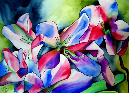
The bright pink Azalea bush outside my front door has been flowering the last few weeks with the Southern Hemisphere Spring weather, so I thought it would make a good topic for the flower of the week.
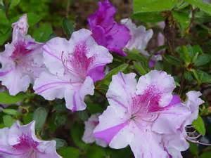
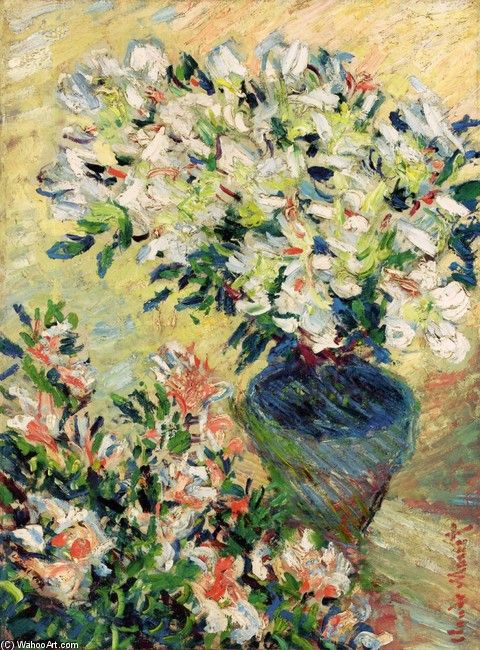
Azaleas are flowering shrubs in the genus Rhododendron. They bloom in Spring with their flowers lasting several weeks. They prefer shaded areas and like to live under or near trees. These colourful flowers are native to Asia, Europe and North America. In addition to their beauty, Azaleas are also highly toxic. In the past, receiving a bunch of Azaleas in a black vase was a well know death threat ! On the left is an older painting of mine of Azaleas (2005). I tried to capture the colourful nature of the petals. The original was sold a long time ago, but prints of this painting are available here. Gift products with this colourful design of Azaleas are available here. On the right is a painting of "Azaleas in a Pot" by Claude Monet, an impressionistic interpretation of these flowers. The Rhododendron festival in Blackheath (Blue Mountains area of NSW) is on every year to celebrate the coming of Spring to the Blue Mountains area and is on right now until the end of November. The main parade and festival stalls etc... will be on the weekend of November 1st this year. More information about the annual Rhododendron Festival here: http://rhodofestival.com.au/index.php?option=com_frontpage&Itemid=1
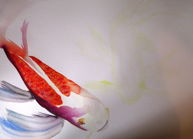
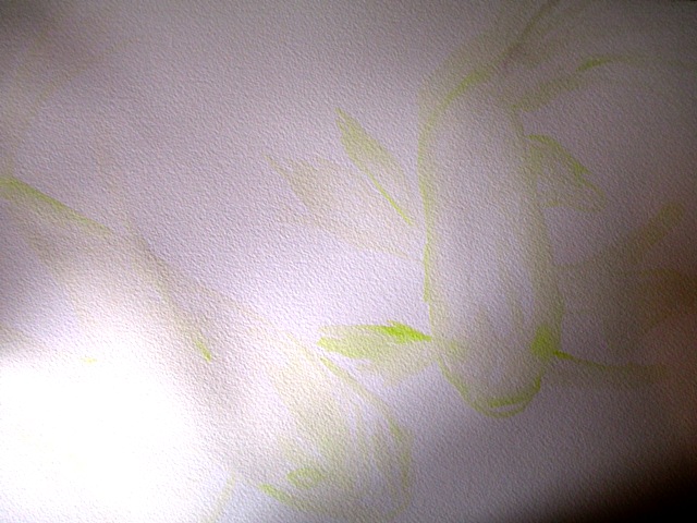
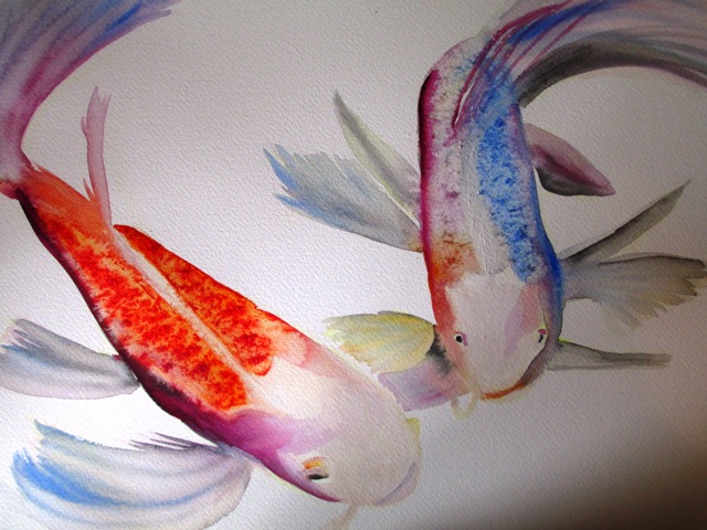
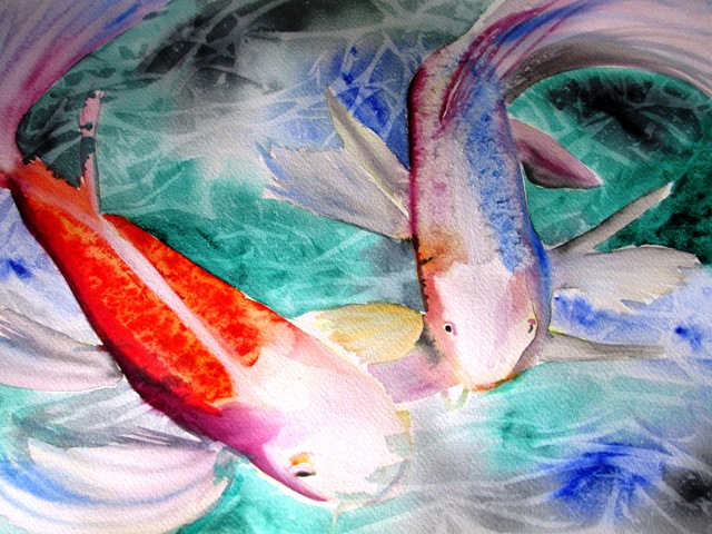
My new painting of Butterfly Koi is complete. Butterfly Koi are also known as Longfin Koi or Dragon Carp. They have longer fins than traditional Koi fish and are actually a crossbreed between Indonesian river carp and traditional Koi. Because they are not a pure breed, they are actually not very popular in Japan or Asia or among Koi enthusiasts. They are more popular in North America. So the middle picture shows my initial sketch in pale lemon yellow. Because I don't use a pencil sketch for the Koi paintings, I still need to map out the positioning of the fish on the page, so I do a very pale wash to indicate the composition. The next step in the first picture on the left is to build up the colour on the fish. From my analysis of my reference photo, I found that the fish had blue and purple running through it as well as the dark orange splotchy scale pattern and a white head. I haven't used too may different layers, as I wanted the bright colours to be very pure and stark against the white head and later the pale green pond.
I 've also used the salt technique on the orange body - sprinkling salt over the wet area and leaving to dry then brushing off creates a splotchy pattern suitable for fish scales.
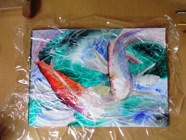
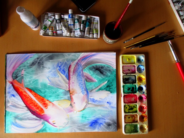
After the fish have completely dried (a couple of hours), I have painted in the watery background - first by wetting the background with plain water with a large brush, then dabbing the colour (Pthalo Green, Ultramarine Blue and Paynes Grey) onto the water which makes the colour run and disperse, then adding the cling film onto the wet background and scrunching it into a pattern and leaving it to dry completely. The pattern it creates denotes a watery background. This original is for sale here or the print of this painting is available here.
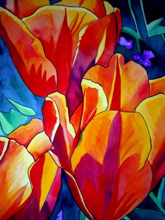
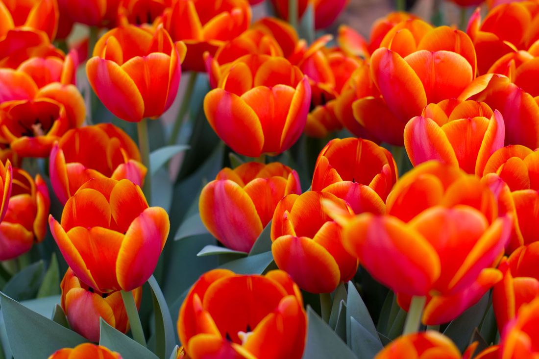
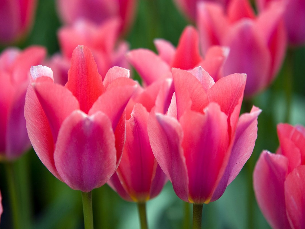
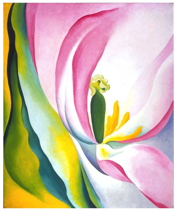
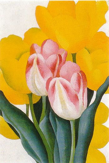
The Floriade festival in Canberra (Australia) has just come to an end this past weekend, having showcased a huge variety of Tulips, these colourful bulb flowers that bloom during September / October Spring season in Australia. Last year I was fortunate to travel to Canberra for this fantastic festival and took hundreds of photos for reference photos for future paintings. I'm drawn to the simplicity of the petal shapes and the dramatic beauty of a field full of tulips, such as in the middle photo above. Tulips are a Spring blooming perennial bulbous plant with showy flowers. Most tulips produce only one flower per stem with petals usually cup or star shaped, with three petals and three tepals to a stem. Tulips come in a variety of colours except blue. On the left (above) is my painting of orange coloured tulips that I did probably almost ten years ago. It's one of my older paintings, so it's high time I pay some more recent attention to this beautiful colourful flower... http://fineartamerica.com/featured/tulips-sacha-grossel.html Below are two paintings of tulips by one of my favourite artists Georgia O'Keeffe. One (left) is a close focus rendition of the centre of the flower (Pink Tulip 1926) and one shows the more classic tulip shape (Pink and Yellow Tulips 1925).
|
AuthorSacha Grossel is a practising Visual Artist from Australia. Archive
February 2019
Categories
All
|
 RSS Feed
